What is Design? – Jonty Valentine
11:30am, 13.08.2012
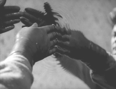
img#1
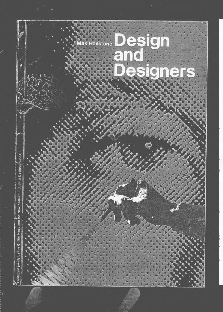
The title of my part of this talk is ‘What is Design?’ This is taken from the first chapter of Max Hailstone’s book Design and Designers which is also the name of the exhibition that we are opening tonight at Ramp Gallery. The book Design and Designers was, incidentally, published in 1985 by the Christchurch printer Griffin Press and the New Zealand Industrial Design Council.1
In this talk, I’d like to directly address Max’s question, and in the process of doing that, I hope to refine the question and ask, more specifically, ‘What is Graphic Design?’. The real point of my talk will be about this impulse, the inclination to subdivide the design field (or any field for that matter), as having distinct areas of knowledge.
As a way to get at Max’s question, I’d like summarize how I might have answered his question differently over my design career. Today, I am going to talk about the four different ‘schools’ of design that I have been involved with. These schools are associated with the following institutions: Canterbury University, The Waikato Museum, your Wintec MediaArts and Yale University.
1. Problem Solving
Canterbury University
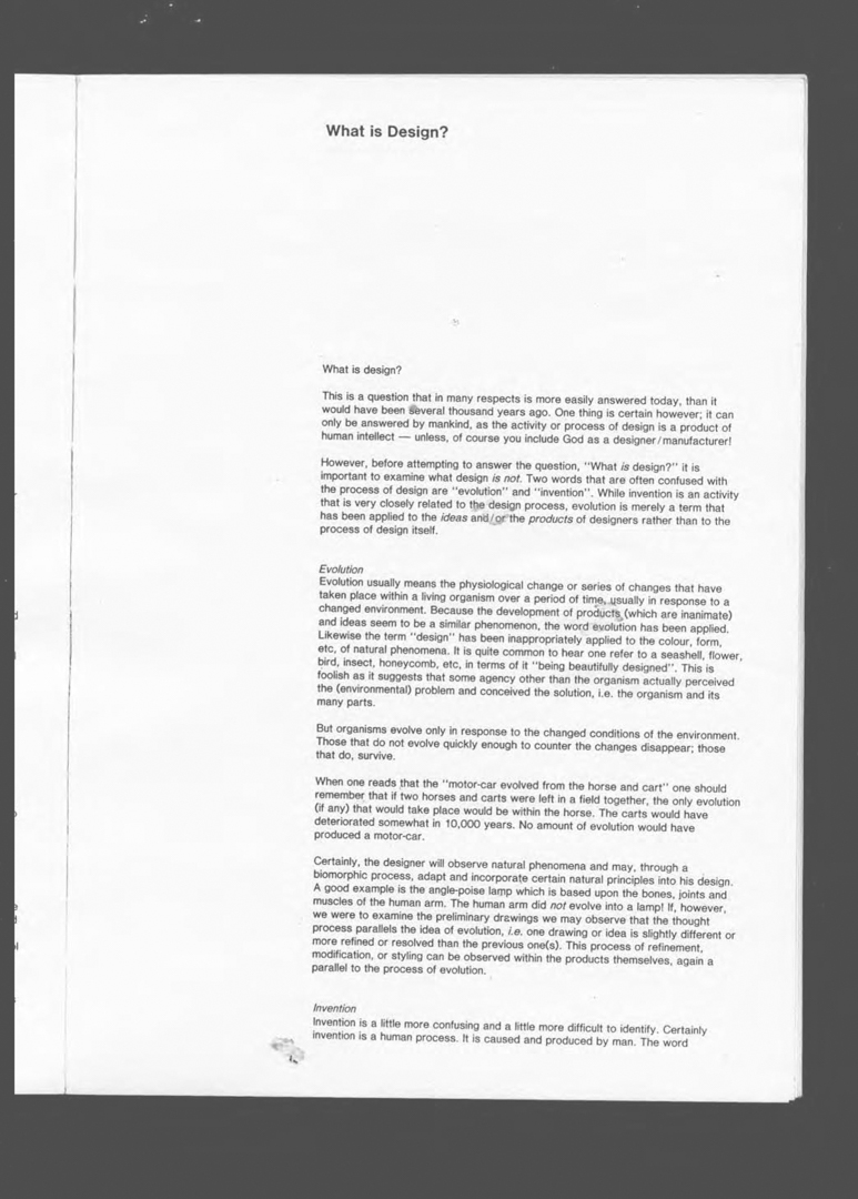
My undergraduate study was at Canterbury University’s Ilam School of Fine Arts. Max Hailstone was the primary tutor there at the time—and he was (perhaps questionably in the early 1990s) still delivering a high-modernist programme of Typo-Graphic Design. Through Max, we were immersed into the mythologies of ‘form following function’, ‘the brief’ and ‘the grid’, etc. As a class, we were indoctrinated into the idea that design is a process of problem solving.
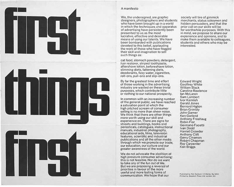
I would now like to contextualise this a bit and explain where Max was coming from. Max presumably took the title for his introduction to Design and Designers from Norman Potter’s book What is a Designer,2 first published in 1969. In his book, Max was reiterating the discourse of English design educators of the 1960s like Norman Potter, Ken Garland and Anthony Froshaug. What perhaps sets the tone for this period is the First Things First Manifesto,3 which was published by Ken Garland in 1964. This was a document that criticised the profession of Advertising, and encouraged designers to use their skills for doing more ‘worthwhile’ forms of comm- unication: like doing design for street signs, buildings, instructional manuals, educational aids etc.
We do not advocate the abolition of high pressure consumer advertising: this is not feasible. Nor do we want to take any of the fun out of life. But we are proposing a reversal of priorities in favour of the more useful and more lasting forms of comm- unication. We hope that our society will tire of gimmick merchants, status sales- men and the hidden persuaders, and that the prior call on our skills will be for worthwhile purposes.
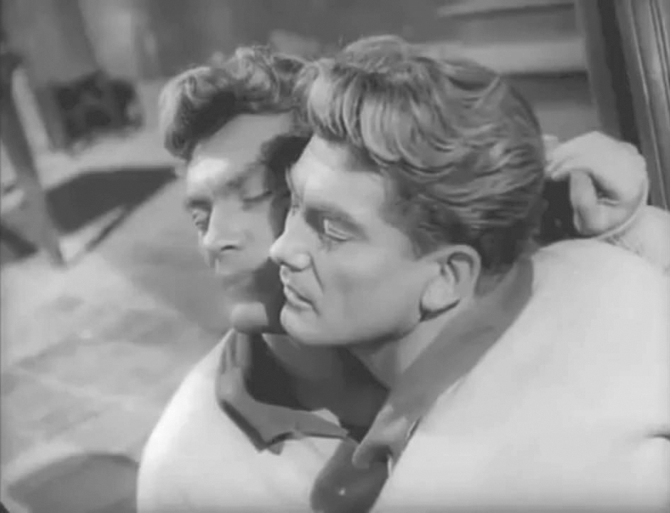
img#2
This idea of asserting the legitimacy of Graphic Design as an independent sphere of study had also taken root in the relatively recently established degree-level courses at places like the London College of Printing and the Manchester College of Art and Design—where Max did his post-graduate studies. While at the Manchester College Max was engaged as a design consultant for Penguin Books working with Germano Facetti. In his time there, he undertook research into the legibility of type, which resulted in a paper on the design of pharmaceutical labelling which was published in the first volume of the journal Visible Language.4
img#3
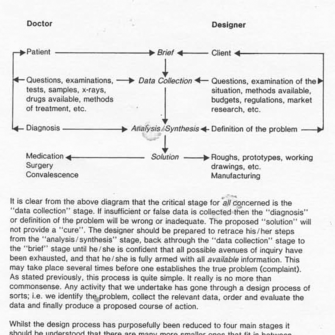
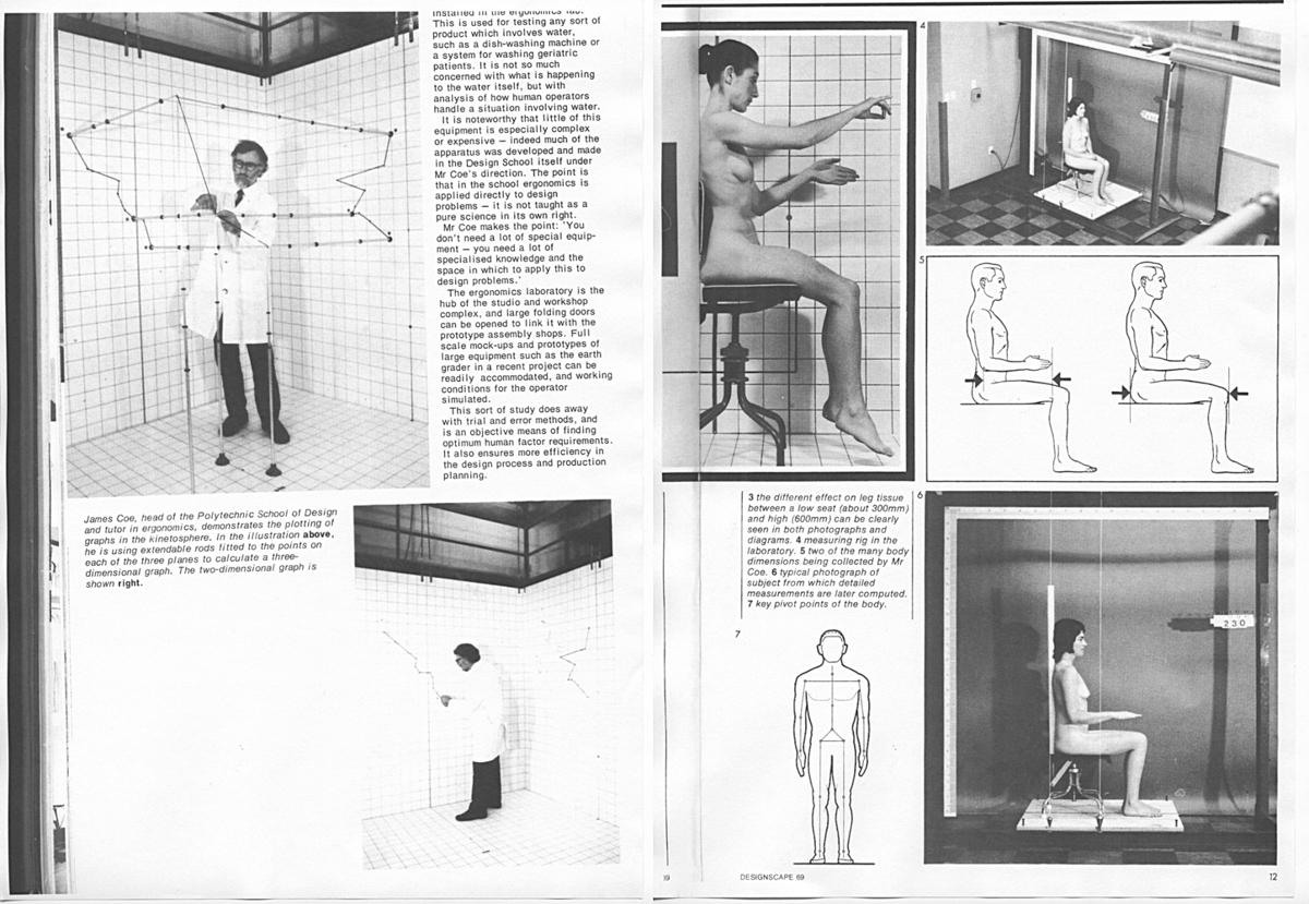
As undergraduate students, we never directly asked the question what is Design?, but at the time I was drawn to Max’s seemingly reassuringly objective way of thinking about this new profession (new to me I mean). In critiques, Max liked to use the analogy that graphic designers are like doctors, and that their clients are like patients whose problems they attempt to diagnose. The argument went that the reason that a diagnosis fails (or a design fails) is that the doctor (or the designer) has simply not succeeded in ascertaining the correct question —the question from which the answer will logically follow. The analogy between doctors and designers is obviously attractive because it suggests that graphic designers have some kind of specialist knowledge, that they must be trained and that they are uniquely qualified to do what they do.
This scientistic-isation of design was also a recurring theme in the New Zealand Industrial Design Council publication Designscape where for some reason designers were often pictured dressed in lab-coats and even more curiously, it seemed necessary for them to ‘study’ and to photograph women without any clothes on,
in order to diagnose the success of a design.
img#4
2. The Real World
Waikato Museum of Art and History
After graduating from Canterbury University, I got my first job working as the designer at The Waikato Museum in Hamilton. From that experience, my understanding of graphic design shifted to accommodate the slightly less objective, less idealistic ‘real world’ of design —a world of restricted budgets, unorganised clients, and uneducated audiences.
Granted, The Waikato Museum is hardly really the ‘real world’ for a designer. The Museum was a bit of a cave when I was there. I like to remember a discussion we had—when once again faced with the perennial threats of City Council restructuring—about how the role of a museum is to conserve and protect its contents, and is to essentially hide its treasures rather than to make them easy to access. This sounded great to me because the job of the graphic designer is more usually described as aiming to sell something to the public. The idea that I could be a graphic designer whose job was to try to make information difficult to access was very attractive for some reason. I guess I don’t like sharing.
Anyway, unfortunately the Museum followed the shift in values coming from the increasingly market-conscious museum world at the time. This shift meant a popularising of exhibitions, which involved an opening up of the Waikato Museum and a move in focus from the back of house to the front of house. Consequently half of the museum staff resigned and I jumped ship to Wintec and MediaArts.
3. Process and Intermedia Media Arts
Now as you know, the MediaArts course here was ahead of its time in New Zealand in deve- loping a degree that questioned the silo-ing, or compartmentalisation of art school depart- ments. The most interesting part of the course for me at least, was that while we were talking about inter-disciplinary collaborations, in doing that it made us clarify what we were doing within our specific home disciplines. We would quite staunchly stake claims for the uniqueness of our own areas.
So it was not so much about looking outwards and promoting cross-disciplinary mash ups, or quakery (to follow Max’s doctor analogy), but more ideally about encouraging all of us— faculty and students—to reflect on the diff- erences and similarities between disciplines. And what I have realised, mostly in hindsight, was that this is interestingly an attitude that is essentially Modernist... I will try to explain the particular aspect of the M-word I’m trying to get at a bit later.
img#5, #6
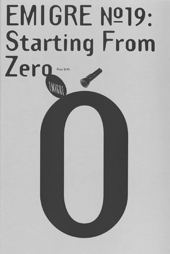
Aside from this, we were also talking about what we thought were Post-Modern theories: of deconstruction and pluralist discourses etc... while looking at graphic designers like Vaughan Oliver, Gert Dumbar, Allen Hori, Lucille Tanazas, Lorraine Wild, Tomato,5 etc., etc., and of course Emigre magazine.6
This was a time when we were all interested in playing with different design processes, different ways of making. I think this was a period when I was trying to contrive a new way of working that was essentially documentary in method. I liked the conceit that I would never really have to make up ‘original’ or new stuff anymore in my work. At the time, the self- critique of my work required an essentially introspective attitude—where I would try not to impose a style on my work, and instead look at the formal and material quality of my work as a ‘natural’ outcome of a digital or mechanical media interrogation.
Like Max’s objective ‘problem solving’ approach this ‘media process’ approach was still essen- tially formalist. We were absolutely interested in the visual, material and compositional quality of design, and not that interested in the conceptual content. However, the difference between this approach and Max’s was that Max thought there is a right or a wrong process. And at MediaArts we wanted to intentionally mess with the process.
img#7
4. Intertextuality Yale University
In 2000, I left Hamilton to begin postgraduate study in the United States. And this is where it gets really complicated, I mean interesting... because I hadn’t anticipated the extent to which everything that I had come to value in design would not be encouraged where I was now studying. Just when I had begun to understand the documentary method I just described, I was starting in a course that had no interest in us playing with, or discussing design as a making process what-so-ever.
Instead, I had to re-orient myself to a program where we were expected to account for the larger cultural, ie., intertextual, ie., literary references that our work could quote from. The critique of my work had to change from
a material interrogation to an essentially discursive parlour game—where one looked at everything but the material quality of the work. Rather we would quote Georges Perec and Jean-Luc Godard and talk about design as
a mere reflection of culture.
img#8
img#9
This pair of still images is from Jean Cocteau’s film Orpheus.7 The story is of course about a poet who travels between worlds—between the ‘real’ world and the underworld. In the film, people move between these two worlds through a mirror. There is a great line about mirrors that is transmitted as a mysterious message from the underworld via transistor radio:
Mirrors would do well to reflect further.
I mention this film and this quote because I think somehow it echoes a very Yale caution about the role of designers. By this I mean partly the idea of questioning how a mirror’s function is normally just to reflect its immediate surroundings, but also at the same time there is the suggestion that mirrors should be cautious not to overstep their place.
Of course, many people have reflected on the place of graphic design, but I would like to point up a couple of examples. Johanna Drucker in The Visible Word8 wrote about the rift between the Literary and Visual Arts realms in the mid 20th Century—in a way that seems to me to relate to the above. The book is about the work of Dada and Futurist writers and artists of the 1910s and 1920s whose typographic production was from a tradition ‘in between’ or was a synthesis of Art and Literary spheres. This changed later in the century for a whole lot of complicated reasons, resulting in a separation of Art from Literature. Drucker suggests (at least I think she does) that the field of typo-graphic design established itself tenuously in the space left in the middle of this split.
The Orpheus quote also reminds me of an article by Stuart Bailey in Dot Dot Dot #8.9 This is what I’m thinking of:
[G]raphic design only exists when other subjects exist first. It isn’t an APRIORI discipline, but a GHOST: both a grey area and a meeting point—a contradiction in terms—or a node made visible only by plotting through the lines of connections.
In what has a similar sounding ring to Johanna Drucker’s text (but is obviously not exactly related, given the contexts they were writing about and from), Bailey argues that graphic design doesn’t really exist as a discipline, or perhaps it is an in-between discipline, a profession that only really makes sense in the service of other areas.
At Yale the answer to the question what is Design? I think would have been answered by saying: “who cares about Design, the question you should ask is what is Language”. I’m over-stating this for rhetorical effect, but Yale did promote an anti-material-stance, that is, we rejected, actually just ignored anything that was purely formal, and too introspectively design-y. Part of this attitude meant asserting that there is essentially no substantial knowledge specific to graphic designers. Obviously this stands in marked contrast to what Max’s generation had wanted to argue.
img#10
Differentiation
The shift at Yale was about seeing the links between design and other cultural spheres —that is, to try to build a kind of graphic intertextuality by making designed artefacts, but only as a prompt to develop an outward gazing narrative. Part of the trick was to see, or rather read, a work of design as a text. It was the unacknowledged and unresolved tension in this way of seeing design (especially typographic design) as both visual and verbal, that I had to come to terms with.
My epiphany moment was when a lecturer accused me of being “a cave man”. This was partly (rightly) I think to challenge me for being naïve and old fashioned in my attitudes—but also to accuse me of living too much in my own closed world of design. I realised that even though I had been talking about inter- disciplinary practice (maybe now inter-cultural discourse) for a while—I was still framing it with an inherently inward-looking Modernist attitude. And this brings me to the crux of my talk... What I mean by that and what I want to tease out, at least for myself, is that it is essentially Modernist to want to differentiate between any discipline. In fact it could be the very definition of modernism. Now, I’m not a sociologist, I’m
a graphic designer... there I go again... The sociologist Scott Lash would explain that indeed the primary shift from Pre-modern to Modern thinking started with the process of beginning to ‘differentiate between culture spheres’.10
img#11
The key independent cultural spheres that Lash writes about are, for example, the Religious and Governmental spheres, or the Scientific and Aesthetic spheres etc. The same idea of differentiation can be applied to distinguishing between the spheres of Graphic Design, Advertising, Literature and Fine Art. Now, I don’t want to go into this too much more, but Lash goes on to explain that Post-Modernism is characterised by another shift—one towards a ‘de-differentiation of cultural spheres’. This implies a (hopefully now familiar sounding) denial of discreet or autonomous disciplinary knowledge.
Conclusion
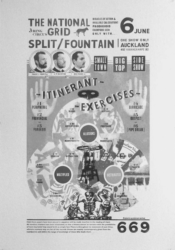
The National Grid
Finally, I want to finish by connecting the dots between my obsession with differentiation and The National Grid, and to triangulate that with Max’s question—what is Design? I think one of the reasons Luke and I founded The National Grid was to address that question in our own way, and to seek out work to hold up as an alternative answer to what was usual in this country. In our first editorial we wrote: “We wanted to have a counter-manifesto, inspired by the manifestos of early modernism... We wanted to have our own salvation narrative— to define ourselves in opposition to the [rest of the New Zealand design establishment].”11
I think now though, for us, that question what is Design? is too big, too finite and too seemingly objective. It is like asking what is writing?. I want to retreat from such an ambitious pose. What I think we have always wanted to contribute is a more humble and a more personal answer. And this is where there may be a bit of a paradox— because while we are differentiating between ‘all Design’ and ‘our personal take on New Zealand accented Typo-Graphic Design’, I think the way we are doing this, is by trying to make links between graphic design and bigger, more important national and international cultural discourses. We want to do both of those things—differentiate and make links— simultaneously.
img#12
In conclusion then... I hope that it has become obvious that I’m not so interested in answering the question what is Design?, but rather in thinking about how the answer to that question keeps changing for me. I guess I am really most interested in reflecting a little more on the meta-question of what it means to ask that question.
Footnotes
Max Hailstone, Design and Designers, New Zealand Industrial Design Council and Griffin Press, 1985. ↵
Norman Potter, What is a Designer: things, places, messages, Studio Vista, 1969. ↵
First Things First Manifesto, published by Ken Garland, 1964. ↵
Max Hailstone and Jeremy Foster, ‘Studies of the Efficiency of Drug Labelling’. Visible Language 1.3, July 1967. ↵
Actually, Tomato’s John Warwicker visited Hamilton as an external moderator during the setting up of the MediaArts degree course. ↵
Emigre, ed. Rudy VanderLans. ↵
Jean Cocteau’s film Orpheus,1949. ↵
Johanna Drucker, The VisibleWord: Experimental Typography and Modern Art, 1909–1923, University of Chicago Press, 1994. ↵
Stuart Bailey, ‘Dear X’, Dot Dot Dot #8, Dot Dot Dot, The Hague, 2004. p.3. ↵
Scott Lash, ‘Postmodernism: Towards a Sociological Account’, Sociology of Postmodernism, Routledge, London, 1991. p.4. ↵
Jonty Valentine and Luke Wood, ‘Index’, The National Grid #1, 2006. p.38. ↵