Wedge – Julia Gatley
Bruce Rotherham
Originally drawn 1947,
this version 1995.
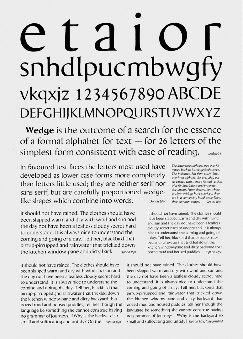
‘Wedge’ is the outcome of a search for the essence of a formal alphabet for text—for 26 letters of the simplest form consistent with ease of reading.
Bruce Rotherham, 1995
Bruce Rotherham (1926–2004) was a key member of Auckland’s Group Architects in the early 1950s, but his interests extended well beyond architecture, encompassing music, chess, painting, sculpture, graphic design and typography. The latter culminated in his design of the typeface that he named Wedge.
There are multiple versions of Wedge, with the year of design included in the name of each. Wedge 47 was the first, designed in 1947 when Rotherham was a third year architecture student. Following refinement—and his 1955 move to London—he submitted Wedge 58 to Monotype Corporation, which designed and sold typefaces for such things as offset printing, for consideration. The company identified weaknesses in certain groups of letters, including the ‘r, n, m, h’ range, but also encouraged Rotherham to continue working on the design. Architectural practice took over and the years passed.
Wedge’s second lease of life began in 1990, when Rotherham heard a BBC radio programme, ‘Science Now’, on computer typesetting. He contacted and found enthusiasm in one of the speakers, Adrian Pickering, a lecturer in Electronics and Computer Science at the University of Southampton. Thus he set about revising the individual Wedge letters, for Pickering to transform into a computer font. This led to Wedge 93, with further refinements in 1995 and 1998, and subsequently to its use in various books, magazines, CD covers and exhibition catalogues.
Rotherham’s interest in graphic design and typography began early, through time spent at Abel Dykes, the printing company owned and operated by his father. In turn, W. C. (Clifford) Rotherham supported his son’s interest by letting him use the Abel Dykes equipment. In 1946, for example, when Rotherham designed a manifesto and a magazine for his Auckland University friends and classmates, who operated under the name the Architectural Group, his father’s company printed them. In the 1950s, this continued with Abel Dykes printing Wedge letters and paragraphs as samples at different sizes.
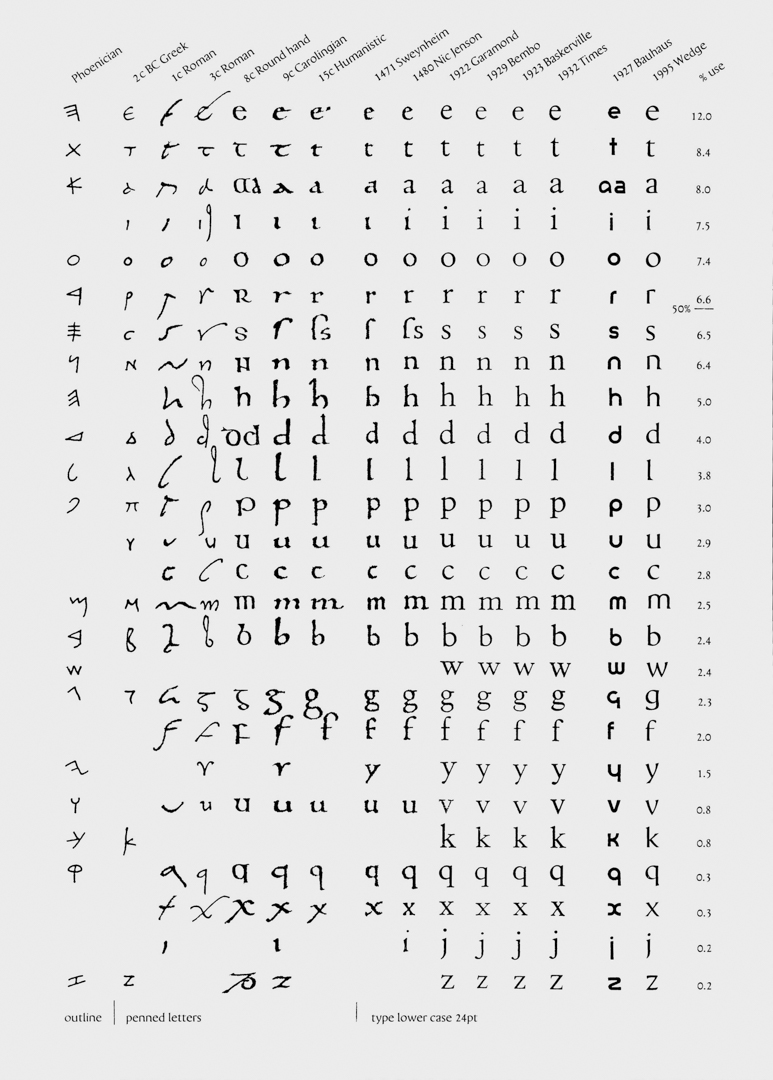
Bruce Rotherham wrote about the ideas that informed Wedge, including the development of the typeface in general and seven detailed pages titled ‘Thoughts on Each Wedge Letter’. His text shows that he was knowledgeable about the history of typography from the ancient Greeks through to the Bauhaus. He identified Herbert Bayer’s ‘universal alphabet’ of the 1920s as his starting point for Wedge. He was struck by it, particularly by its problems, and asked: “why was this alphabet, so clear in its geometry, virtually unreadable?” Thus, he aimed to produce a typeface that was as ‘elementary’ as Bayer’s Universal, but “as readable as the recognized book faces.”
Rotherham premised the design of Wedge on ‘lower-case-ness’ and more specifically on his observation that the letters which are most frequently used have developed more in their lower-case form than those which are less used. He analysed the occurrence of individual letters, from the most commonly used (‘e’ followed by ‘t’) to the most rarely used (‘j’ and ‘z’). Thus he chose the ‘e’ and the ‘t’, letters that “have no superfluous detail and yet have much individual character”, as the basis for his own alphabet.
Rotherham noted that in general, the Wedge letters with rounded bowls are thicker at the bottom left and top right and thinner between, while straight lines taper up when the line is on the right- hand side of the letter and down when the line is on the left-hand side. He also reflected on each letter’s ‘wedge’, commenting that “The wedge is found in its simplest form in the top of the ‘t’... It also occurs where the eye is understood to travel, along the top of words where most detail lies, in ascenders ‘l, b, h, k, d’ and ‘i, j, u’ (and also v, w, x, y in ‘Wedge’). It is echoed in the taper from thick to thin of curved letters.”
Wedge was painstaking work for Rotherham over many years, with each letter and punctuation mark hand-drawn and re-drawn multiple times at large scale. Increased interest in the work has emerged since his death, with the inclusion of the font in graphic design and typography exhibitions and its increasing use in a range of print publications. Rotherham wanted to see Wedge in use, and son Jeremy believes he would have been delighted that this is now happening.