A dry cough – Lara Strongman
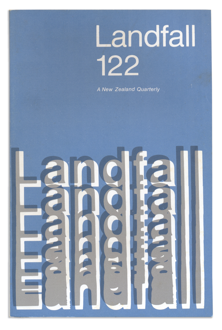
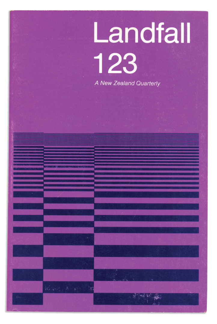
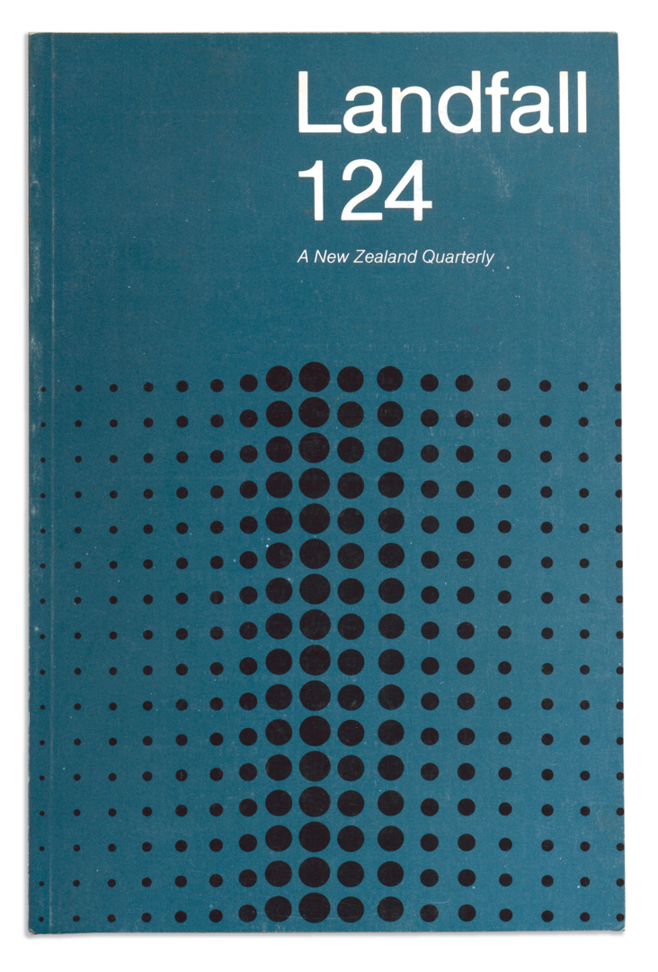
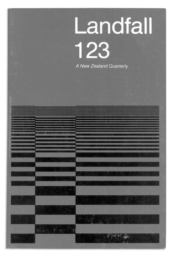
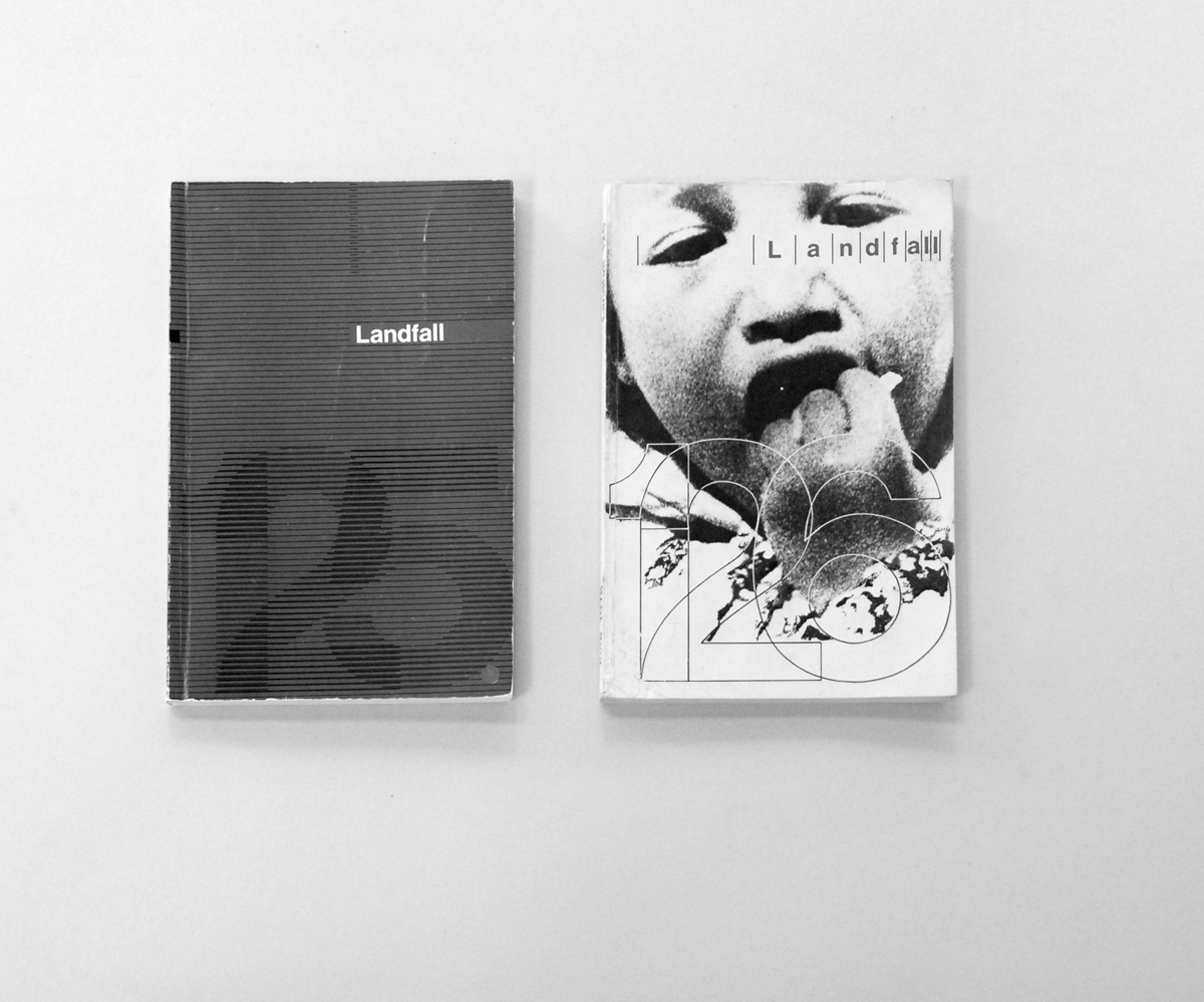
Covers designed by Max Hailstone
March 1976 – June 1978
In the mid-1980s, not long after the fourth Labour Government ousted Muldoon and reformed the economy by opening it to the forces of global capital—and when this still seemed like a good thing—I started to get interested in graphic design. There was, arguably, no coincidence in this: the politics and the aesthetics were, as they always are, very close to being the same thing.
Before the change in government, New Zealand was like a country behind the iron curtain. Years of import restrictions and currency controls had limited the availability of international consumer goods. Levis only came in one style, navy blue straight leg with zip fly. Magazines arrived by boat, three months out of date. There was a general dullness and conformism about New Zealand society in these last years of the era that Chris Wheeler, editor of the infamous Wellington-based underground magazine Cock, had once described as ‘old, grey, warmongering, RSA, Keith Holyoake New Zealand’.1 New Zealand conformism was leavened by local expressions of progressive culture based—like many other global modernisms—on productive misreadings, misunderstandings and reworkings. What arrived in New Zealand—and what we made of it—was subject to the pressures and needs of local culture. Graphic design was not exempt.
The first graphic designer whose name I knew and whose work I could recognise was Neville Brody; and I knew about him from reading The Face magazine, the paean to British style that he’d designed between 1981 and 1986, and which began to be regularly imported into New Zealand from about 1985. Brody’s work was a shot in the arm. Hand-drawn fonts; text blown-up and stacked and rotated; typography reduced to graphic symbols and pushed beyond the limit of legibility; it represented a new freedom of aesthetic beyond the exigencies of direct communication.
I saw Brody’s work as a generational challenge to the dullness of conventional typography, by which I meant the debased form of Swiss modernism that then characterised much graphic design in New Zealand. Small point size, large white gutters, ragged right edge, everything in Helvetica: Swiss modernism seemed like the graphic design equivalent of a dreary institutional corridor or a one-size-fits-all school uniform, the house style of an older generation. In that pre-Mac age, local designers responded by making their own versions of Brody’s typographical interventions, calculating point sizes and line lengths by hand and pasting up the lettering they got back from the typesetters, stretched or condensed to fit the available space. It was a raucous, emotive mode of address that had something in common with the bold design of early 19th century Vaudeville posters. It was a long way from the polite dry cough of the Swiss style.
It took me years to grow out of my general adolescent disdain for Swiss modernism: long past meeting its foremost New Zealand exponent, Max Hailstone, in the early 1990s. It wasn’t until a new generation of young designers began to rework its precepts around the new millennium that I was forced to rethink my long-term association of the International Style with the conformity and prescription of old New Zealand. When I look now at Hailstone’s cover designs for Landfall, completed between 1976–8, I see —ironically—many conceptual and stylistic similarities with Brody’s work of a decade later.2
At the time, it is the differences that seem most important, the particular qualities that distinguish one moment from the next; but from a historical viewpoint, what is held in common assumes a greater significance. Style moves in great cycles. (Someone, somewhere, is no doubt reprising Brody’s mid-80s work right now.) It is the experimenters, the outliers, the non-conformists, people like Brody and Hailstone who respond to the needs of their own time and place in order to push the culture forward; and what they have in common is far more interesting than their differences.
Footnotes
Chris Wheeler, quoted in Toby Boraman, Rabble Rousers and Merry Pranksters: A History of Anarchism in Aotearoa/New Zealand from the mid 1950s to the early 1980s. Christchurch and Wellington: Katipo Books and Irrecuperable Press, 2007. p.33. ↵
A key difference, perhaps, is that Brody brought the experimentation previously acceptable only on a cover to the interior of the publication. ↵