So it goes – Lisa Grocott

Jonty Valentine & Luke Wood
2009
It wasn’t supposed to be like this. When I said yes to writing this there was no reason I would be here, in Hamilton. I should be writing this in my Brooklyn apartment where my other-side-of-the-world perspective on this diagram was to be framed by the fact that I live in a place where being a New Zealander means having to patiently explain to my eldest son why we will not be supporting the USA in the rugby world cup and patiently listen to people rave about New Zealand scenery when they only know the middle earth version. But then my father died... and here I am in my hometown.
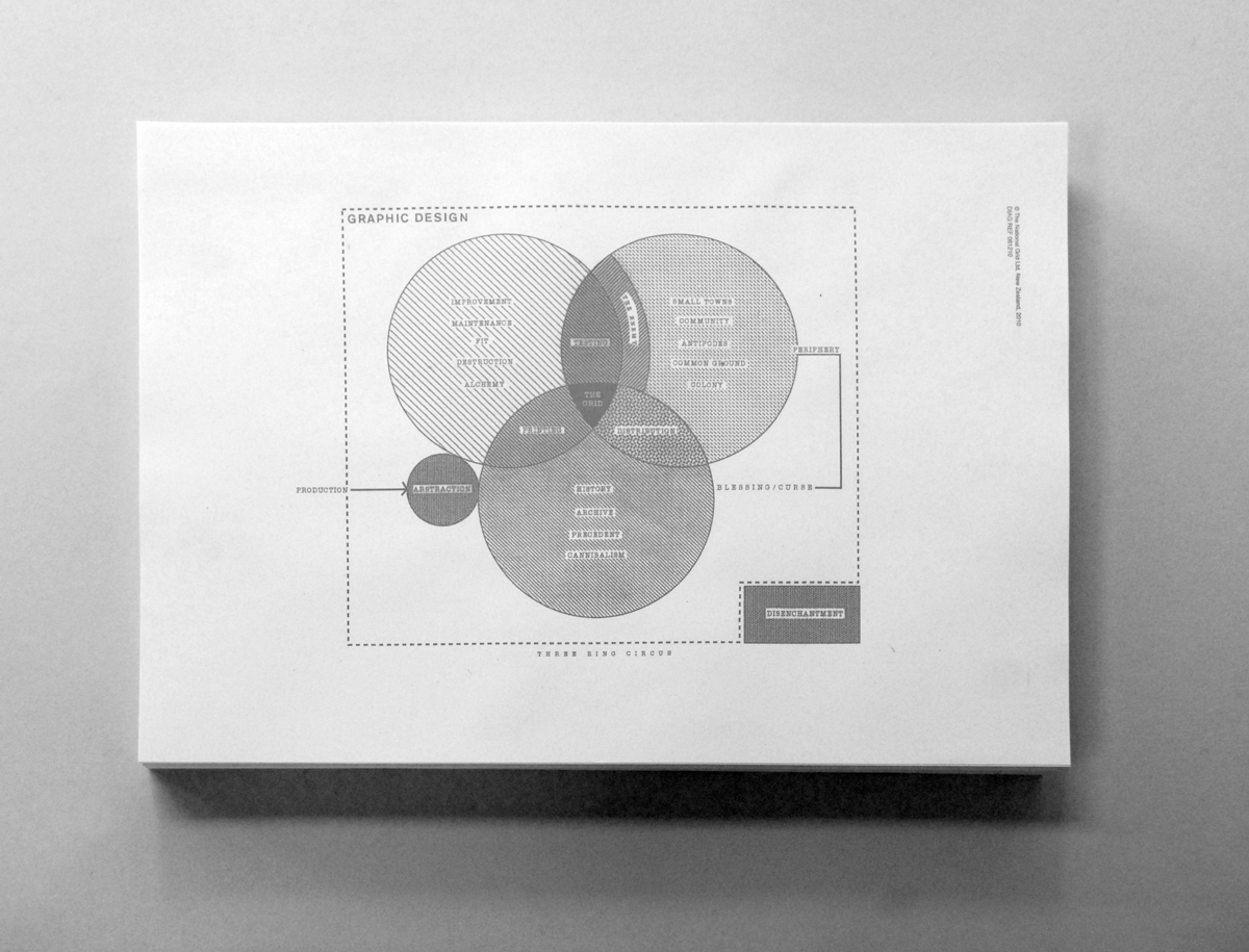
When I first saw this diagram I smiled to myself that venn diagrams always seem to ignore the complexity of the intersections and inter-relationships to preserve the elegance of symmetry. Back then I planned to critique how like so much info-porn this diagram doesn’t reveal too much if you try to read it as an objective artefact. But then my father died... and I haven’t written anything.
Now I revisit the diagram I only see one word: periphery. In New York I thought I knew what this meant. I assumed I lived at the centre and you lived on the periphery. Theoretically it is easy to understand that any sense of centre and periphery are constructed; yet that doesn’t change the surprise of having an event expose the extent to which your worldview can be turned upside down. New York may be where my children were born, it is where I live and work—and yet for a month my so-called life in Brooklyn has been pushed to the margins. Here I am in my antipodean small town and it is as if 15 years ago I never left. The Waikato fog, the taste of feijoas, the Southern light are just a few of the embodied memories that remind me every day that Aotearoa is my turangawaewae and any place else is just where I happen to live. As you can tell... I am only just figuring this out.
This is connected to what I planned to write back in Brooklyn: the agency of discursive, reflective diagrams. The conventional perspective on information design is that diagrams are useful for objectively visualizing data and relationships. But what we too often overlook is the potential of diagrams to work through ideas still under negotiation. If we were to grant diagrams the poetic license of subjective interpretation it wouldn’t just change how people engage with the diagram it also shifts how people use diagrams.
I am sure the intention of this diagram was never to fix an understanding of The National Grid. What I assume is that the act of figuring this ambiguous diagram afforded the designers’ an opportunity to (re)negotiate their understanding of the journal. I took this back talk between the designers and the diagram and extended it to the reader and the diagram.
If I weren’t interpreting this as a bereft daughter visiting New Zealand from New York I would surely have glossed over the word periphery. For me this is more engaging: to interrogate the diagram through the lens of my lived experience than to guess what the designers were thinking. This approach may be more Matthew Ritchie than Edward Tufte—but I think the generative nature of the discursive diagram is an interesting vector for graphic design to explore. Maybe next time you sketch a diagram over-ride the impulse to communicate a predetermined position and check out the potential of simply figuring a new understanding of the situation.