Only parts of a never-whole – David Bennewith
SoFA Gallery exhibition catalogue
Luke Wood
2003
Once the language has been established it can be easily appre- hended. At least, I think, this is the case. At least, it seems to be like this for typefaces. Typefaces, who seem to need external influences—parts—for their creation/construction. Whether it be a current idea or a trend of some sort, or a machine that will only allow the letters to be made reproducible in a certain way. Our inherited alphabet is not untouchable and always along for the ride, maybe it is a [our last] utopian remain? These multifarious things that are made and put as a thing, into devices, that can now be called a type-design.
•
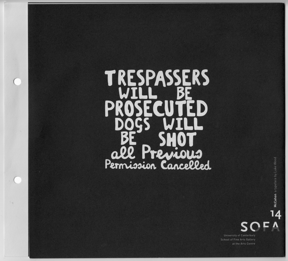
I like how you refer to your experiment with Colin McCahon’s particular, yet nominated, lettering—used mostly in his paintings but also in his graphic design works—as ‘Frankenstein-like’. And I vaguely remember(?) the creature being referred to in Mary Shelly’s book as ‘a strange device’—‘device’: an older word that could be used to refer to the design of something. That word we think of now, more, as all these undead digital gadgets everywhere.
•
That only after it had unwittingly ‘escaped’ (as data on a CD) did it begin to acquire a sort of strange animation. Applied, ended up on these things that we see in front of us—ripped-out and half-drunk— things that seem to be infinitely reproducible and consumable... It's bizarre that this caused you some distress? Or, at least troubled you enough to wonder what it was that you had designed? This digi- tisation that suggests very strongly his painterly hand. Which was influenced by other hands (Known? Not-known?—I think we think we do?), that painted a certain way because of the things they had to paint their roadside price-signs with; which were most likely purchased in local hardware stores. This a common and interesting thing to consider when thinking about the writing of certain communities, groups, coteries; how they achieve identity without (or the mis-use of) certain devices (or designers) to communicate things. First unfamiliar and wild then familiar and established, then capture-able.
•
Dominion Post
2002
Advertisment by Saatchi & Saatchi
In 1994 a Joan Miro typeface had been designed by the digital type-foundry P22. ‘Miro’, inspired by the artist’s formal language, was available for purchase on a CD at the Guggenheim Museum’s giftshop. At least until the product was removed from its shelves by Miro’s grandson under a breach of copyright. Royalties from the typeface were then paid to the artist’s estate and the typeface was taken out of circulation.
•
Why it was suggested McCahon was influenced by—and applied— this type of lettering is, seemingly, a matter of our honourable, dark and transforming culture. These poor morphologies that they will come, through inheritance, to represent an idea. This is why we can use these forms for designing, because we know that any applied suggestion is, at least, some particular form of communication. No matter how disturbed... actually not disturbed... distributed... this still-until-activated file becomes, via its series of registers, its final and silent form.
•
As I watched Isabel trace the digital-McCahon for the Latent Stare exhibition, onto the wonky wall at CasCo in Utrecht; taking it out of the computer; back into perceptible space; as the charcoal dust fell and accumulated; and shadows appeared and it was negative again; as absent on the wall as on the screen; slowed down to an unfamiliar pace; over the days; the hours it was...
•
I am sitting in a dusky valley in the Italian part of Switzerland, about 350km from Frankenstein’s setting. I’m writing this on my laptop, if I had a copy of McCahon I might type ‘I AM’ just to amuse myself. And to remind myself of the essence of most personal writing or typing I do.