Photography in the age of mechanical reproduction – Neil Pardington
Edited by John B. Turner Auckland: Photoforum 1995
Ink & Silver is a PhotoForum publication edited by John B. Turner and produced by the Elam Fine Arts Printing Research Unit (EFAPRU) in 1995. At that time, John was head of the photography department, Elam School of Fine Arts, University of Auckland. It is a book dedicated to art of reproducing black and white photographs in the offset printing process. The techniques used in the book include duotone and tritone printing. A clear or tinted spot machine varnish is also used on the images throughout the book.
For those not in the know, duotones are images printed with two inks, typically a black and a grey. Tritones, as the name suggests, use three inks—usually two blacks and a grey. When setting up the printing plates for duotone printing, the black ink will favour shadows and the lighter grey ink the highlights. With tritones the second black plate is usually posterised, blowing out all but the darkest image areas. What this hopes to achieve is a reproduction with solid blacks, brilliant whites and detail held in all of the tones between. Simply put, having your lights and highlights mostly on one plate and your shadows and blacks mostly on another gives you the ability to control the contrast of the image on the press, and thereby create a greater contrast ratio in the printed image.
As I read through the credits for this publication, there were many personal connections for me. I studied at Elam from 1981– 84 and although not in the photography department did take a photographic history paper with John B. Turner. I have also worked with Martin Schänzel, one of the printers of the book, on many publications— most notably Handboek: Ans Westra Photographs, which was printed in duotone with a spot gloss machine varnish. I consider Martin to be the best press operator I’ve ever worked with.
For someone who is both a photographer and a designer, this book enters territory that I both love and loathe. Love, because I’m passionate about printing photographs and printing books—and have an extensive collection of photography books. Loathe, because it is all to easy—in photography and design—to put so much emphasis on technique that it buries what is really important about the work. However, my expectation for great photography and great design is that it displays rigor in both thought and execution—for me either one is left wanting without the other.
I can’t talk about duotone printing without first acknowledging Brian Moss. Back in 1985, when I was a green Elam graduate starting my first job at the Sarjeant Art Gallery in Whanganui, Brian was the go-to designer if you were printing a photographic book. Gallery director Bill Milbank was planning a definitive publication on Laurence Aberhart, and brought Brian in to work on the project. The book never eventuated, but Brian’s meticulous approach to reproducing photographs in print left an indelible impression on me.
Brian was famous for sleeping in the print shop while they ran his books on the night shift (as I have since done many times myself). He’d be woken to approve a run, then sleep until the next pass was ready. Legend has it that his high standards were too much for one printer who famously tried to take Brian out with a forklift.
But I diverge. Needless to say, the printing quality of this book is exemplary. The blacks are very black, the whites are paper white, and the many tones between beautifully separated. Really, on a technical level it can’t be faulted. I would say that it has probably never been matched by another publication printed in New Zealand, but for good reason. As John Turner notes in his introduction: “Fine printing simply cannot be done in a hurry, and for this reason, so often it has to be carried on outside of any commercial pressure.”
While the images are close to perfection, the design and typesetting is not. It’s a large format book (400 x 300mm portrait), with an aesthetic that sits comfortably within the tradition of quality photographic books. I’m thinking, the likes of Twin Palms Publishers / TwelveTrees Press. Big format, big type, brilliant printing.
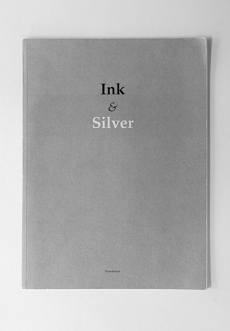
Editor and photographer John B. Turner has also turned his hand to design this publication. Overall the book has a beautiful aesthetic, including the elegant typographic cover printed in black, silver and green.
The internal design, however, suffers from simple errors made by someone not sufficiently experienced in typesetting and design. The two-column layout combined with body copy set at a large point size has resulted in endless hyphenation breaks at line ends. In a properly designed book of this scale there should be no need for hyphens. In addition to this, hyphens have been used for en dashes and there is the odd double word space in evidence, along with many gappy and tight lines.
For a publication that brought photographers, pre-press workers and printers together to perfect the reproductions, it seems strange to not have a designer in the mix to lift the design and typography to the same standard.