Typography in Protest – Elaina Hamilton
Collection of the Waikato Museum Te Whare Taonga o Waikato
In July of 1981, 56 days of protest began in New Zealand that would bring about a civil disruption that would divide the country. The protests were against the apartheid policies practised by the South African government, and in opposition to the “Springboks”, the segregated (white) national sports team sent by the South African Rugby Board for the impending series of rugby matches planned between the countries. The front line of the confrontation was the game-day standoffs between the anti-tour protesters and the New Zealand police and pro-tour supporters.
For many people the protest became a historical event that was viewed entirely pictorially—from television coverage and in newspapers. As historical documents photographs are a powerful record of the event; my interest is also in how other graphic content—in particular typographic content—played an important role in the protest. Decoding the graphic design is equally revealing in understanding these images.
A Brief History
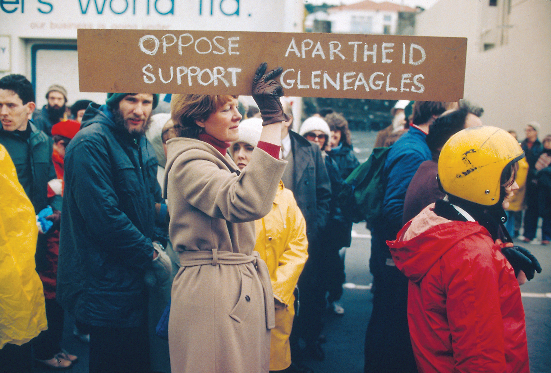
Under the apartheid system in South Africa, legislation mandated the separate development of non-white races that did not share the same rights of citizenship—such as the right to vote—as the white minority. First introduced in 1948 these racial segregation policies stayed in place up until 1994. They reached a crescendo when in the 1950’s the government separated the population according to ethnic background through forced resettlement. In 1977 the heads of the governments of the Commonwealth signed the Gleneagles Agreement, which discouraged competition between the sportspeople and organisations of South Africa and the rest of the Commonwealth. It was part of an international campaign against apartheid embodied in an earlier declaration in 1971 to discourage racism. The New Zealand government, led by Prime Minister Robert Muldoon, chose to ignore the Gleneagles agreement in favour of supporting the 1981 tour.
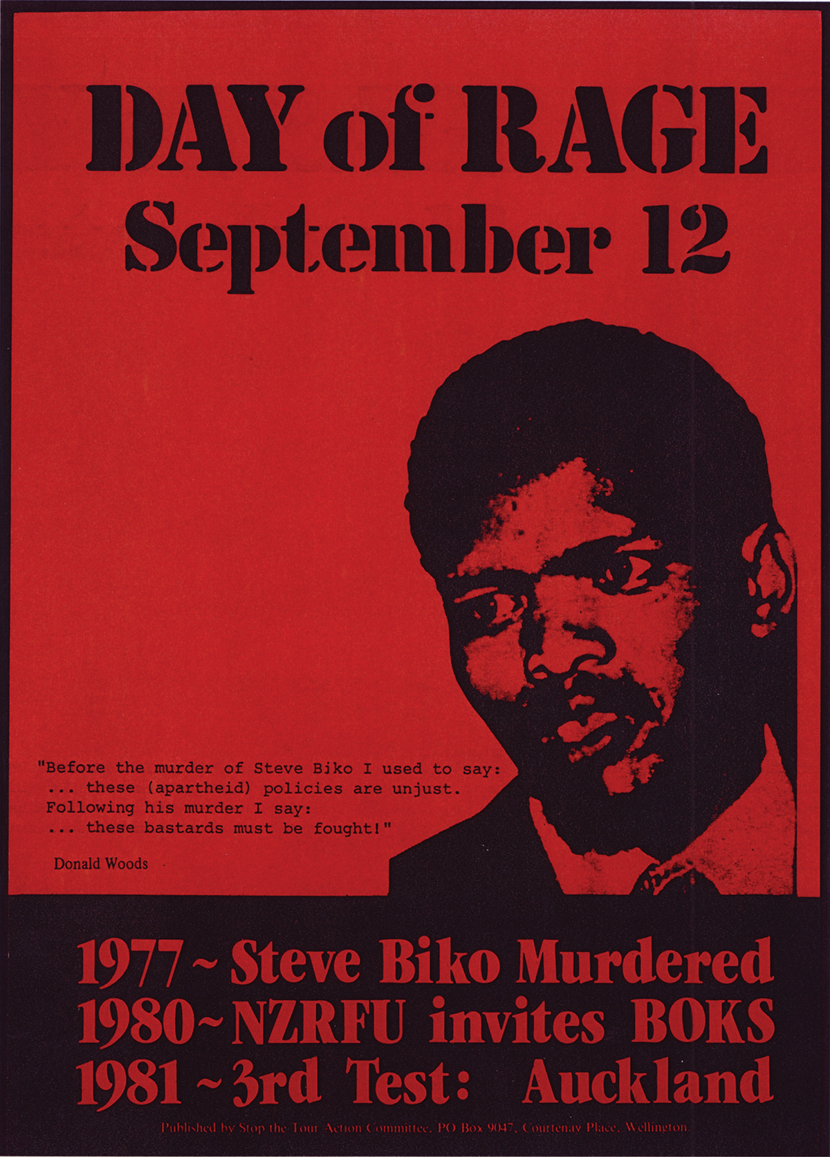
In the South African township of Soweto, June 16 1976, hundreds of high school students peacefully marched in protest of having to use Afrikaans—considered to be the language of the state oppressor. The police used tear gas and live ammunition against the protesters, resulting in several deaths and many injuries that would escalate into an uprising that cost the lives of several hundred South Africans. On 12 September 1977, Steve Biko, founder and martyr of the black consciousness movement in South Africa died after sustaining massive head injuries while being detained and interrogated by police under anti-terrorism legislation. In New Zealand these two significant events, still in the public consciousness, would play an important part in many demonstrations. Imagery and text referring to Steve Biko and Soweto uprisings featured throughout protests in remembrance of these events.
1981
Published by Stop the Tour Action Committee, Wellington.
[Evening Post Collection, Alexander Turnbull Library, Wellington, New Zealand.]
1 August, 1981
Photograph by Marti Friedlander
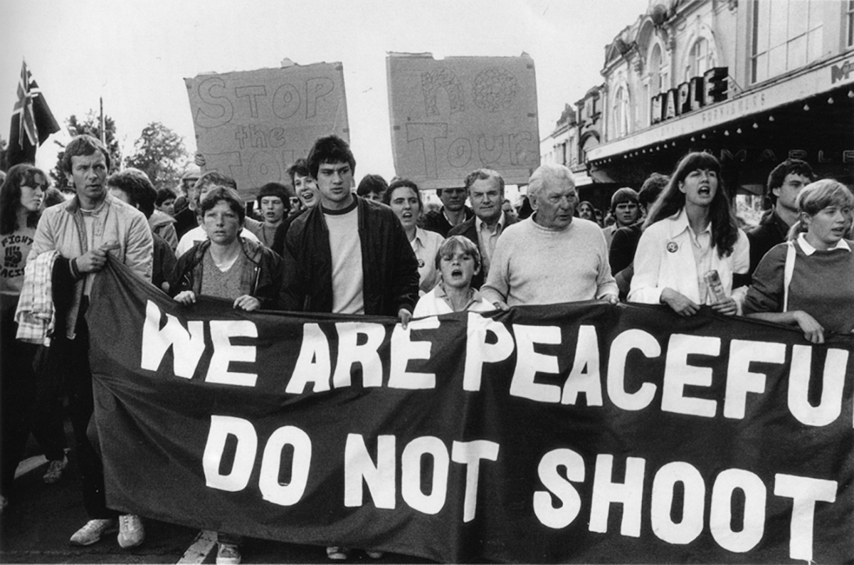
Leading up to the tour, there was a barely contained climate of general social unrest in New Zealand with the economy declining, and with an increasingly out-of-touch government. As a consequence many social issues were brought to the surface by the state of civil unrest provoked by the Springbok tour protests. Various groups including trade unions, student organisations, churches, Maori groups, and womens’ associations came together in opposition to the tour. Signs often represented these collectives. Declaring their union links, banners read for example, RAIL WORKERS, or AMALGAMATED ENGINEERING UNION, or SOCIAL WORKERS—AGAINST THE TOUR!
12 September, 1981
Photograph by John Miller
Ready for Battle
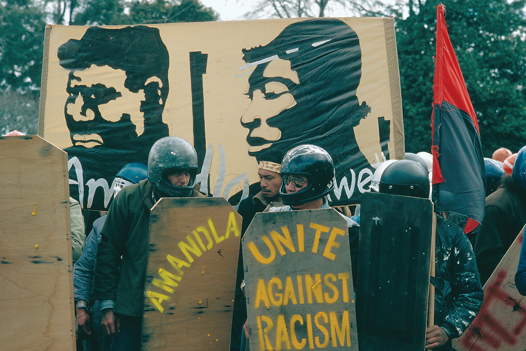
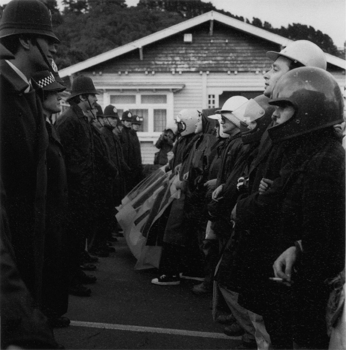
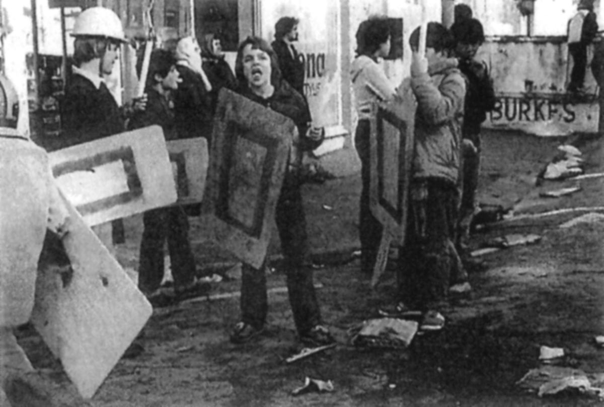
As the tour progressed, the sports grounds were surrounded with coils of barbed wire; police were outfitted with helmets, long batons, and riot shields. The field of play became as much the ground surrounding the rugby fields as the ground between the posts. Much of the tour looked more like scenes from a civil war than a disputed rugby game. Some protesters mirrored the protective clothing worn by the police, adopting motorcycle crash helmets, makeshift shields, and padded clothing. The nature of this clothing impersonalised police and protesters alike. Protesters chanted ‘Amandla Ngawethu’, power to the people; banners were adorned with similar mottos of civic empowerment. Hundreds of thousands of posters and leaflets were printed and distributed in anticipation of the major demonstrations to be held on May 1 and July 3. Protests started well before the South African team had flown into the country, and would progressively follow the matches as the tour travelled the length of the country.
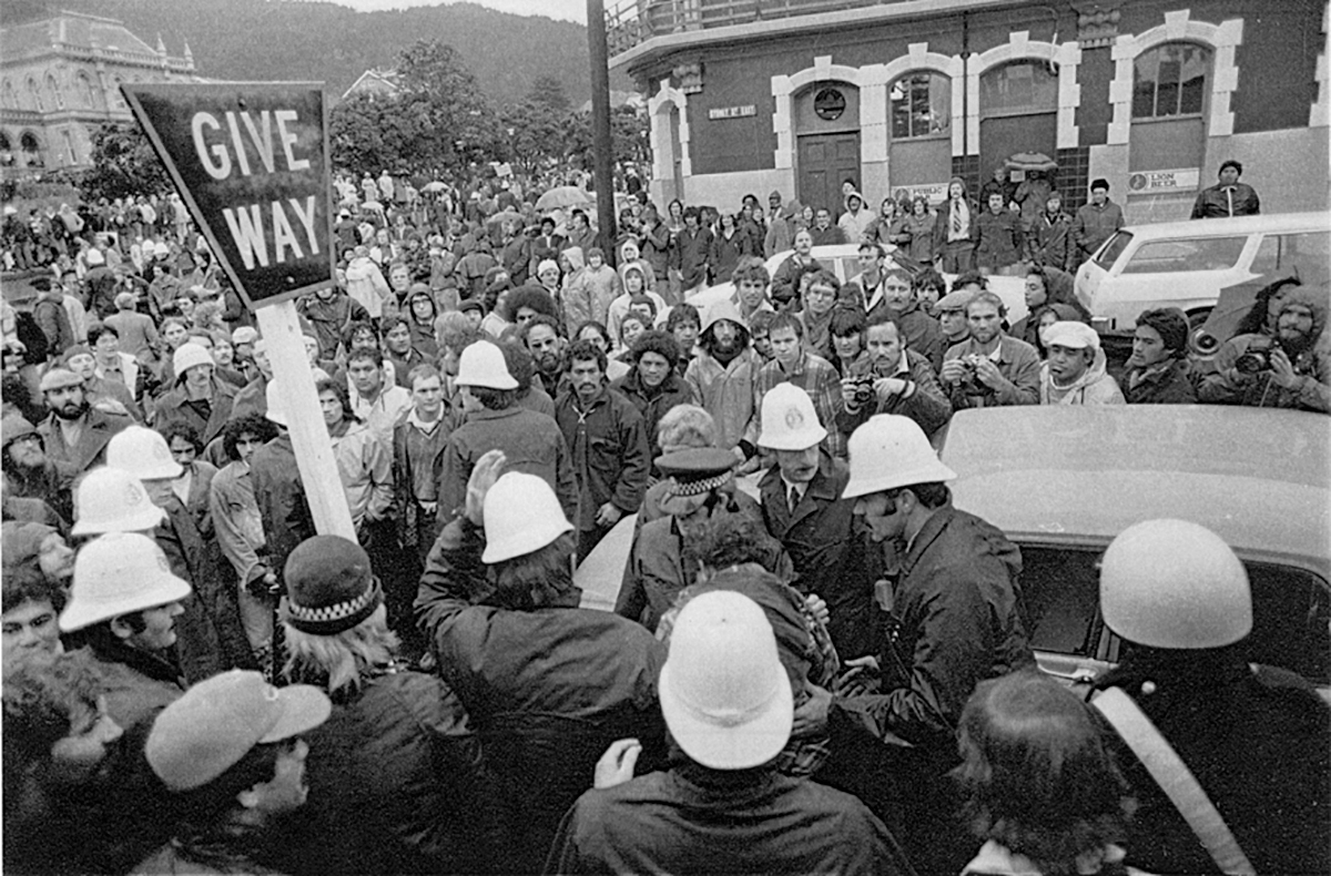
Sign Language
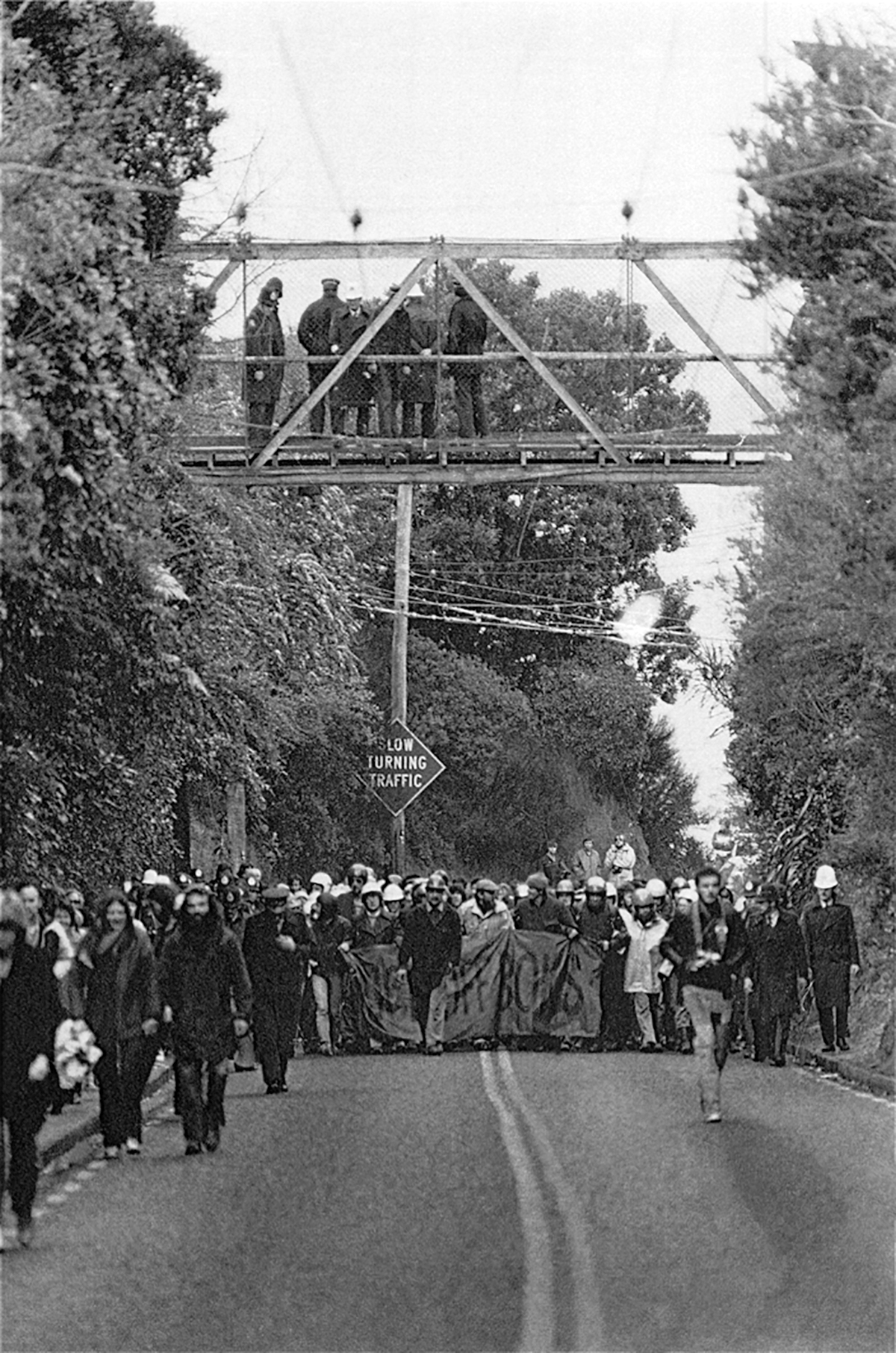
In the tradition of civic protest, the street is the place where ‘the people’ have a voice. Through public demonstrations they claim public space as a stage to highlight and argue issues. While looking through photographs of the tour it is apparent that as the protesters negotiated the rules of the urban landscape the road signs used to control traffic shifted in their significance. In one image the opposing groups (protesters and police) converge at an intersection, the disregarded GIVE WAY sign is engulfed, looking precarious as if it will give way. Another reading of this standoff reveals an underlying irony; the viewer imagining the scene unfolding into further chaos can read the sign as a futile plea for balance, as if begging for both sides to compromise. In another photograph the meaning of the road sign, SLOW TURNING TRAFFIC, becomes ambiguous because of the absence of any punctuation. Once directed at vehicles the sign is now indicative of the protesters movements as they occupy the space. The function of the sign seems pointless now and its meaning redundant because of the presence of protesters walking in the wrong direction.
1981
[Evening Post Collection, Alexander Turnbull Library, Wellington, New Zealand]
July 1981
[Evening Post Collection, Alexander Turnbull Library, Wellington, New Zealand]
From a Macro Level
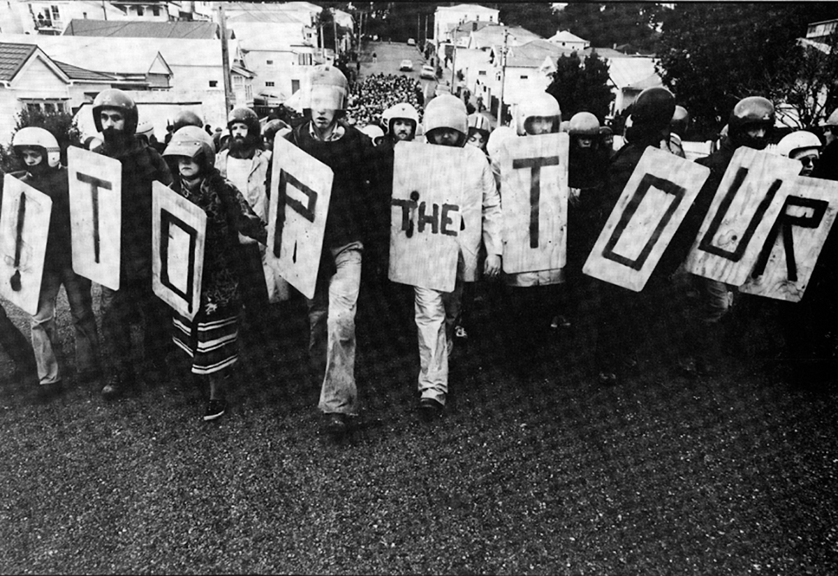
The vernacular typography of protest signs is unconventional in the sense that the forms do not adhere to the contemporary technologies and formal typographic styles of commercial graphic design (characterised by slick printing techniques, mass production, and standardisation). Since the form of protest is based on reactionary impulses, it follows that the typography relating to it is impulsive also. This is not to say that it is not organised or designed, merely that it comes from a spontaneous reaction —an immediate need to communicate a message. However seemingly chaotic and disordered, the form of protest typography is related to its intended function. Often letters and symbols are stencilled and spray-painted so they can be duplicated rapidly across various mediums. Stencilled letters—reminiscent of the typography of 1940’s military paraphernalia, and now associated with modern graffiti—are here representative of ‘protest’. Stencilled letters are also found printed across makeshift shields as demonstrators prepare to do battle.
1981
[Evening Post Collection, Alexander Turnbull Library, Wellington, New Zealand]
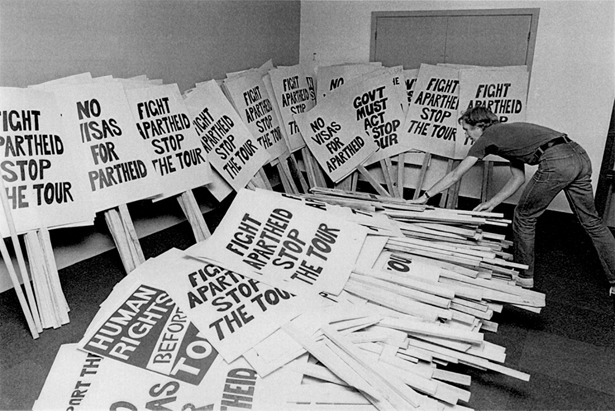
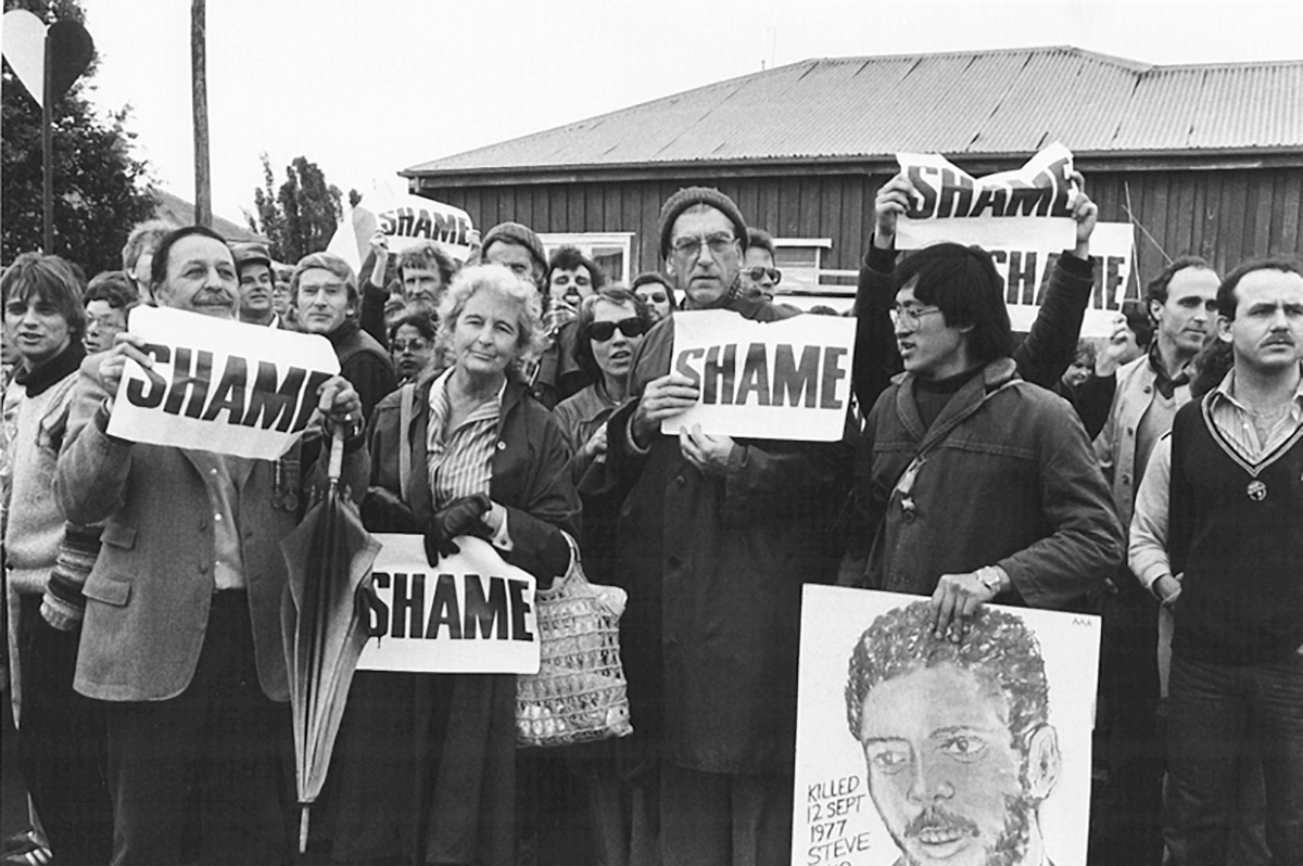
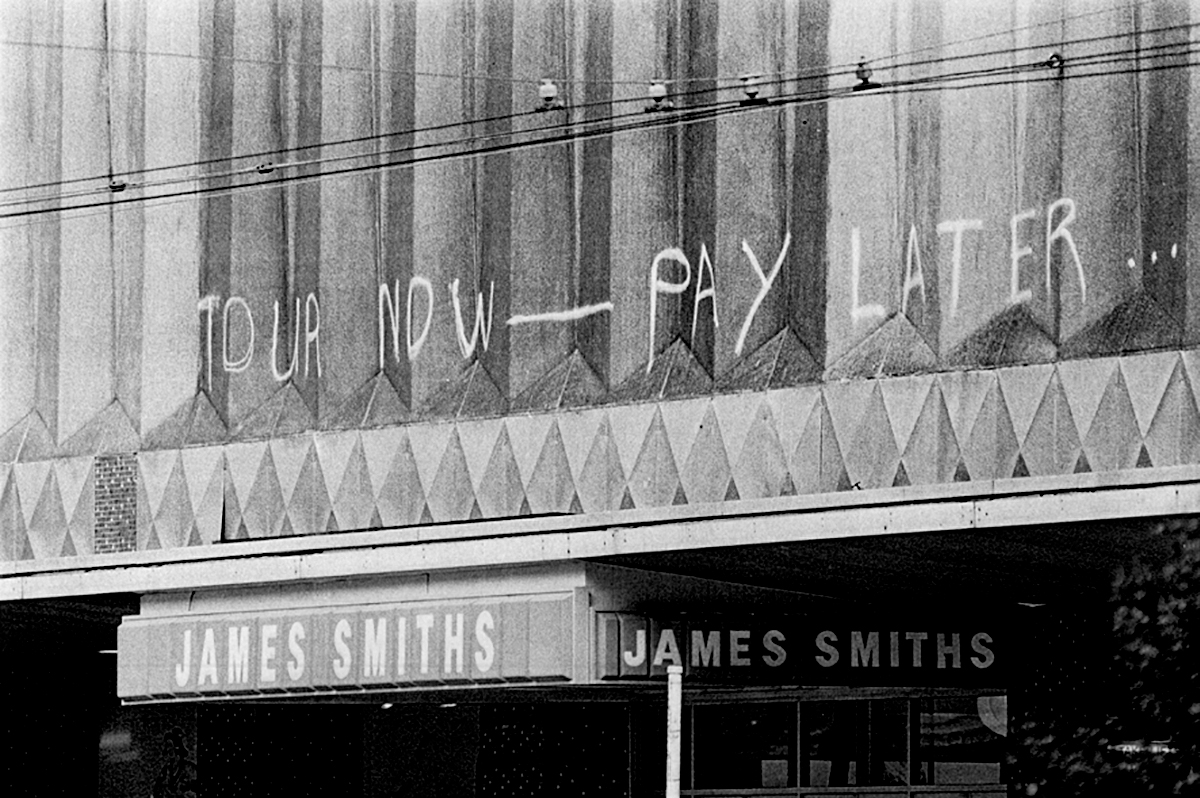
The protest involved careful, strategic planning and preparation; one image shows hundreds of placards made in advance—illustrating the level and scale of organisation. At one end of the organisational spectrum, placards and posters are printed en masse and distributed by supporters or pasted all over the city. Mass exposure was created by distributing the same sign amongst protesters that contained the single word SHAME printed in uppercase black letters on white paper. This was just one part of the ‘day of shame’ campaign, which used the repetition of multiple voices to increase the power of the message. TOUR NOW–PAY LATER... was also branded in spray paint across the second story façade of a Wellington department store.
12 September, 1981
Photograph by Athol McCredie
ca. 26 August 1981
[Evening Post Collection,Alexander Turnbull Library, Wellington, New Zealand]
From a Micro Level
At the other end of the spectrum: in a potters’ shop window in Auckland a carefully drawn message read CLOSED, NATIONAL DAY OF SHAME. This too interacts with its surrounding environment and typography, as a poignant political declaration.
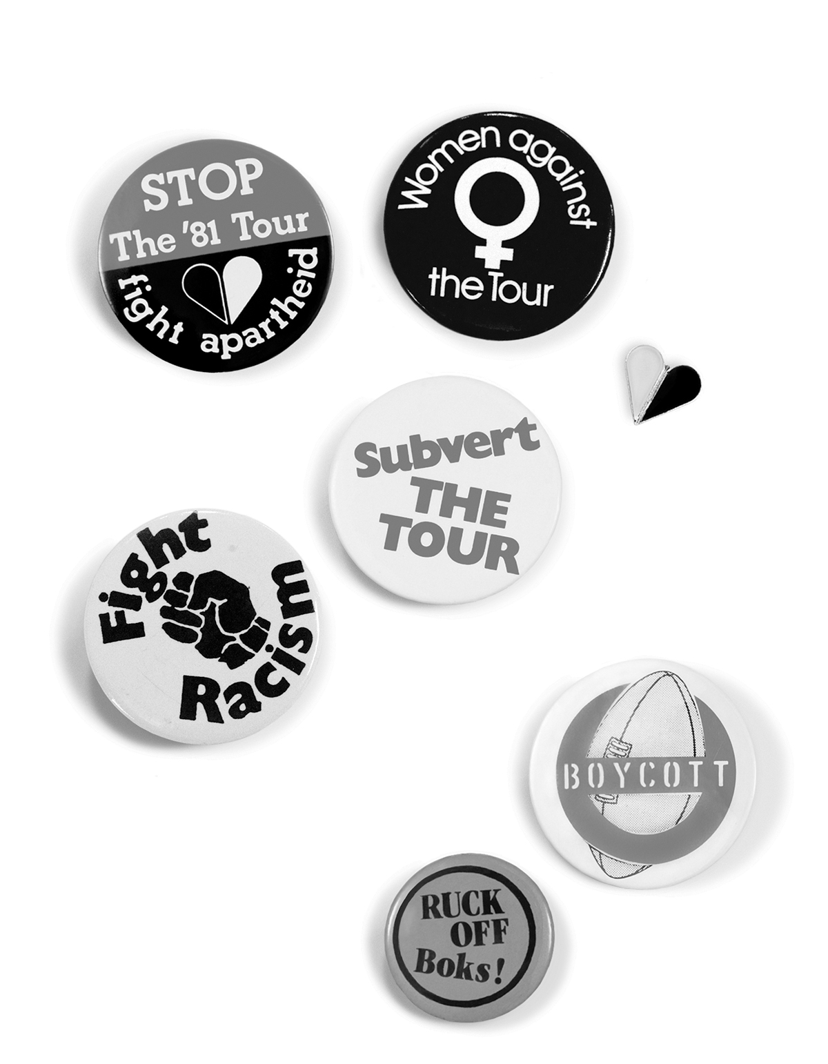
There were many typographic gestures that operate on a much smaller scale and at a more personalised level. Ranging from smaller stickers and badges worn by individuals to sometimes lengthy and complex handwritten messages to be read one on one. Individuals held up ripped pieces of cardboard with hand-printed personal messages written roughly with crayons and felt pens, also wearing t-shirts with their own messages printed onto the fabric. Many of the signs were handmade and handwritten—spontaneous expressions of the individual, they collectively form mass opposition in a unified protest. It is evident that for these signs the medium and printing reflects the personal feeling and personal involvement.
29 August, 1981
Photograph by John Miller
Order vs. Disorder
Everyday typography on the street normally represents order—street and road signs, shop signage, letterbox numbers. Posters and advertising too are all generally standardised. The police were organised in strict regimental lines; their uniforms, high hats, badges and colours are an attempt to reclaim order. As the tour went on, the protesters adopted similar organisational tactics: ‘front line’ protesters wore crash helmets with anti-apartheid badges on them and formed their own units such as RED SQUAD or BLUE SQUAD to achieve separate group objectives. Protest typography is the typography of the people, existing at the street level. It works in opposition to ordered sign systems, against forms that are valued by the dominant groups in society. It is unsanctioned and so it gains value by what it isn’t rather than what it is.
29 August, 1981
Photograph by Ans Westra
Visibility
Visibility was an important part of the protest, as the rugby games were broadcast globally the messages of the protesters would also be communicated to a world audience. At the time, for thousands of people throughout the country, these images were also their prime source of information about the issues and progression of the tour. The signs reinforced the protesters’ communication objectives; through these images the message is highly visible, repeated on the television and printed in newspapers for all to see. High visibility also played a part locally to communicate the message to the widest possible audience. Banners were suspended across motorway bridges capturing the attention of motorists, and strung across building façades addressing the passerby. Unrelated people joined in one voice as they marched forward clinging to the same banner, united by the same message. Large banners also draped over the crowds, their oversized text was unavoidable, simple and direct.
Formal Qualities
The majority of the lettering was large, mostly in bold and uppercase. Such typography has expressive qualities analogous to that of a megaphone. It is determined to be heard, crudely defiant, it overrides the typography of the surrounding environment, and it demands attention. Protest typography of the street is visceral, dirty and raw. The typography has a sense of urgency about it, a frenetic quality; the stencils cut roughly—the counters of letters partially filled in, the edges sharply outlined. Others simply spray-painted by hand, the edges of the forms blurred, the letters piling on top of each other.
Subversive Typographical Tactics
Even from their homes, some people angered at the government’s disregard for the Gleneagles agreement, took an interesting tactical approach: they altered the licence fee on their broadcasting payment form as a protest of the use of their public funds to support the New Zealand Rugby Football Union (NZRFU). Other subversive tactics included the selling of printed tickets to NOT attend the local match. For example, in Wanganui tickets read:
STAND
Up and be counted
$5.00
The tickets proclaimed to admit ticket holders to a more hopeful future.
Artists against apartheid (AAA) were one of the many groups involved in the anti-apartheid demonstrations. At the third and final test in Auckland they set off a group of balloons flying a banner with the single word BIKO written across it. Floating above protesters across the sports ground, the message had a great impact on protesters and rugby supporters alike.
The subversion of national symbols also featured in the protest; the swastika was painted over the image of the springbok, the banner reading SPRINGBOK, THE BIG WHITE LIE. A fake newspaper THE DOUBLE STANDARD took a satirical approach. The masthead also incorporated the Beehive and the headline read: P.M. BRAGS: I STUFFED GLEN EAGLES, I’LL DO LAURA NORDA NEXT!
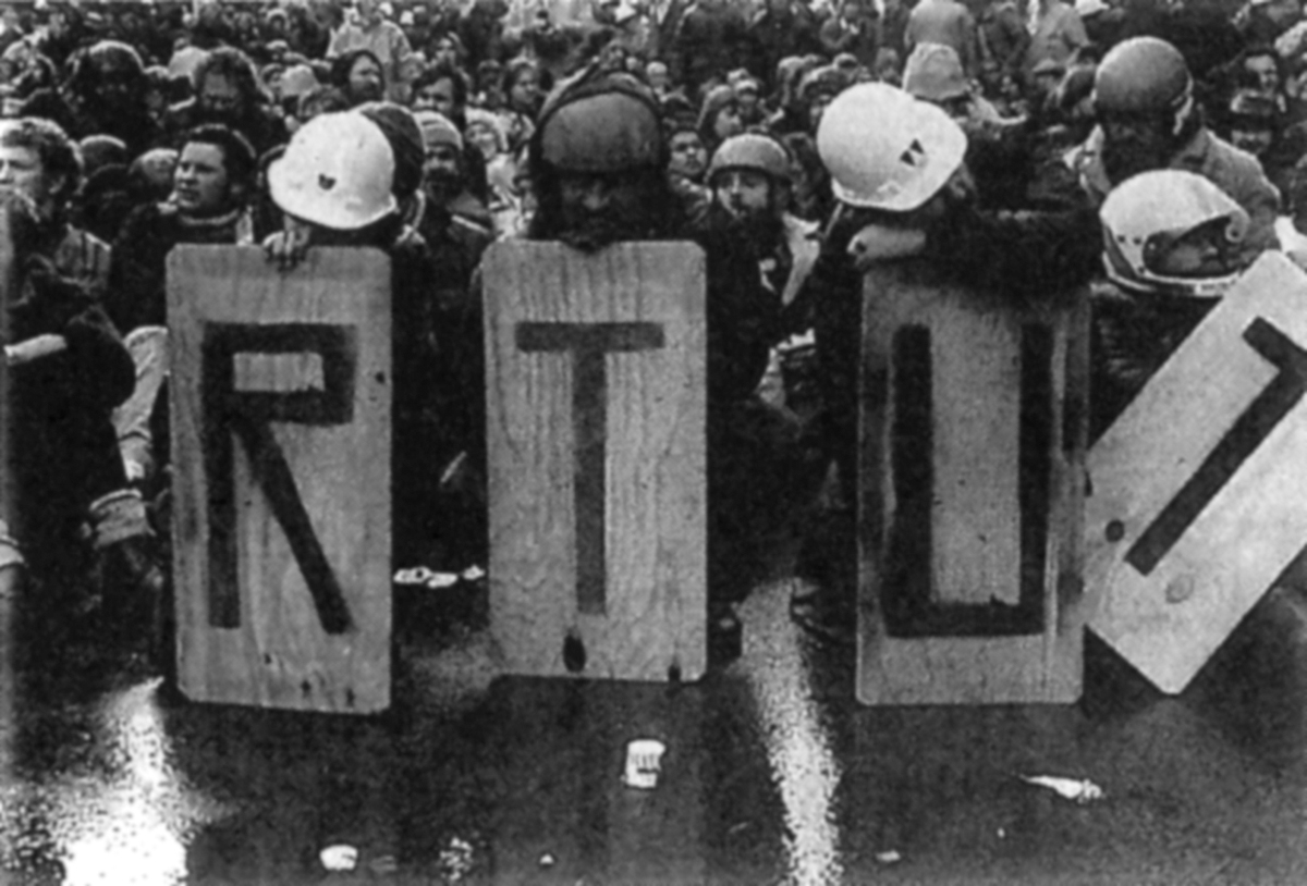
Type Remains
The protest signs were ephemeral. They were created to be used then discarded—their temporality is necessitated by their function. However, through photographs they become permanent identity markers. Individual shields once representing each letter that was part of a larger message are now jumbled. The fixed order of the words is lost and their message becomes obscured. They now symbolise fragments of a lost declaration. As the conflict became even more frantic, protesters retreated, abandoning placards and banners—leaving a trail of debris. These remnants are now kept in museums as a record and reminder of the events.
29 August, 1981
Photograph by Mark Hantler
29 August, 1981
Photograph by Ans Westra
29 August, 1981
Photograph by Ans Westra
Ruck Off
One last typographical tribute: at a farewell banquet held for the South African rugby team by Ron Don, a councillor on the board of the NZRFU, some of the Springboks team were surprised to find little messages reading NO MORE TOURS, RUCK OFF BOKS, and DON’T COME BACK printed on little strips of paper mixed through their salads.