Commonplace Books and Other Rhetorical Devices or Just Hold Me* – Jonty Valentine
The idea of commonplaces1 (and later commonplace books) dates back to antiquity. Originally a memory aid, orators would go to metaphorical places to gather their arguments. They were places to which one could return for reference. As the places took physical form and became literal places (i.e. books), commonplace books evolved into the precursors of modern reference books. They were often personal collections of things that their owners found to be important, from random collections that were really just glorified diaries, to very organised, thoroughly-researched scholarly volumes. Today our understanding of this term has acquired a negative connotation, and it is now used to mean ordinary and trite. But when I proposed that the exhibition Just Hold Me should be seen as a kind of commonplace of contemporary New Zealand publication design, I meant it in the original sense of the word. Accordingly, the exhibition (as well as the accompanying catalogue), presented a range of work organised through (seemingly) contrasting pairs of categories: like the best to commonplace, and from the original and innovative to stereotyped and clichéd.
Best to Commonplace
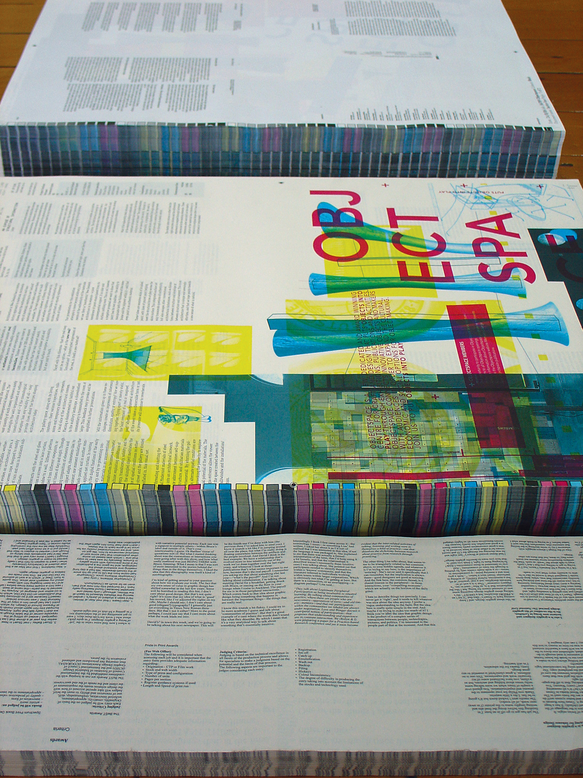
The exhibition was the outcome of the search for an answer to the question: ‘How does the design profession describe the making process and evaluate the final product of publication design?’ Because graphic design exhibitions remain unusual in New Zealand the most common fora for public viewing of design work have been publication design awards (i.e. the BeST, Pride in Print, Montana, and Spectrum Design awards). As a result, the judging criteria of these awards have dominated discourse about publication design here. Since it was only natural that the content of my exhibition would cross over with all of the established awards—in fact the opening coincided with the BeST Awards award ceremony—the exhibition became an opportunity to enter into dialogue with the different categorisations of design that emerge from different assessment criteria of the awards, and to compare these to the way the designers themselves talked about their work.
As with the above-mentioned awards, the exhibition Just Hold Me needed to have an evaluation process to identify work to be included. Not all publications could make the cut—there needed to be assessment criteria. In awards competitions, a collection is made through a process of selection and evaluation (judging). The aim for this exhibition was a bit different. Unlike competitions that articulate strict requirements for submission (see Appendix below), the exhibition resulted from an open call for contributions—visual and written.2 Instead of considering only the final product, the designers/makers were invited to respond to a number of (fairly loose) questions about their work and to suggest other work they liked. The result of this conversation, a word-of-mouth collection methodology, was a group of mixed work and assessment criteria. Over a number of months, the task was to gather a collection by talking, prodding, and emailing people to ‘help’. This could be seen as a shamelessly personal undertaking from the point of view of contributors, not to mention the curator. But perhaps the best alternative to the “fair and objective judging criteria” by established competitions is a deliberately subjective exercise that makes a virtue of personalities, subjective tastes, and personal connections between people.3 Through the work in the exhibition, I wanted to present a range of different collections, or assessment criteria—in order to compare different evaluations of work. In so doing, the idea of universal judging criteria, and the resulting reification of the final product, became problematised.
Original to Stereotype and Cliché 4
A lot of descriptions of work in exhibitions or publications of graphic design merely fetishise the finished object. Design industry spokespeople like to talk about ideas of originality and offer one-liners about innovation, but they often restrict discussion to assessing work at face value. In the end what is presented by such vehicles for portfolio promotion is usually more stereotyped and cliché than original or unusual. Design writer Robin Kinross has criticised how often descriptions of design “lack truth” or present a “relentlessly rosy picture” and has called for alternative and more “honest” accounts of design processes and discourses, that also acknowledge failures:
"They do not look on the dark side, or, when they do, they turn a blind eye. The results are often very bland and dull. Yet, it is just where there are some cracks in the surface of what happened that one can get a hold on something: cracks then revealed by a truthfulness in telling, by an account that includes the failures and the dead ends and the apparently meaningless episodes that don’t fit into a wished-for narrative coherence. I suppose that all human endeavours suffer such imperfections, and especially if you let the finished products rest for a few months before taking the photographs and writing the review. In the meantime the users will have begun to add their embellishments, will have put up their own laser-printed signs, will have stuck up their holiday postcards; the materials will have begun to deteriorate, to fade in the weather. This is not really ‘failure’, but may seem like a difficulty to those expecting an unblemished finish."
– From ‘Uses of Failures’, by Robin Kinross, in Dot Dot Dot 2.
The important question here for Kinross is whether the rhetoric used to talk about design has any reality or truthfulness; “does it leave any space for the reader to engage with it? does it provide some grounds for another view? does it show any awareness of what it is doing?”
Kinross’ comments reflect a climate in design where a number of people are voicing the same concern—that the design profession needs alternative discourses that include the local, personal, individual, peripheral, grey, and imperfect. Just Hold Me attempted to break a path toward an answer by presenting a mix of original work to be engaged with personally. Where the viewer was encouraged to look at graphic design as the product of a series of different complex interactions—between people, objects, ideas, tools etc. This awareness of the personal element in design was meant to lead the viewer to question why this vital part of the creative process is often hidden, as well as provoke designers to question why they are rarely given the occasion to talk about how this affects their work (for BeTTER or for worse).

Brief to Extended
"It reminds me of how graphic design is always a translation—in its broadest sense, from a cerebral idea into a physical object—and something is always lost in that translation. The work here seems to me to come about as close as possible to forging a direct link between the initial idea and its eventual communication. Anthony Froshaug wrote: ‘design consists […] in translating all the problem, sets of problems, into another language, another sign system, with love.’ The majority of what passes as graphic design doesn’t really stick to any reasonable notion of form following function. On the contrary, I would say form generally fucks function. And to proceed with such a dubious line of thought, I’ll turn it around again and say that, contrary to this, the examples here show form and content having great sex, mutual and inseparable, or at least French kissing."
– From Stuart Bailey’s discussion on his selection of ‘charged, luminous, illuminating’ publication design in ‘Never Mind the Bollocks (After Jamie Reid)’, Dot Dot Dot 11 (he is referring to the French practice of translating foreign film titles).
A central theme to my project also was that there are fundamentally important things that go unnoticed or are lost in design. The design process is not always traceable or predictable; it is often flawed, accidental, subjective, improvised, and personal. This state of affairs should call into question the idea that there is some sort of fixed brief like a contract that encapsulates the problems of a project that are to be creatively solved. In her contribution to the exhibition catalogue (see following article), Lara Strongman questions the myth of the brief, and its place as the defining difference between design and art. A straightforward contract between maker and client simply does not exist, or at least it does not exist in the simplistic sense of a high school science experiment where one can set out the aims, objectives and conclusions like a recipe.
The fiction surrounding the brief has also been sustained by a design discourse that either confuses or conflates the making process and the final product. The limitation of narrowly defined one-liners, or the universal evaluation criteria typical of much writing about design, is that it cannot take into account the things that are slippery and lost in the making process. They do not acknowledge the extent to which interactions happen by chance, are arbitrary, made, and contingent. In contrast, Just Hold Me explored the connections and disconnections between the process and the product. As Max Hailstone liked to warn us as students; “design is a slippery customer.”
Holding to Uncovering
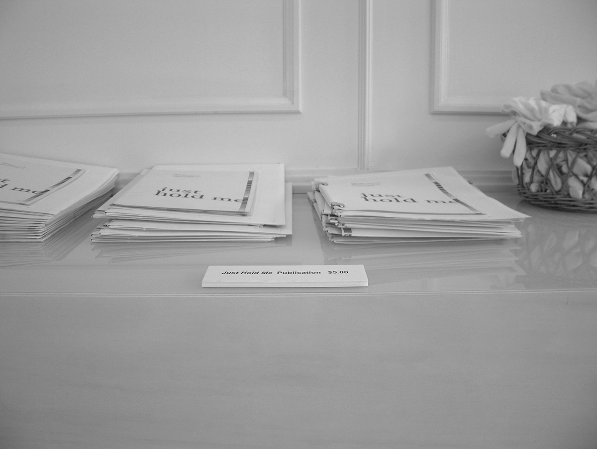
The content and thesis of the exhibition developed through decreasingly formal, but increasingly focussed discussion over about six months from initial proposal to opening night. Objectspace’s programme focus is to showcase (in this case publication) design as a dimension of object making—and in doing, to profile designers as makers. Inspired by this mission, the initial idea for the project was, quite simply, to collect and present a cross section of beautifully-crafted and engaging publication objects and, most importantly, to present them for people to hold. The exhibition title, was an (admittedly tongue-in-cheek) plea that this level of interaction was not just permitted, but encouraged. The broader aim of Just Hold Me was to at least hint at, the possible reading of a deeper, hidden layer—if only from the opportunity to see a designer’s ‘body of work’. The viewer was meant to uncover meanings, connections, ideas—things that are enclosed, enveloped, enfolded in the objects. The exhibition presented graphic design as the product of a series of interactions, and gave the participants—the makers—the opportunity to describe how this interaction affected their work. It connected the making process to the final product. It gave the designers, and others involved in the making, the chance to reflect on how interaction with people, with things, and with discourses affects what they do. And finally, it uncovered this for the public in the work, the labels, the floor-talk and in the contributions to the exhibition catalogue.
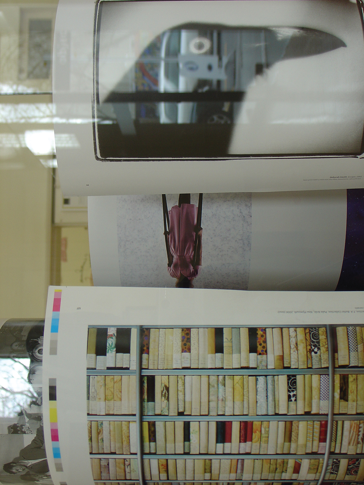
Early on in the project, Objectspace Director Philip Clarke and I talked about trying to uncover books that were hidden, rare, or not meant to be seen—at least not meant for a large New Zealand audience. The series of books created to accompany work at the Venice Biennale were an example of this. The very limited-edition three volume box set entitled Andris Apse—Fiordland by Guy Pask was another example. Jessica Gommers tipped me off about a really impressive (and valuable) book called Max Gimblett: Searchings, a publication of drawings from Gimblett’s workbooks.
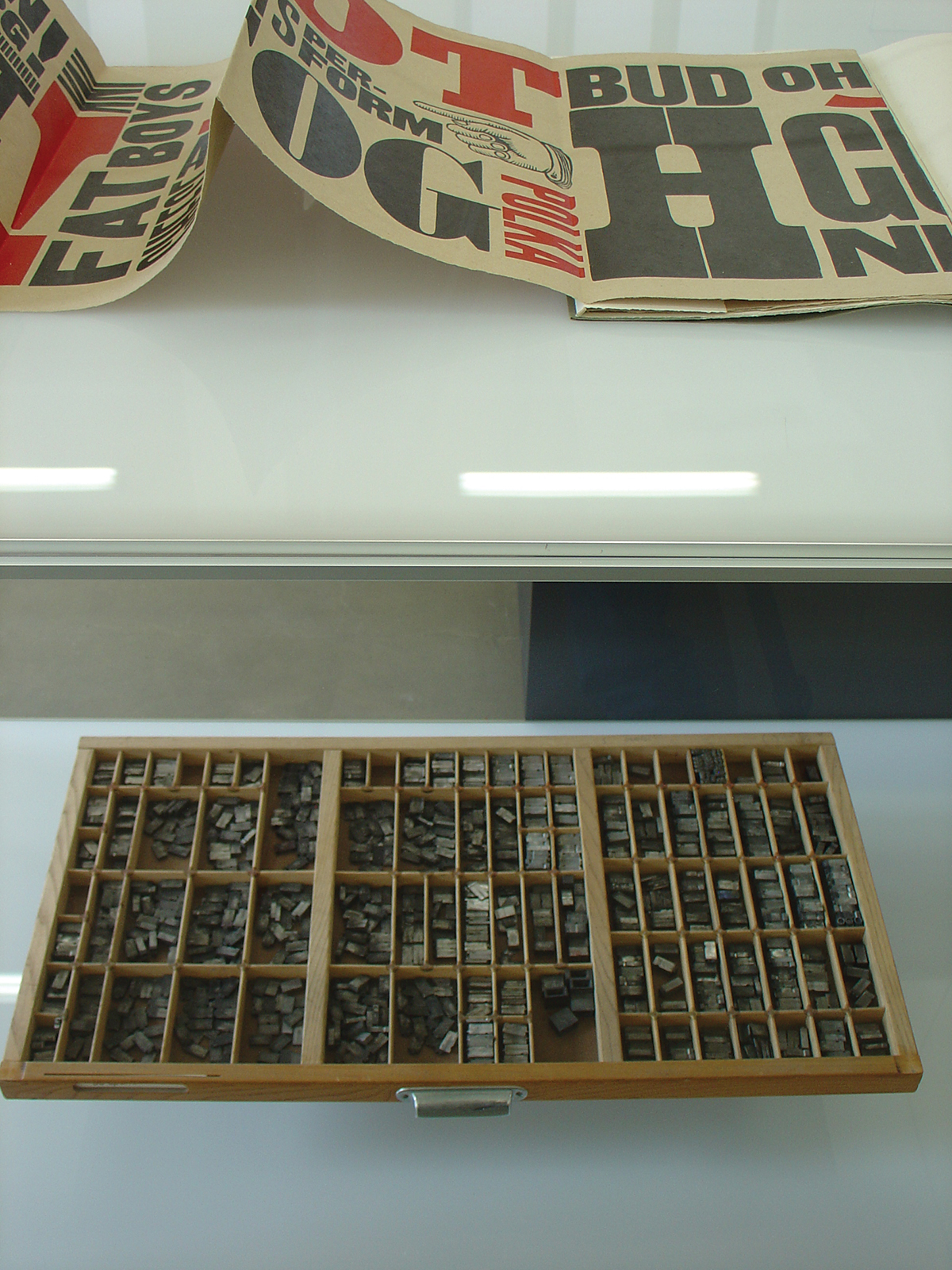
This book is so rare that only 80 copies were printed and only 64 of those are for sale. Each copy has two unique, hand made spreads. Upon discovering that Tara McLeod had printed it (at Auckland University’s Holloway Press), I contacted Tara and arranged to drive out to his place near Kaukapakapa. There finally I got to see the book along with a whole lot of other work that Tara had printed on the two letterpresses that are his Pear Tree Press—an Albion Flat bed and a Littlejohn proofing press in the garage. Along with all of his favourite cases of type—lead Gill Sans and Garamond as well as wooden display type. I realised that this was a rare pleasure to have a personal invitation and insight into such a body of expert work. It was indeed—as the card Tara gave me proclaimed—“Printing, the way God meant it to be.” It wasn’t just the great rare books I was getting to hold, but the invisible back-stories and idiosyncratic, local, specific influences on the way that designers work that I was beginning to find.
Normally, of course, the viewer is only able to read publication design at face value, and usually very superficially. There is a lot that is lost in translation between the intention of the designer and the reading of the viewer. While not everything can be retrieved, the viewer’s reading is enhanced by knowing about the making process. Without revisiting the debate over ‘the death of the author’, the stories told by the designers I met attest to the intention, expertise, and their control over the making process. It is precisely because the practitioners represented in the exhibition are trained and experienced in design and printing that they are able to make something of the connections and interactions that they are faced with.
Justified to Unjustified (Conclusion)
The collection exhibited was the physical outcome of conversations with designers. This project was about having those conversations, and the conclusion was the collection generated by the participants in the conversation. The exhibition was about the practice of design rather than just the outcome; the final publication works were the props, the evidence of the practice of being a graphic designer. Rather than representing one-liners or satisfying abstract criteria, the works indexed a varied (and sometimes contradictory) activity. Together they hinted at a rich story about what graphic design is.
As a collection of ‘commonplaces’, the exhibition uncovered a diversity of works and discourses that contextualised rather than merely fetishised the finished object. The important thing about collecting and being able to get hold of objects is that it enables the viewer to return to the source multiple times. The hope was that by seeing and holding the real thing themselves, the exhibition audience might uncover something that was missed last time. In this text, I have discussed the exhibition through categories that are personally meaningful to me. But by re-ordering and re-categorising objects in the exhibition, the viewer was invited to find new connections between them, leading to multiple reevaluations of the collection.
* The exhibition Just Hold Me: Aspects of NZ Publication Design was held at Objectspace gallery in Auckland during August and September, 2006. The texts in this section—by Lara Strongman, from selected New Zealand design award judging criteria and my essay—are (in my case re-written versions of text) from the catalogue that accompanied the exhibiton. The original catalogue included eight other texts by designers/writers involved with the exhibition. Thanks are due to Objectspace director Philip Clarke.
Appendix:
Awards Judging Criteria – New Zealand graphic design awards
THE BEST AWARDS
http://www.bestawards.co.nz
JUDGING CRITERIA:
Each entry will be judged on the basis of:
• Originality, creativity, appropriateness, technical innovation, craftsmanship, skill, use of resources and ability to meet the brief.
• Judges will take special account of how well the design solution meets the requirements of the client and the needs of the end user.
• Entries will be presented to the judges with no marks, symbols, or labels that can readily identify the designer/s.
• Finalists will be assessed using all available material accompanying the entry.
• The judges reserve the right to relocate an entry from one category to another if they deem it necessary.
• the judges’ decision is final and no correspondence concerning the results can be entered into.
• If judges feel entries in a particular category do not reach an appropriate standard, an award will not make Gold, Silver or Bronze as the case may be.
• Where there is a likelihood of conflict of interest in the judging procedure, then that judge will step down from evaluating that entry.
• The judges reserve the right to contact the client/referee for examination or clarification of the work entered.
The BeST Awards are run in keeping with the conditions established by the International Council of Societies of Industrial Design (ICSID) and the International Council of Graphic Design Associations (ICOGRADA), thus ensuring fair procedures and unbiased evaluation by the jurors.
MONTANA BOOK AWARDS
http://www.booksellers.co.nz
GENERAL JUDGING CRITERIA:
Strict judging criteria are applied to ensure the Montana New Zealand Book Awards achieve their objective—the recognition of excellence in New Zealand books. The judges consider each book as a whole while giving particular attention to specific elements, including enduring literary merit, overall quality of authorship, illustrations, design and presentation, impact on the community, and the promotion of entertainment, cultural and educational values. General judging criteria apply to all books submitted, regardless of the category they are submitted under. Judges consider each book as a whole. Attention is given to the integration of all the contributing elements that constitute the finished product. The following elements are considered, where appropriate, in relation to the specific category criteria:
• Enduring literary merit and the overall quality of authorship.
• Quality of illustration and graphic presentation.
• Production factors including jacket design, general design, typography, indexing and the standard of editing. Impact of the book on the community, taking account of factors such as topicality, public interest, entertainment, cultural and educational values, lifespan and value for money.
SPECIFIC JUDGING CRITERIA:
Fiction Category
The purpose of this category is to recognise literary excellence in works of published fiction and drama. The award is for creative writing and the text will form the substance of the book. The winning book will, in the opinion of the judges, be a significant addition to the literature of New Zealand. Included in this category will be short stories, novels, play scripts, and books where the substance of the test presentation is in prose rather than verse.
Poetry Category
The purpose of this award is to reward literary excellence in poetic works. The winning book will, in the opinion of the judges, be a significant addition to the literature of New Zealand. Included in this category will be selections and collections of poetry.
History Category
The purpose of this award is to reward books which enhance our understanding of people in society, their history, beliefs, arts, language and achievements. Judges will look for a well written book with sound documentary research and/or creative insight. Included in this category will be any book that gives the history of an event or a movement including social analyses that tell the story of a policy or idea.
Biography Category
The purpose of this category is to recognise excellence in biographical works. Judges will look for a well written book with sound documentary research and/or creative insight. Included in this category will be biographies, autobiographies, memoirs and autobiographical travel writing.
Reference & Anthology Category
The purpose of this award is to reward excellence in reference or anthology books. Judges will look for a well written book with sound documentary research and/or creative insight. Included in this category will be edited, multi-author encyclopedia, dictionaries and anthologies. Books by a single author which bring together writings in more than one genre will be considered in this category. All anthologies of work by two or more authors in any genre will be considered in this category.
Lifestyle & Contemporary Culture Category
The purpose of this award is to recognise excellence in books which inform our life choices and/or reflect contemporary culture. Judges will give consideration to clarity, quality of writing and information in this category. Included in this category will be cultural commentary, books which reflect the experience of living in contemporary New Zealand, books on lifestyle, travel, gardening, food and wine, practical crafts, ‘how to’ guides, spirituality, new age, health and business.
Environment Category
The purpose of this award is to reward excellence in books which enhance understanding and enjoyment of the physical environment and of natural history. Judges will look for a well written book with sound documentary research and/or creative insight. Included in this category will be books on the physical environment in which people live, geography and geology, flora and fauna.
Illustrative Category
The purpose of this award is to recognise excellence in books which are essentially graphic or pictorial. The substance and impact of the book will be carried by illustrated material. Any complementary text should work and support the illustrative material. Included in this category will be books of photography, fine and decorative arts.
SPECTRUM BOOK DESIGN AWARDS
http://www.bpanz.org.nz
BOOKS WILL BE JUDGED ON:
• artistic merit
• innovation of form
• quality of production values
• appropriateness to the intended market
Best Book
The judges are asked to consider each entry as a total package, cover to cover.
• Appeal
Does the book design have magic, charm, and impact?
Is this impact relevant to the target market?
Has the design maintained consistency throughout the whole book?
As a complete package, does the design have strong ‘pick-up’ appeal?
Is the design innovative?
Is the cover a good indicator of content?
Does the cover draw the buyer in and provide information?
Have the back cover and flaps (if applicable) been used to maximum effect?
Do the legibility, format and organisation of the design satisfy the functional requirements of the reader?
• Production
Has the designer pushed the restrictions of the print industry in any new or novel way?
Is the production of a high standard relevant to the retail price?
• Relevance
Consider the book as a whole and the design in relation to its presentation of the author’s work, whether words, images or a combination of the two.
PRIDE IN PRINT AWARDS
http://www.prideinprintawards.co.nz
(For Web Offset)
The following will be considered when assessing each job and it is important that the entry form provides adequate information regarding:
• Origination—CTP or Film work
• Stock and web width
• Type of press and configuration
• Number of units
• Pages per section
• Register guidance systems if used
• Length and speed of print run
JUDGING CRITERIA:
Judging is based on the technical excellence in all facets of the production process and allows for specialists to make a judgment based on the potential and the limits of that process. The following aspects are important to the judges considering each entry:
Coldset:
• Registration
• Set off
• Catch up
• Emulsification
• Wash out
• Backup
• Piling
• Hickeys
• Colour inconsistency
• The degree of difficulty in producing the entry taking into account the limitations of the stocks and technology used
Heatset:
• Registration
• Set off
• Catch up
• Emulsification
• Wash out
• Backup
• Piling
• Reverse image piling
• Hickeys
• Line-ups in general
• Gluing
• Striping
• Cording
• Density Levels & Colour Inconsistency
• The degree of difficulty in producing the entry taking into account the limitations of the stocks and technology used
Finishing:
• Spine condition
• Squareness of trimming
• Creasing
• Line-ups
• Foreign marking
• Although in most cases the cover is produced Sheet-fed, the colour & register consistency between the web and sheet-fed will also be looked at
Footnotes
"In the strictest sense, the term “commonplace book” refers to a collection of well known or personally meaningful textual excerpts organised under individual thematic headings. These passages, or sometimes simply the headings themselves, have historically been termed “commonplaces.” — Earl Havens, Commonplace Books, a History of Manuscripts and Printed Books from Antiquity to the Twentieth Century, Yale University, 2001. ↵
All design awards publish their judging criteria, revealing the values of the group sponsoring the awards. Each of the awards mentioned above are different(not surprisingly) given who they represent. For example, the BeST Awards which is organised by the Designers Institute of NZ (DINZ)—cares about commercial success and takes in to account things like “how well the solution meets the requirements of the client and the needs of the end user/viewer”,while the Pride in Print Awards, run by the Printing Industry (although alsoco-hosted by DINZ) stresses that “judging is based on technical excellence in all facets of the production process and allows for specialists to make a judgement based on the potential and the limits of that process and materials.” In contrast, the Spectrum Awards run by the Book Publishers Association of NZ (BPANZ)declares that books will be judged on “artistic merit, innovation of form, quality of production values, appropriateness to the intended market.” (see Appendix 1). ↵
Competitions have to deny personal connections to maintain legitimacy and ensure fairness. As the BeST awards reassures us, “The BeST Awards are run in keeping with the conditions established by the International Council of Societies of Industrial Design (ICSID) and the International Council ofGraphic Design Associations (ICOGRADA), thus ensuring fair procedures and unbiased evaluation by the jurors” (www.bestawards.co.nz). As I didn’t have such restrictions, I was free from maintaining such a fiction or having to introduce elaborate procedures to keep the proceedings in check. ↵
The word stereotype was invented by Firmin Didot in the world of printing;it was originally a duplicate impression of an original typographical element, used for printing instead of the original. Over time, this became a metaphor for any set of ideas repeated identically, en bloc, with minor changes. In fact, cliché and stereotype were both originally printers’ words, and in their literal printers’ meanings were synonymous. Specifically, cliché was an onomatopoetic word for the sound that was made during the stereotyping process when the matrix hit molten metal. (From www.wikipedia.org) ↵