Signs of Modesty – Jessica Halliday
In the first half of 2007 nearly every piece of exterior signage at the University of Canterbury in Christchurch was replaced and many new signs materialised in new locations. This event may seem to be of little consequence until you consider that few single public institutions in New Zealand of this size exist on large, purpose-built sites with a distinct and predominately unified architectural presence.1 The volume of the university’s signage and its interaction with the university’s architecture and landscape give this alteration significance. The fact and implications of these changes seem to connect with a few of the issues and side issues discussed in the first issue of The National Grid: Noel Waite’s case for a history of New Zealand communication design (pp.40–47); Jonty Valentine’s longing to sense a Benjaminian aura of significance in graphic design (pp.83–89); Aaron Beehre’s conviction that design needs a distortion pedal (pp.53–55). This article is a mish-mash, a combination of architectural history, comparative analysis, a review, a bit of a rant and an attempt to tackle a pair of ideas I’ve been tossing around lately: modesty in design and the modesty of modernism.
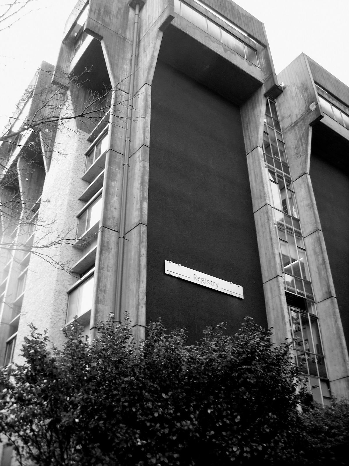
The defining architectural encounter at Canterbury is with Brutalism and many of the key buildings on campus belong to this late modernist architectural movement—in particular the Student Union, Registry, the James Hight Library, the Arts Lecture Blocks and Departmental buildings and Fine Arts.2 From the 1950–70s, Brutalist architecture attempted to return modernism to first principles. The origins of Brutalism in England in the 1950s centred on: an admiration of Le Corbusier’s post-war use of beton brut (raw concrete); an awareness of Jean Debuffet and L’Art Brut and the rejection of establishment aesthetics in favour of the work of outsider artists (especially criminals, the mentally ill and children), the use of rough, “non-aesthetic” materials like burlap, sacking and sand in art; and an interest in creating an architectural realism that echoed the brut reality of everyday life for the working majority.3 What this resulted in was an uncompromising architecture with an anti-aesthetic defined by large bulky structural members (“which collide ruthlessly”)4 and raw concrete surfaces, unadorned by paint, plaster or revetments.
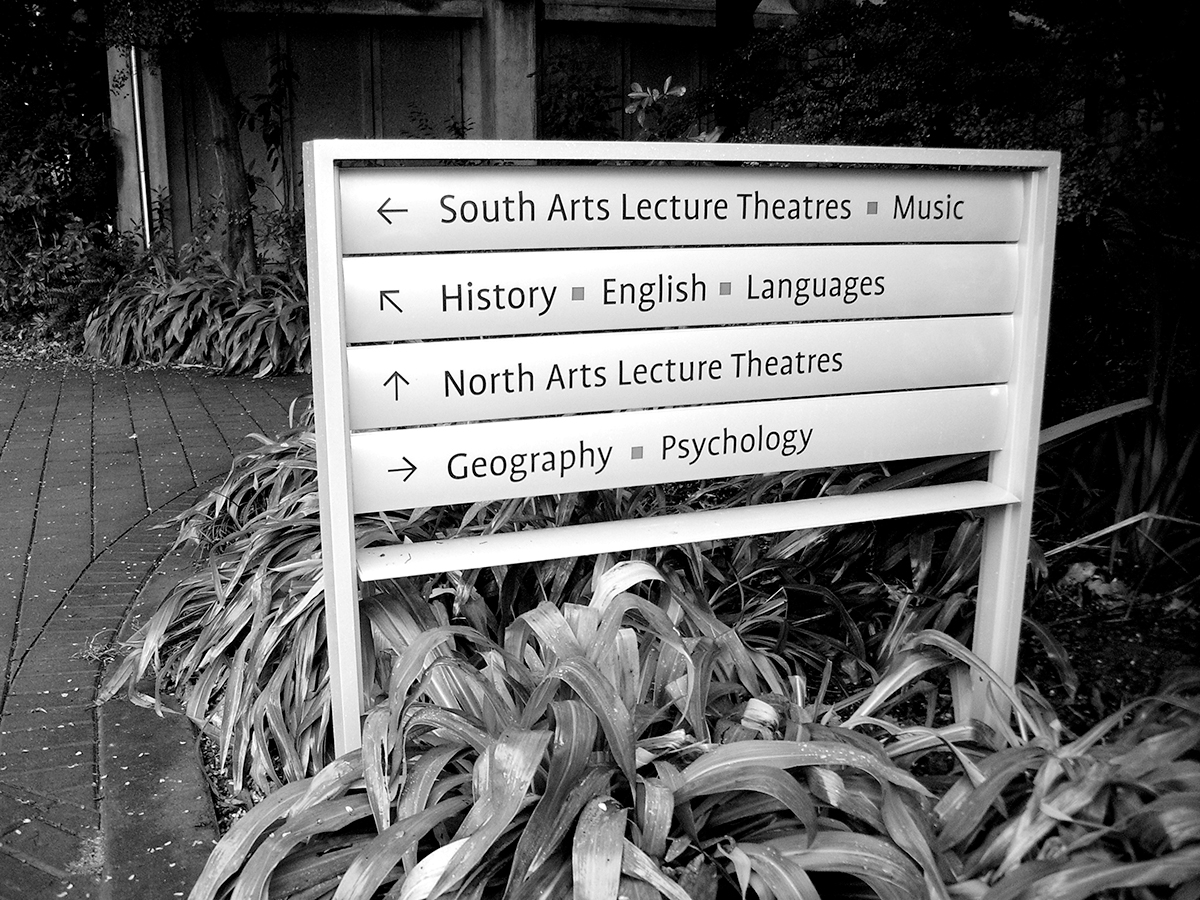
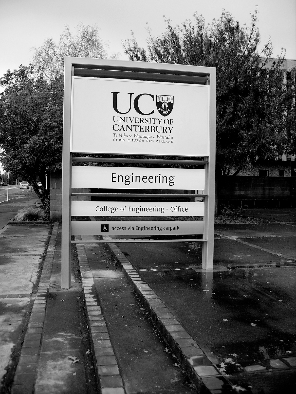
The new signs introduced at Canterbury stand in sharp contrast to the rough, unrelenting and exposed nature of this Brutalist environment. They are slick, and thinly stylish, highly refined in finish and aesthetic. Predominately constructed of powder-coated aluminium with applied vinyl lettering, the signs follow a loose hierarchy encompassing large illuminated freestanding site signs, smaller un-illuminated freestanding signs for internal roads, car-parks, directions and some buildings, bannerstyle signs attached to buildings and decal signs fixed to door or window glazing. Typographically they follow the dictates of the University’s brand architecture developed by Strategy Design in 2004 in the use of the sans-serif Profile typeface and ‘UC’ University logo, although the choice of stop-sign red as an accent colour is non-compliant.
The impetus for the new signage came from continual complaints about the difficulty experienced by visitors to the university in finding where they want to, or are supposed to, go on campus. The response of the University’s Facilities Management was to bring in a consultant, Isobel Gabites of naturalTEXTures, to design a system of wayfinding and accompanying signage for the campus. The wayfinding methodology used was based on the idea that people unfamiliar with the campus should be directed to individual buildings, not to the functions or departments or services located within a building. Once the building was located, signage within the building would direct users to the desired department. This necessitated creating an identity for each building independent of what the building houses, as buildings shelter a variety of departments and this, as all students know, is liable to change. The methodology failed. It failed primarily because the academics consulted in the naming of buildings were unable to agree on appropriate names for specific buildings on campus.5 The few buildings at Canterbury with historically established ‘identities’ have barely managed to sustain that connection: how many students remember that the Central Library is in the James Hight building or that the Rutherford building houses the departments of Physics and Chemistry? This would seem to suggest that even if names had been agreed on, this was no guarantee that users would adopt them.6 Despite this methodological failure, Facilities Management did adopt the signage produced as a result of the project.
While the new signs have replaced many of the existing signs, several of these relics remain and in comparison the aesthetic modesty of the older modernist signs sings. These signs are, perhaps, what signs shouldn’t be: quiet, simple, rough, unassuming and, like the Brutalist buildings, still retaining what Richard Serra called “the crudity of initial effort”.7 The old signs fail to follow any hierarchy or the kind of typographical consistency necessary for brand identity—like the buildings on campus they were a result of accretive development over decades. Many of them used the same materials, techniques and structural principles as the Brutalist buildings.
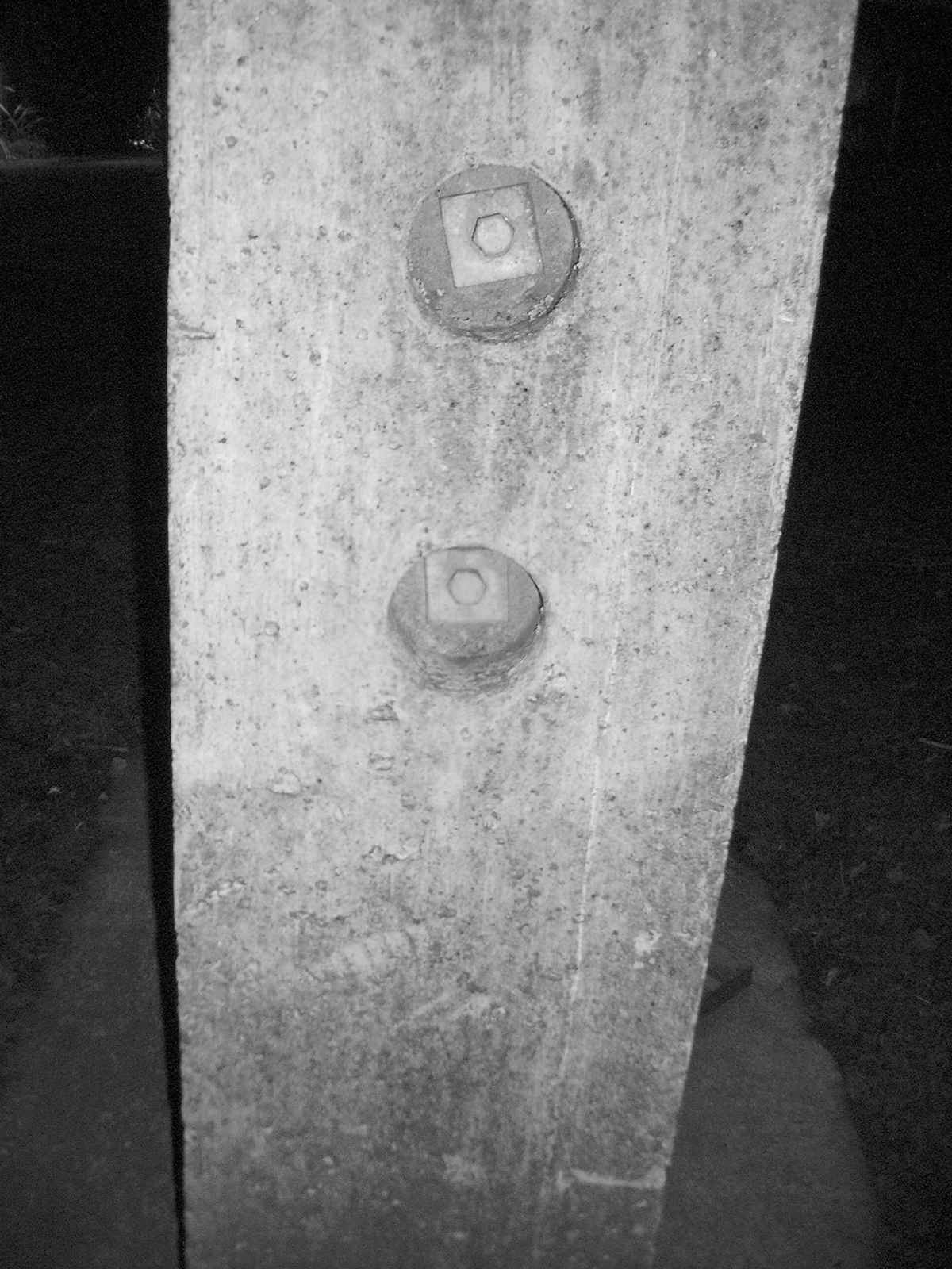
Originally, there was only ever one site sign for the whole campus: the name of the university incised on stone mounted on the length of a large, low-lying concrete I-beam resting on two columns of stacked concrete slabs erected at the entrance on Clyde Rd.8 Most of the internal road signs were simple trabeated affairs with either pre-cast, fair-faced concrete or timber posts and timber transoms with incised lettering painted white to stand against the dull, dark-stained timber. In true Brutalist fashion the boltholes on the concrete posts were left exposed. Both Registry and the School of Foresty have signs mounted on large pre-cast sculptural concrete units, demonstrating the plasticity of which concrete is capable.
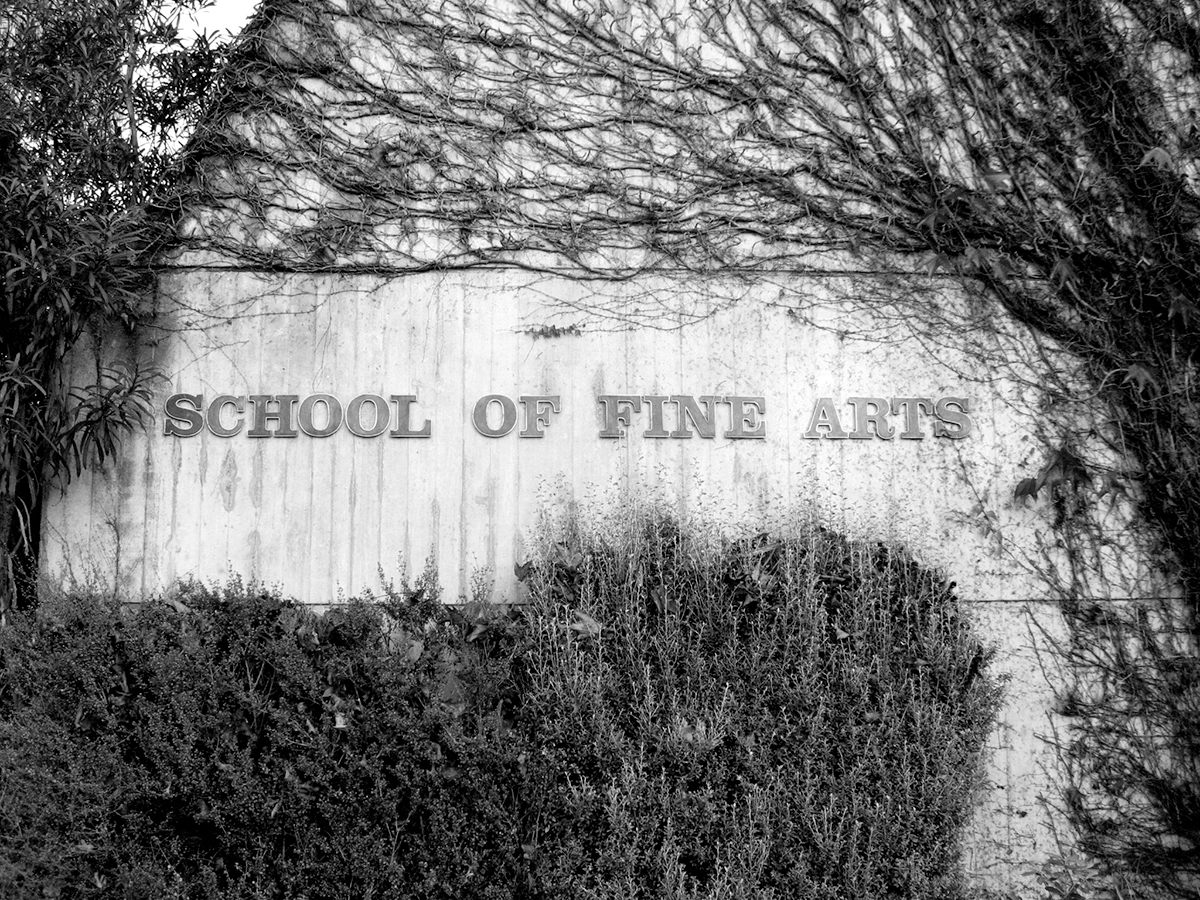
Most of the buildings on campus were originally labelled according to department in cast bronze Clarendon lettering with each letter individually stud mounted on the building fabric. This approach managed to suit the glossy marble revetments of the walls of the campus additions of the 1980s (the vulgar classical allusions of the School of Law and the Central Block Lecture Theatres) as well as it did the fair-faced, ‘off the box’ concrete walls of the earlier Brutalist buildings.
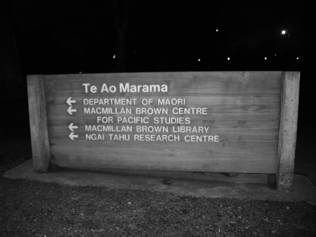
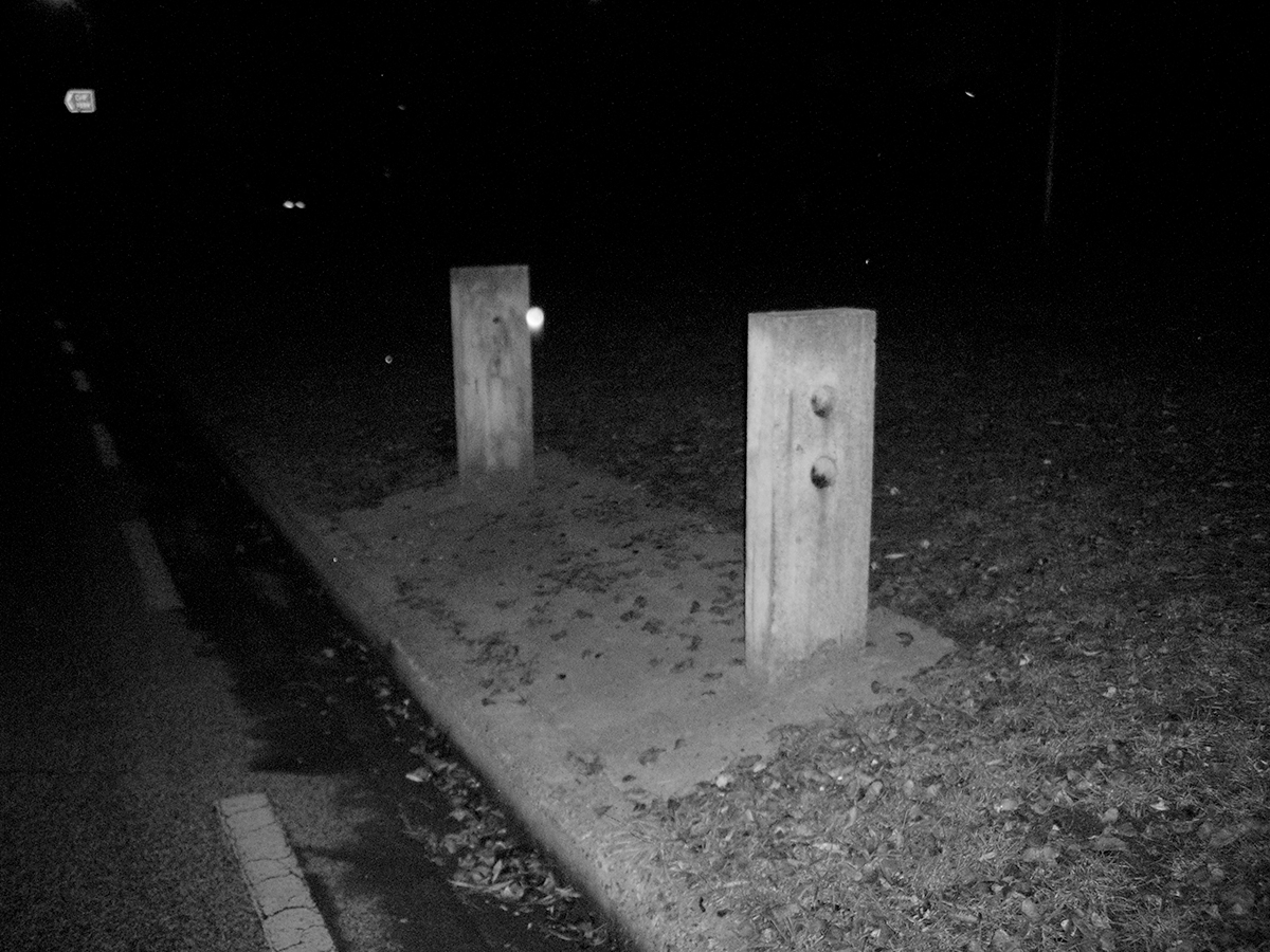
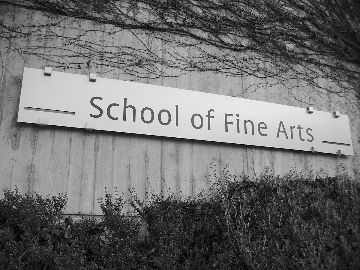
The aesthetic distance between the old and the new signs cannot be overstated. Each element of the old signs is necessary to its function — posts make them stand up off the ground, the transom is there for the letters to be cut into. The construction is apparent and materials are treated simply and directly: it is clear that the concrete was cast in timber formwork and ‘knocked off the box’; the timber transoms were rough sawn and stained for their own protection; and even the way the units are bolted together is visible. In one sense, the Clarendon signs were even simpler — the only items required are the actual letters that form the departmental name, directly mounted on the building. Nothing is extraneous. For all their apparent simplicity, naturalTEXTures’ signs are deceitfully complex: each of the free-standing signs is constructed using a frame of powder-coated aluminium into which the horizontal elements are cunningly locked. They also often feature peculiar superfluous transoms that are rotated 45 degrees to form louvers on an item which does not have a sun-shading function. Despite being the very reason for the item’s existence, the letters are not integral to the sign but simply adhered to the shiny powder-coated silver surface of the aluminium. The banner signs are attached to the wall on eight clumsy hook brackets and their scale and placement, most notably on the Registry building, appears absurd. All this serves to demonstrate that aesthetically, in scale, in choice and treatment of materials and in the way they articulate their construction, the older signs betray one of the secrets of modernism: its modesty.
Voicing my growing belief that modernism is modest is risking sounding nonsensical, for the idea seems oxymoronic. Modernism’s claims to universalism, rationality, truth and unquestionable progress are anything but modest. The foundation of modernist practice is the idea that art and design could and should be used to transform social and political structures and to change peoples’ lives for the better. Modernism has never been modest in its intentions. What it is about modernism I feel is modest, what it is I feel modesty is, is nascent and barely half-formed and loaded with contradictions.
If modesty is covering what is unseemly, then modernism can’t be modest. In its preference for abstraction, rectilinear geometry and ‘returning to essentials’, modernism is about stripping, not covering up. After describing the principles behind Brutalism to my aunt she likened it to someone who hasn’t got a perfect body taking off all their clothes in public. Modesty in modernism isn’t about a lack of display; it’s about the nature of what is on display. It’s in its lack of ostentation that modernism is modest.
There isn’t much room in modernism for ostentation or gaudiness — at its best modernism is too rough, too raw or too stark for showiness. Photomontage, collage, the use of industrial materials and the readymade all helped take the ‘fine’ out of art. In modernist architecture things are what they are: structure is apparent and space can be enclosed and divided freely (providing it doesn’t disturb the structural units, which must stand); materials are treated directly (steel is steel, glass is glass, and concrete is concrete) and betray the signs of their making; function is legible on the exterior, there to be read (to Louis Kahn, for example, this meant the servant was distinct from the served) and ornament is at very least deemed superfluous, if not the crime Adolf Loos identified it as. The ordered, uncluttered, asymmetrical methods of The New Typography were as disciplined and restrained as the new architecture. Tschichold’s description of old methods (the “schematic, thoughtless centring of blocks”) as “decorative, impractical, uneconomic” vs the new approach, which was “constructive, meaningful, and economical”, could have as easily applied to one of Le Corbusier’s many sketch comparisons of a traditional house and a modern house as it could to Tschichold’s contrasting examples of magazine layouts.9 For many modernists, this stripping or return to structure and primary units of construction was a political act, a way of removing the symbolism and imagery of class and social distinction.
Modernism’s modesty, then, is in its lack of elaboration. In the twin move of rejecting additive embellishment and relying on the existing, necessary units (structural, material, functional) as the only legitimate aesthetic source, modernism achieves an ascetic modesty. Modernism, then, does not deny beauty or elegance or aesthetic pleasure—it’s just that it finds these qualities within, integral to the object rather than applying obvious trills or flourishes. This modest approach allows the aesthetic of modernism to be slowly discovered and appreciated.10
Viewing the nearly century old movement from the first decade of the twenty-first century, I can easily be accused of revisionism: modernism only seems modest to me because I’m looking and understanding it well after it has lost its shocking newness. Perhaps, but some movements will never look modest, no matter how distant we grow from them — I can’t imagine anyone ever finding the Baroque or hip-hop modest.
The contrasts between the old and new signage at Canterbury are not merely about the nature of the aesthetic. Adjacent to each of the new ‘UC’ site signs on three of the roads bordering the campus are a trio of tall poles of the same powder-coated aluminium intended to hold long fabric advertising banners. They most recently held simple text-based banners (in Profile, of course) promoting information days on campus. At present the three on Creyke Rd display banners with a different image of healthy, smiling students photographed standing in the campus landscape and carrying items indicating their student status: folders, books, a backpack. This purpose pulls the whole new signage system into the sphere of promoting the University.
John Berger wrote about publicity as a system with a single message: “it proposes to each of us that we transform ourselves, or our lives, by buying something more. This more, it proposes, will make us in some way richer… Publicity persuades us of such a transformation by showing us people who have apparently been transformed and are, as a result, enviable.”11 The three banners are cousins to the wider Strategy Design advertising campaign featuring good-looking students (they do only use enrolled Canterbury students) pictured against solid colour backgrounds over-written with power-words such as ‘aspire’, ‘stand-up’ or ‘achieve’. These ads and the banners are designed to make prospective students imagine their own enviable future, economically transformed by buying their education at Canterbury.
It was important that the new signage system work within Canterbury’s brand architecture. The University’s Brand Manual states that the Profile typeface was chosen for its “freshness which helps to convey the image of the university” and when used within the parameters given in the manual “ensure the clean consistency of our identity.”12 Of course, the signage, like the UC brand, is really designed for the benefit of those external to the university. Discovering the campus through exploration and mistakes is what makes students and staff familiar with the university — it’s part of your initiation into the institution and acquiring this knowledge in a haphazard but ultimately meaningful way is a crucial part of engendering a sense of belonging.13 When the campus was new the Buildings Registrar held off on laying paths around the Arts buildings until the ground bore the signs of where staff and students instinctively chose to walk.14 The old signs belong to a past when you attended university to get an education which encouraged you to pay attention to how you think, not to give you “transferable skills” which help you become employed.
Footnotes
No local government has an architectural complex of this nature and despite all thegrand plans of the 1950s and 60s the national government certainly does not. Massey and Waikato are possibly the only other tertiary institutions with a comparable built environment to Canterbury University. ↵
Student Union: Warren & Mahoney, 1964–67; James Hight Library: Ministry of Works, 1969–73; Arts Lecture Blocks: Trengrove, Trengrove& Marshall, 1972–73; Arts Departmental buildings: Ministry of Works, 1972–74; Registry: Hall & Mackenzie, 1972–74, School of Fine Arts: Hall & Mackenzie, 1978–80. ↵
See Reyner Banham, The New Brutalism: ethic or aesthetic?, London: Architectural Press, 1966. ↵
Nickolas Pevsner, John Fleming & Hugh Honour (Eds), Penguin Dictionary ofArchitecture and Landscape Architecture, 5th edition, Hammonsworth: Penguin, 1999, p.75. ↵
Conversation with Lindsay Hampton, Facilities Management, University of Canterbury, June 2007. ↵
It appears that only Architectus’ Maths and Computer Building has been assigned a new name: Erskine, presumably after alumnus and major university benefactor John Angus “Jack” Erskine. ↵
Sorry, I can’t find a reference for this quote — it’s just one of those quotes I’ve remembered but I’ve never known the original source, let alone forgot it. ↵
The sign doesn’t seem to have been considered a necessity by past university management — a stone sunk into the top surface of the stacked columns acknowledges William and Alison MacGibbon, whose generosity “made it possible to mark the entrance to the University of Canterbury, 1967.” ↵
Jan Tschichold, Die neue Typographie, 1928 ,quoted in Christopher Wilk (Ed), Modernism: designing a new world 1914–1939, London: V&A Publications, 2006, p.202. One of Le Corbusier’s comparative sketches (made in Buenos Aires in 1929) is reproduced on p.163. ↵
This concept of modesty perhaps finds a parallel in the Japanese aesthetic principle of shibumi. One definition of shibui (adj.) is “bitter and astringent in taste; rough because of friction; not gaudy in appearance but elegant with real feeling.” (Ishimaru Hisashi, ‘The Aesthetic Principle of Shibumi’, ARTH210 reading, University of Canterbury). It seems unsurprising, given this aesthetic tradition, that Japanese architects of the late '50s and '60s enthusiastically embraced Brutalism and inflected it with their own building traditions. ↵
John Berger, Ways of Seeing, London: BBC & Harmondsworth: Penguin, 1972, p.131. ↵
University of Canterbury ‘Brand Manual’, December 2004, section 2.4. ↵
Although apparently staff and students are also all part of the brand, which “defines us” and “expresses our unique personality and style”. Ibid, welcome page & section 1.1. ↵
Jeremy Thin, ‘Softening the edges of a modernist university campus: a landscape history of the University of Canterbury at Ilam’, Social Science Research Centre, University of Canterbury, 2007, p.14. ↵