Tasman's A's: Lessons for the Postmodern Typographer from Early Dutch/New Zealand History – Peter Gilderdale
It is doubtless quite possible to live a full and happy life without knowing when the first letterform was written in New Zealand. However, as graphic designers, our lives should be just a little fuller for knowing the answer. This article examines the conditions under which writing arrived in New Zealand waters and, through this, sheds light on an important but overlooked area of the history of letterforms. It is my contention that Dutch calligraphy of the seventeenth century (with its lavish invention in letterforms), was the high point of calligraphic history, and I will therefore argue that today we can learn something from the Dutch refusal to work with a singular design for each letter. The alphabet, at this period, had many more than 26 ideal forms—something which post-modern typographers have been tentatively (re)discovering over recent years, as they explore what is achievable when the limitations of metal type are removed. But first, in order to understand this connection with Dutch seventeenth century lettering, it is necessary to revisit some history.
History is seldom devoid of cultural bias. It takes a mental effort for many of us to realise that the Encyclopaedia Britannica is not the final word on world history. It is, in fact, centred around Britain (as its name implies). British history always placed British contributions centre stage, and New Zealand has inherited a tradition of British history. This is why most of us, if asked which European first discovered New Zealand, say James Cook rather than Abel Tasman. And even if we do know of Tasman's role, we are unlikely to know as much about him or the people that sailed with him as we are about Cook. It is also difficult to believe that in 1642, when Tasman was first sailing along the west coast of the South Island, the Dutch were the pre-eminent world naval power, and that it was entirely logical that they, not the British, got here first. We are not alone in this lack of appreciation of the Dutch either. Americans are apt to forget that New York, prior to the British, was a thriving Dutch settlement called New Amsterdam.
This prompts a question that is of some relevance to contemporary New Zealanders. How did Holland, then a modest country, comprising several small parochial provinces, manage to play such a major role on the world stage? The Dutch Republic was formed by Calvinist Dutch states banding together to resist Spain—the principal instrument of the Catholic Counter-Reformation. As the dominant power of the sixteenth century, Spain had initiated European exploration (Columbus being the best known pioneer). However internal rigidity and too many wars had weakened Spain, and the Dutch were very effective at resistance. They were more inclined to commerce than conversion, which made them the Europeans of choice for other cultures. Whilst this tolerance would provide a haven for persecuted thinkers like Descartes and gives the Dutch a good claim to being the breeding ground of the Enlightenment, it was their economic genius that propelled their immediate success. Lacking strong central government, the Dutch instead had strong local authorities who worked closely with an entrepreneurial business community imbued with the Protestant work ethic. This devotion to work, competition and commerce saw the Dutch invent the stock market system and develop a trading fleet more than twice the size of any other country's (Fig. 2), which it saw them, in 1603, start up the Dutch East India Company.
Based in Batavia (Java), and working throughout the area, the officials of this company were alert to new trading opportunities and instituted a sustained period of exploration which peaked with Tasman's voyages. Ironically the later voyages were, from a commercial standpoint, a disaster. No new significant trading partners were discovered and the pragmatic Dutch eventually tired of exploration and concentrated on safer trade routes. Nevertheless, Abel Tasman was not to know that when he set off from Batavia to try and extend the Company's knowledge of the Australian continent—he missed.
If the Dutch were entrepreneurs, the Dutch East India Company was also bureaucratic. Its officers kept meticulous records. Hence, on board the Heemskerck and the Zeehaen—the two ships that arrived in New Zealand in December 1642—there were several officers charged with specific roles that involved writing. Tasman (who having missed Australia proper made land on the island that takes its name from him, Tasmania) kept a log. The navigator Visscher, and the 'merchant' Gilsemans (the latter charged with forging trade relationships with the native peoples encountered) made charts and drawings of the discoveries. Although the crew were officially banned from keeping diaries, at least one sailor's account survives. Thus, when the ships first sighted 'Staten land' (as New Zealand was initially named) and famously encountered Maori at 'Murderers Bay', Tasman's was not the only quill to record the events.
Unfortunately, Tasman's original log has not survived. Once the expedition returned, rich on experience but poor on tangible trading triumphs, the Dutch East India Company took the notes and sketches from the voyage and created more cohesive documents for official use. It is thus difficult to be sure which of the surviving documents was written in New Zealand waters and which was created by the clerks back at base. Grahame Anderson, who has examined the merchant Gilsemans' role on the voyage (and whose delightful and impressively researched book about Gilsemans and his colleagues has provided much material for this article) argues that some originals done in Tasmanian waters have survived, pasted into one of the copies of the log, but in all likelihood all of the New Zealand material we have is post-expeditionary.
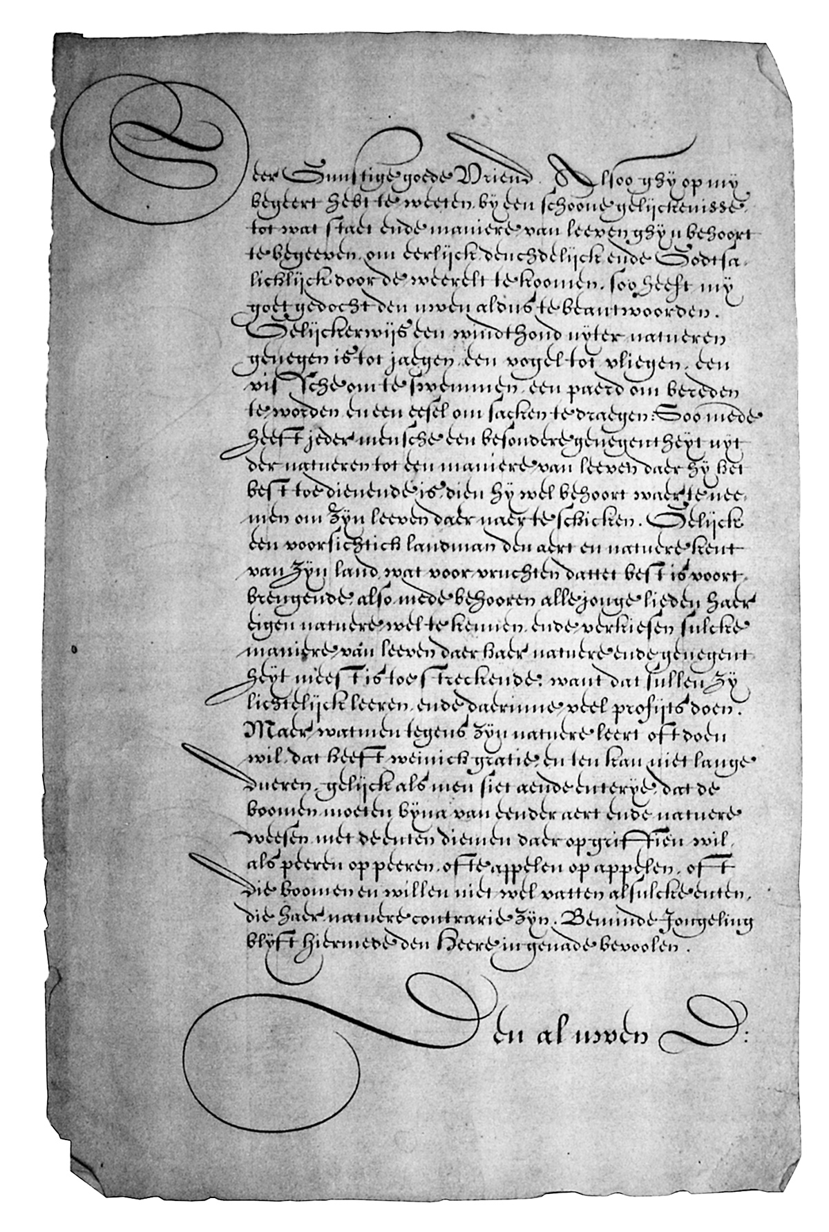
In a sense, this does not matter for our purposes. Enough survives for us to be able to see the writing of the major figures, and the copies reflect the 'house style' of the Dutch East India Company clerks—a style where a quickly written 'Netherlandish' gothic hand, is used for the body text whilst the headings and maps have strongly flourished letters (Fig. 1)—mostly written in the more prestigious 'Italian' hand (Fig. 8). This flourishing, as with much calligraphy of the period, can easily be seen as excessive. Indeed, anyone who adheres to Beatrice Warde's 'crystal goblet' theory of letters will recoil in modernist horror. Anderson, for example, suggests that Gilsemans' exuberant calligraphic displays might have been “an irritation to others”. This, however, is to miss the social background to Dutch calligraphy. In the seventeenth century, as Susan Frye points out, control of the hand was equated to moral development—something that was true for both writing and drawing. This explains why the seemingly Baroque and decadent virtuosity that we see in the work of Visscher, Gilsemans and the Batavian copyists (not to mention painters of the period like Frans Hals) is so much in keeping with Dutch Protestantism. The control required to make these flourishes required intense practice, dedication and concentration, and was therefore seen as a physical manifestation of hard work and moral virtue. A 'good hand' implied a good person. Virtuosity was an indicator of virtue. This is why calligraphy was such a central subject in the Dutch school system of the period. A writer with a good hand was likely to be trustworthy, and trustworthiness was essential to good Protestant business.
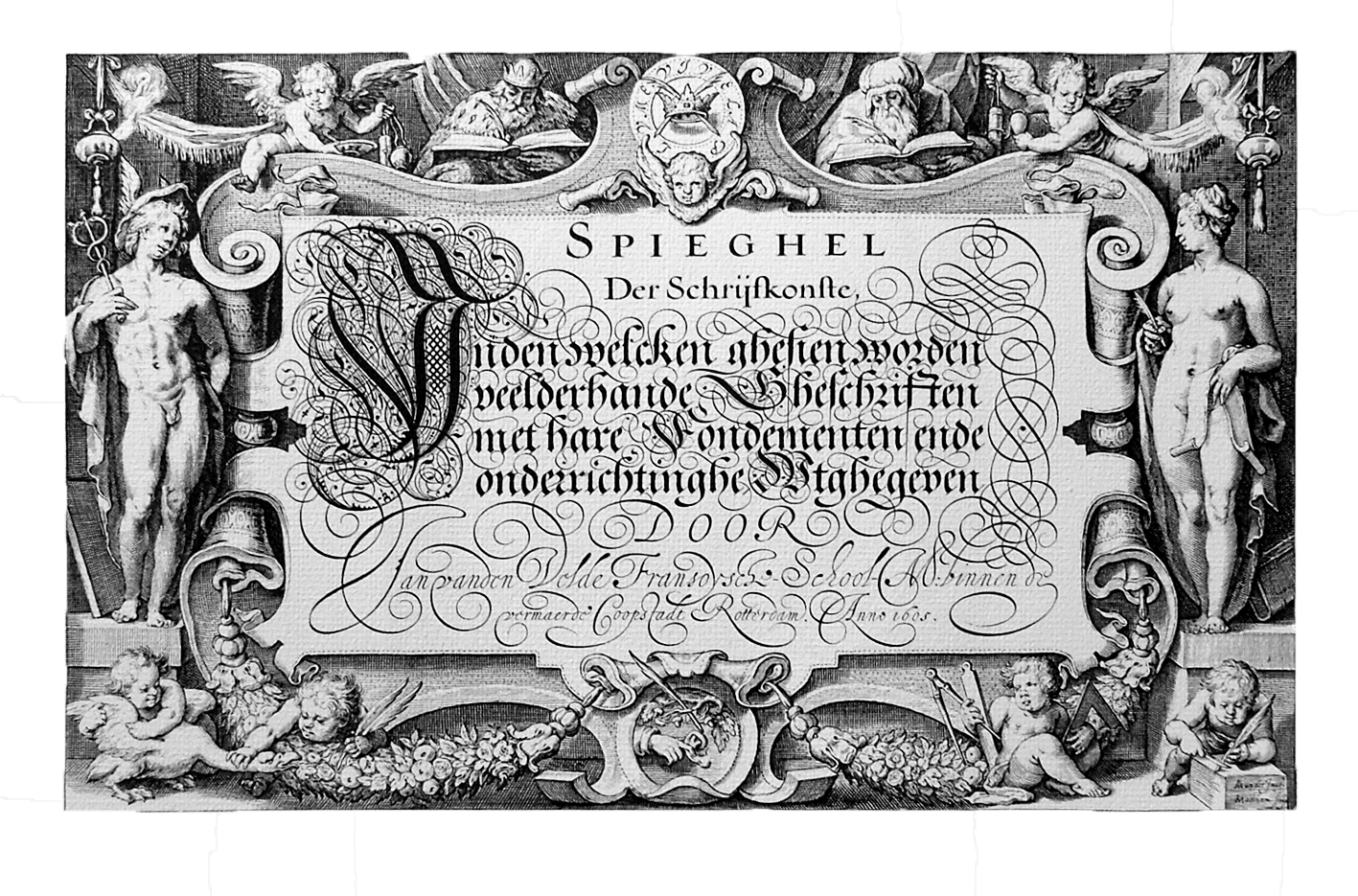
Believe it or not, at the start of the seventeenth century, calligraphers were the Calvinist equivalent of rock stars. Widely publicised competitions made or broke reputations, and calligraphers enjoyed a status approaching that of painters at a time when those painters had names like Rembrandt. Amy Worthen, in particular, has shown how painters, calligraphers and printers were socially closely connected, and it is thus no surprise to find the leading painter and theorist of Dutch mannerism, Karel van Mander, creating the artwork for Jan van den Velde's first major book (Fig. 3).
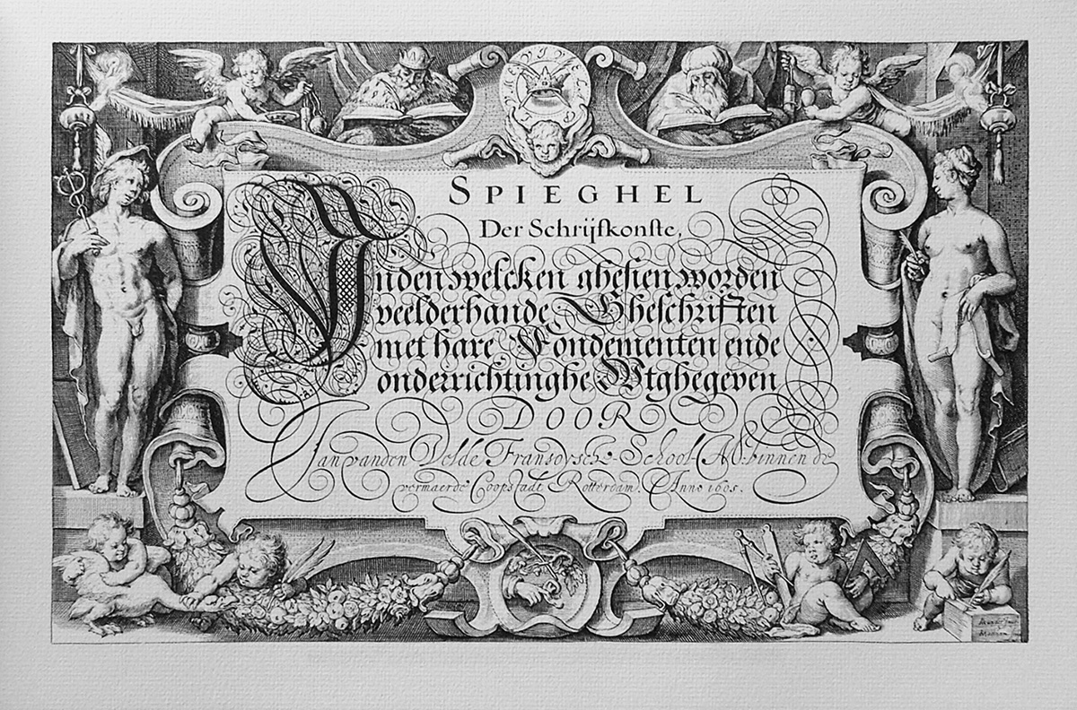
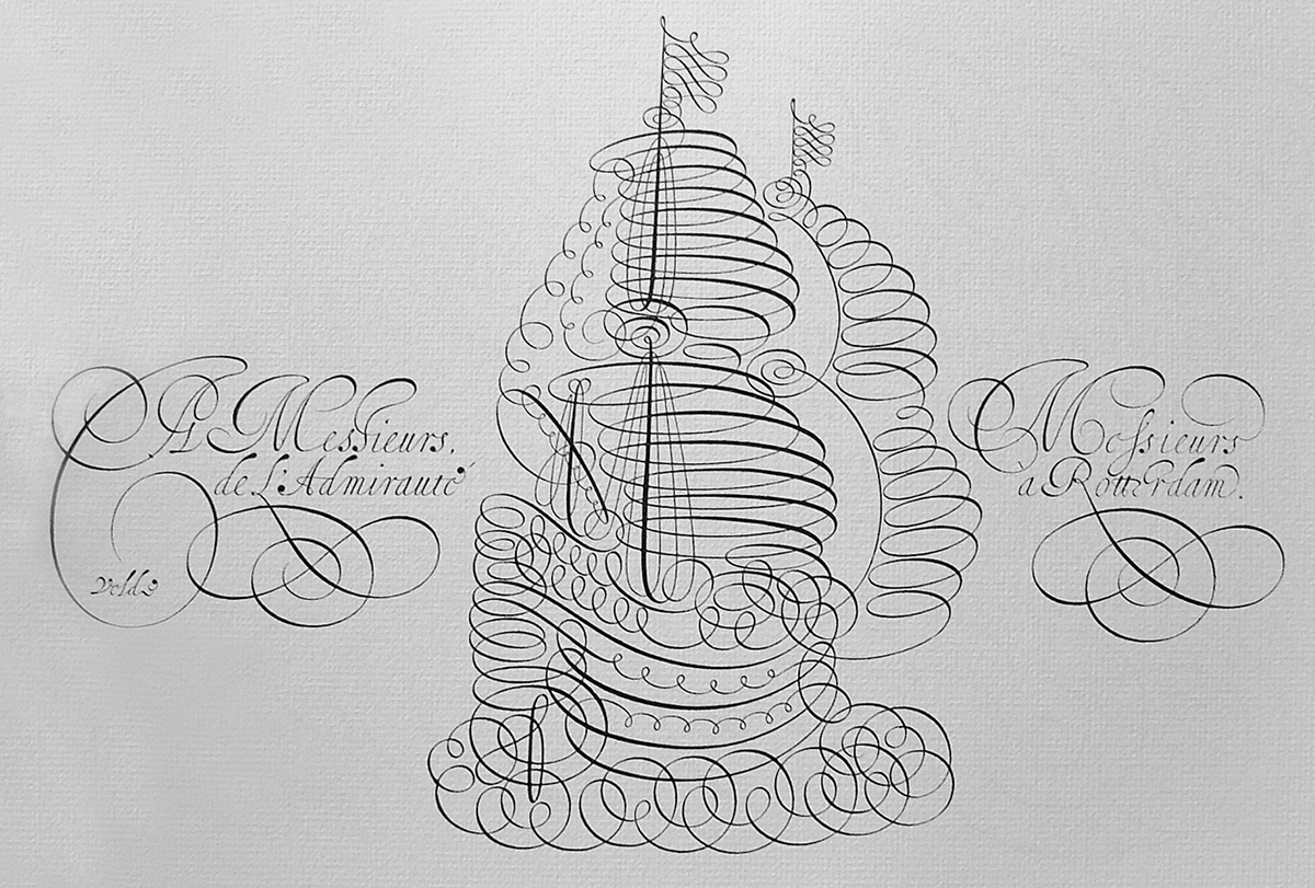
Van den Velde (perhaps the most technically gifted calligrapher of all time), exercised unparalleled control of the quill, and his books would continue to inspire calligraphers for the next two centuries. He had taught in Rotterdam and Anderson suggests that he may have influenced Tasman's merchant, Gilsemans. Whilst possible, by the time Gilsemans was studying (around 1613–20) van den Velde had moved to Haarlem, and I cannot see any real similarity between the dense texture of van den Velde's designs and Gilsemans' or Visscher's work. Some of Gilsemans letters seem to be influenced by a mid-sixteenth century calligrapher, Clement Perret, but he also demonstrates a liking for a distinctive flourish that occurs frequently in the work of the best female calligrapher of the age, Maria Strick (Fig. 4). Strick, like van den Velde, taught at the French school in Rotterdam (French was the international language of business at that time), but was still there when Gilsemans may have been studying. Her versions of the French and Italian hands (which were used for maps and important texts) show a preference for sweeping flourishes that go back and under the capital letters. This element is also evident in Gilsemans' hand. Nevertheless it is hard to be too sure about this, since each calligrapher seems to have taken pleasure in creating endless variations of each letterform.
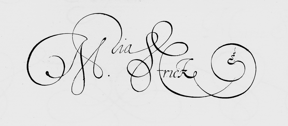
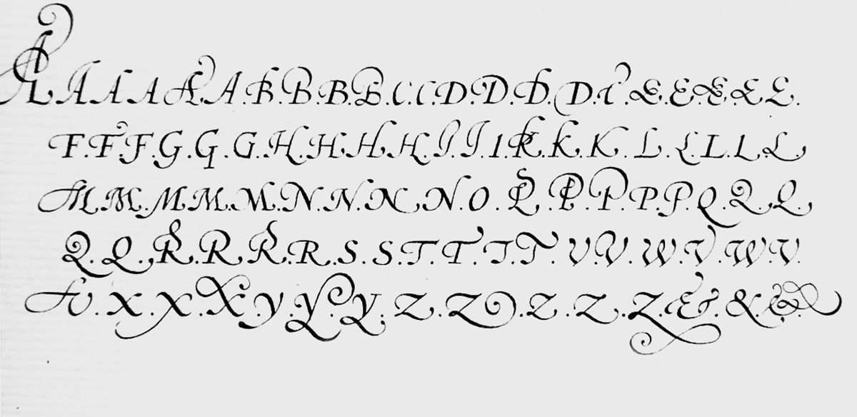

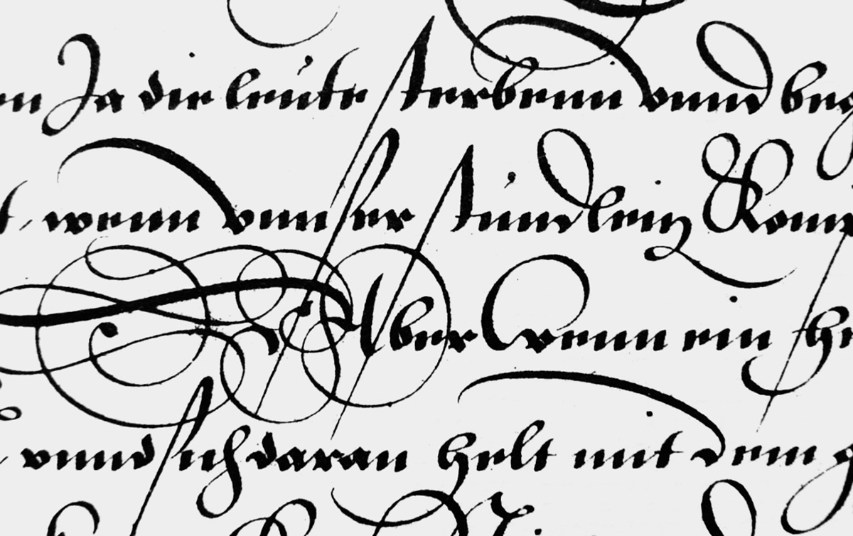
We can see this urge to elaborate on each letter in several ways. Firstly, in copybooks of the era like Strick's, Perret's and van den Velde's (Figs. 4, 5 & 6), it is common for each letter to appear in five or six quite distinctly different versions—which could be applied depending on the surrounding letters and spatial relationships. The idea that a choice could be made for each new letter is inherent to calligraphy, although modern calligraphers have become so conditioned to a typographic approach that most do not exercise the option. This multiplicity had, in fact, existed well before the printing press. Anyone who has looked at medieval manuscripts will, for example, have seen how they use two versions of the letter S. Given this tradition, it is no surprise that Gutenberg's alphabet had to have over 200 characters and kerning pairs in its attempt to mimic the expected scribal inventiveness. Subsequently, however, those who cast letters in lead found it easier to make a single version of each letter, whilst their competitors, the scribes, latched onto this print conservatism. If printers preferred a single letterform, calligraphers could create multiple upon multiple. If printers could not easily print interlinear flourishing, calligraphers could (and did) fill the interlinear gaps with serpentine, sinuous and expressive line—as is clearly visible in another detail from van den Velde's work (Fig. 7).
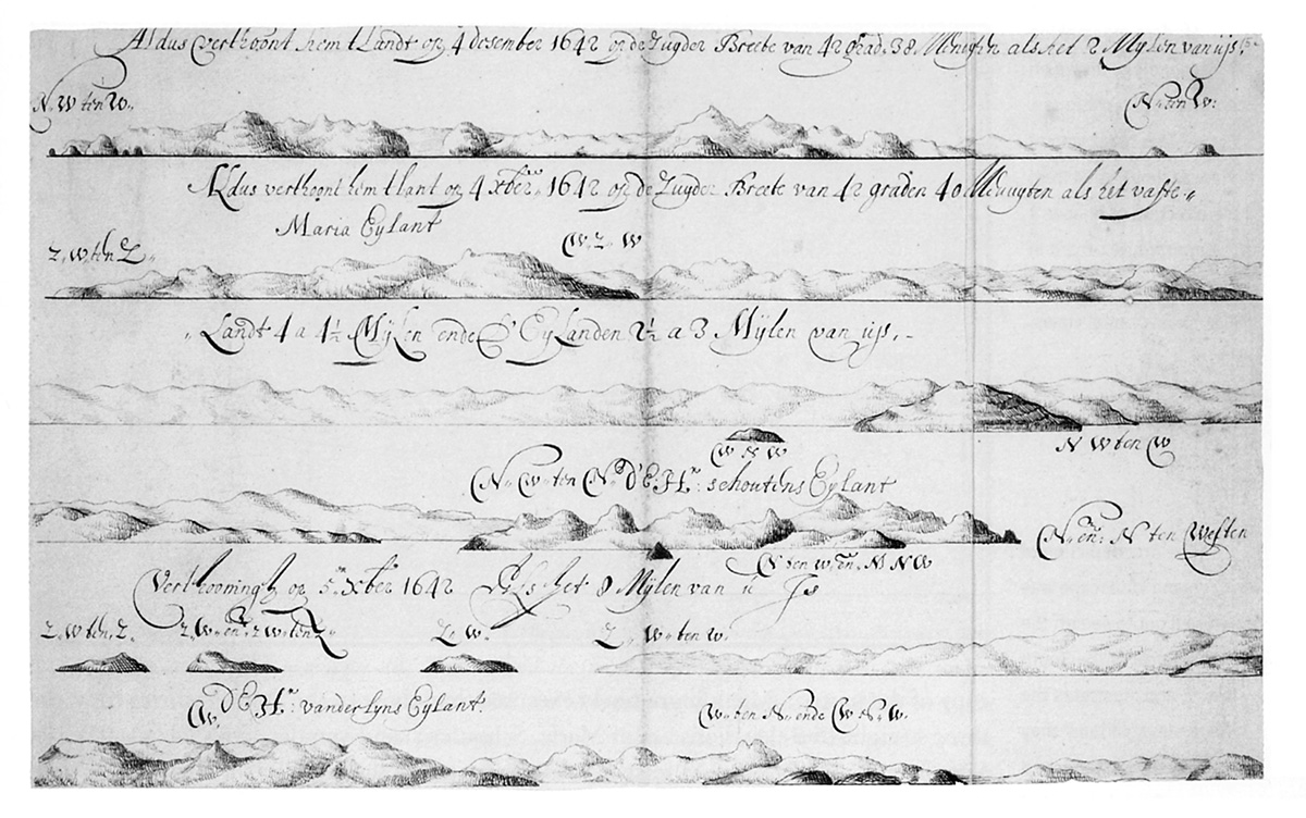
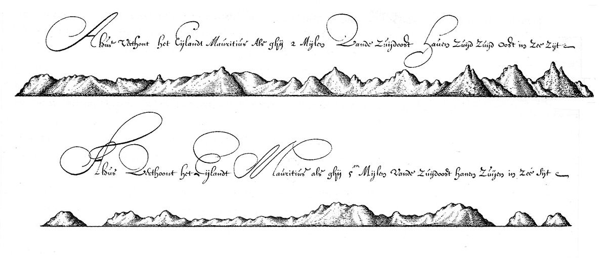
This same elaboration, albeit in the realm of mortals, occurs in the work of the Tasman expedition. On a single page of Gilsemans' Tasmanian drawings (Fig. 8), 23 W's appear in the captions. Each is unique, but seven different letter structures are apparent, plus added flourishes. Not all are equally successful (one senses the problems of writing at sea in places) but they are all consciously designed. Another example is the capital letter A, that occurs frequently throughout both copies of Tasman's journal. It is seldom the same twice (Fig. 9). To understand why we find this is occurring here, I think it helps to imagine the inherent boredom of a Dutch East India Company clerk's life. Half a globe away from home, living with a somewhat dour world view and faced with copying large amounts of text, what can a workaholic boy do? Improvise! Each A has something of the spontaneity and freshness that the Dutch seemed to be able to throw into their business dealings and which turned them into the world power that, in 1642, they undoubtedly were. On this level, these letterforms represent the exploratory, questing nature of a nation on the rise.
So how does this connect back to us, in our world-weary, post-modern, post-colonial state? Interestingly, there are more parallels that one might at first imagine. The Dutch were charting routes through a world that was new and mysterious for them. We, too, are finding ways to explore a new and relatively uncharted realm—the digital. Just as the Spanish and the Dutch had to give away their earlier world views to accept a globe that you could circumnavigate, so are we, too, having to let go of ways of thinking that limit our approaches to the digital world. In typography, this has meant painfully unpicking the things that made sense in traditional print environments and deciding which needed to be challenged. Back in the late 80s I remember figuring out that there was no fundamental reason to divide the space between letters vertically and that one could get a more even spacing by dividing letters diagonally. But tradition is a tough thing to break. We still design type on rectangles that mimic metal blocks. Pair kerning, however, has made a comeback—since kerning pairs are now viable in the digital environment in a way that (despite Gutenberg) was impractical in metal. Less frequent, but to my mind just as inevitable, is the realisation that there is no inherent reason for limiting the number of designs for each letter of the alphabet. Typographers now have the freedom to use multiple versions of letters—if only type designers were prepared to supply them. And here is the snag. Is it in a type designer's interest to double or triple the workload for the sake of variety? Well, this is a case where the market will decide. And there are signs of designers starting to head into this territory.
Rebecca Alaccari and Patrick Griffin's 2005 Sterling Script, offers 750 characters, with alternate letterforms and ligatures. From what they say on MyFonts, it appears that in creating this font they were neither aware of how historically appropriate their approach is, or how it fits with contemporary theory. They were just solving a problem that occurred in the design process—but that solution was enabled by digital technology. A more obviously choice-based concept is Peter Bilak's History Remixer, which allows multiple versions of a basic font to be created—though, as is also the case with Matthew Carter's 'snap on serif' Walker typeface, the Roman letterforms underlying its many versions remain resolutely singular and classical.
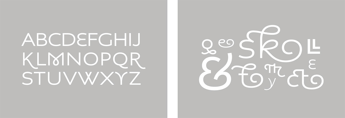
It is perhaps fitting to conclude this article with another case of a European interacting with the South Island. Jeremy Tankard's 2002/3 Christchurch Art Gallery font was the basis for the more generally released Aspect (Fig. 10). In this, Tankard plays with the tension between the typographic and calligraphic, and acknowledges the calligraphic by offering over 200 different ligatures and alternates in this upright script face. Granted, none of the typefaces above offer anything like the degree of structural difference in letterform that characterises Dutch calligraphy, but that may still be to come. At all events, looking at the work of the seventeenth century Dutch shows that it is possible to offer fundamentally different letterforms within the same alphabetic framework—and that this was done successfully in the past. Whether contemporary type designers choose to take up the challenge is, of course, up to them.
Bibliography
Anderson, Grahame, The Merchant of the Zeehaen: Isaac Gilsemans and the voyages of Abel Tasman. Wellington: Te Papa Press, 2001.
Croiset van Uchelen, Ton, Vive la Plume: Schrijfmeesters en Pennekunst in de Republiek. Amsterdam: Uitgeverij De Buitenkant / Universiteitsbibliotheek Amsterdam, 2005.
Frye, Susan, `Materializing Authorship in Esther Inglis's Books.' Journal of Medieval and Early Modern Studies. 32:3 p.479–80. 2002.
Gilderdale, Peter, Of Hand, Quill and Virtue: A study of the relationship between calligraphy, drawing and painting in the Dutch Republic.
Simulacrum, 2006. 14:2 p.15–19.
Mediavilla, Claude, Calligraphy: from calligraphy to abstract painting. Wommelgem: Scirpus, 1996.
Prak, Maarten, The Dutch Republic in the Seventeenth Century: the Golden Age, Cambridge: Cambridge University Press, 2005.
Worthen, Amy Namowitz, Calligraphic Inscriptions on Dutch Mannerist Prints, in Goltzius Studies: Henrick Goltzius (1558–1617),
Waanders Uitgevers: Zwolle, 1993.
http://gutenberg.net.au/ebooks06/0600571h.html#life-11
http://beeldbank.nationaalarchief.nl/na:col1:dat520630
http://www.myfonts.com/fonts/canadatype/sterling-script
http://www.typotheque.com/fonts/history/about
http://www.typography.net/commissions/project/christchurch
http://www.typography.net/type/font/aspect?phpMyAdmin=rIWLLLoGrh1wz%2C8qxoHregBc5t9
http://design.walkerart.org/detail.wac?id=2098&title=Articles
(all last accessed: December, 2008)
