Trespassers Will be Prosecuted: A B-Grade Horror in Four Parts – Luke Wood
Part I:
Grave-Robbing and Cannibalism
"...and there was even talk of having Elvis’s corpse dug up and the stomach analyzed for traces of drugs these two years on which led me to fantasize: Can you imagine anything more thrilling than getting to stick your hand and forearm through the hole in Elvis’s rotted guts slopping whatever’s left of ‘em all over each other getting the intestinal tracts mixed up with the stomach lining mixed up with the kidneys as you forage fishing for incriminating pillchips... as you pull your arm out of dead Elvis’s innards triumphantly clenching some crumbs off a few Percodans, Quaaludes, Desoxyns, etc. etc. etc. and then once off camera now here’s where the real kick to end ‘em all comes as you pop those little bits of crumbled pills in your own mouth and swallow ‘em and get high on drugs that not only has Elvis Presley himself also gotten high on the exact same not brand but the pills themselves they’ve been laying up there inside him perhaps even aging like fine wine plus of course they’re all slimy with little bits of the disintegrating insides of Elvis’s pelvis—SO YOU’VE ACTUALLY GOTTEN TO EAT THE KING OF ROCK ‘N’ ROLL!—which would be the living end in terms of souvenirs, fetishism, psychofandom, the collector’s mentality, or even just hero worship in general."1
Being that my career as a designer has often involved helping artists to make books or posters etc., I’ve often been interested in art that referenced, appropriated or inhabited the conventions of graphic design—and vice versa. Examples are numerous, easily found and particularly frequent across generations of New Zealand art. From the likes of Billy Apple to Daniel Malone—who, interestingly enough, cannibalised the older-but-still-seemingly-alive Apple by way of a name change a few years ago. And then of course there is Colin McCahon, who, like Elvis, casts a sort of posthumous shadow over everything.
"There are those who want a text (an art, a painting) without a shadow, without the ‘dominant ideology’; but this is to want a text without fecundity, without productivity, a sterile text... The text needs its shadow: this shadow is a bit of ideology, a bit of representation, a bit of subject: ghosts, pockets, traces, necessary clouds: subversion must produce its own chiaroscuro."2
McCahon’s interest in the everyday is well documented, and while his ‘word paintings’ are well known for their use of lofty, poetic and often biblical texts, his formal points of reference came from comic books, advertising and signage. He claimed to be interested in the ‘look’ of words, not only what they ‘meant’, and the story of how as a boy he “fell in love with signwriting” while watching someone paint ‘HAIRDRESSER AND TOBACCONIST’ on a shopfront window has been firmly embedded in the popular imagination of New Zealand’s art history.
"I collected bones from charnel-houses; and disturbed, with profane fingers, the tremendous secrets of the human frame."4
Like McCahon, the graphic designers I grew up liking never seemed particularly bothered by borrowing or appropriating bits and pieces from other people’s work to make something ‘new’ of their own. As such I’ve never really subscribed to the pervasive emphasis design discourses commonly place on ‘innovation’ or ‘originality’, and prefer instead to consider that all design is really just, to varying degrees, a process of re-design. And nowhere does this seem clearer than in the evolutionary history of type design.5
In saying this though, I don’t mean to make the mistake of sounding like I want to legitimise this THING. That is not my intention here at all—quite the opposite actually. Obviously my project does not belong to a civilising lineage of concern for the conditions of reading. Mine is a more marginal exercise—a monstrosity—a ‘Display’ face. Which makes perfect sense actually, the term ‘monstrosity’ coming from the Latin ‘monstrate’, meaning ‘to exhibit’ or ‘to show’. And so within a practice dominated by an unsurpassed concern for invisibility,6 any use of the term ‘display’ is more than likely cynical.
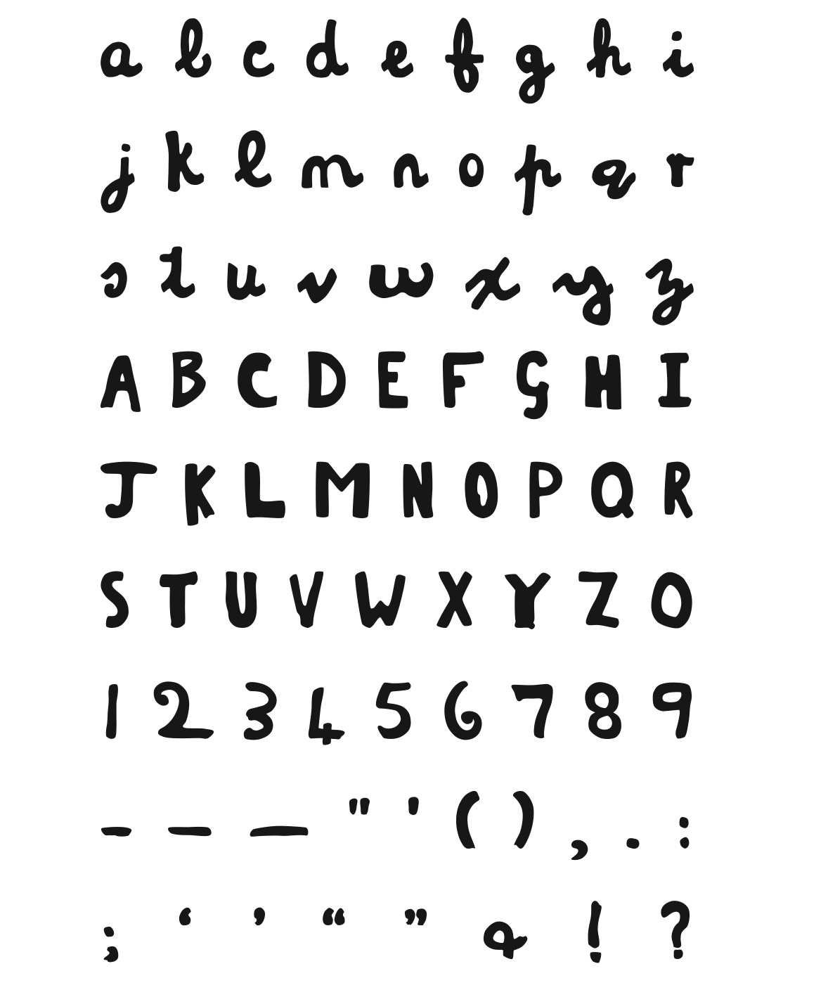
Typefaces, unlike handwriting, can usually be described by, or even as, shifts in systematic relationships across the body of a grid. My work here pays only very little attention to that tradition, and makes absolutely no claim as such. The McCahon typeface is, instead, a kind of illegitimate hybrid, made from stolen parts, the raw material for my exercise coming entirely from books—McCahon’s body of work being well entombed within various publications by now.
Part II:
Reanimating The Corpse
"It was on a dreary night of November that I beheld the accomplishment of my toils. With an anxiety that almost amounted to agony, I collected the instruments of life around me, that I might infuse a spark of being into the lifeless thing that lay at my feet. It was already one in the morning; the rain pattered dismally against the panes, and my candle was nearly burnt out, when, by the glimmer of the half extinguished light, I saw the dull yellow eye of the creature open; it breathed hard, and a convulsive motion agitated its limbs."7
Of course a corpse can never be reanimated ‘whole’, or perfectly as-it-was. McCahon with his paint and brushes—colours and edges bleeding into one another, the texture of the surface, and the paint sitting there on that. Me with my vector outlines, restricted like Victor Frankenstein by the technology available to me. Ones or zeros, on or off, black or white—you can’t have both at the same time. My monster, like Victor’s, is an approximation. I’ve had to add bits that weren’t there originally and leave out certain other bits that were. I can’t reproduce the infinite possibilities of nature, and I’ve had to ‘step-in’, picking the best ‘a’ to go alongside the ‘b’ and so on, and so on.
"...SoFA is currently exhibiting Luke Wood’s typeface McCahon, which attempts to reproduce some elements of the script Big Mac used on his paintings. Homage, yes, but one somewhat missing the point. McCahon’s painted signs were great art because every letter expressed something of his personal expression, strained out of blood, bone and muscle. This, on the other hand, finding its apotheosis as vinyl stick-on transfer lettering, is merely self defeating and cheap—endlessly repeating in mass production what was unique and individual..."8
At odds with The Original, my ungodly ‘version’ is infinitely reproducible, the same each time, doomed to repeat itself over and over and over...
"I am shocked to see the McCahon project occupies the main gallery while McCahon originals are placed as secondary in the back gallery—Don’t see the purpose of this computer project, it seems to ‘cheapen’ the artist’s work. It merchandises and trivialises the work of McCahon."9
Actually at this point in time the typeface wasn’t for sale. I’d never intended for it to be available to others to use. But the monster, a trespasser by its very being, cannot be contained...
Part III:
The Monster is Loose
"I stepped fearfully in: the apartment was empty; and my bedroom was also freed from its hideous guest. I could hardly believe that so great a good fortune could have befallen me; but when I became assured that my enemy had indeed fled, I clapped my hands for joy, and ran down to Clerval."10
I’d never thought very far ahead, and, in fact, the typeface sat unfinished for a good year or so until I was approached by Sam Brodie, who (under the aegis of the DINZ Design Ambassador scheme) was putting together some sort of CD-ROM collection of ‘New Zealand design’. I didn’t know what to expect, but it seemed like a good-enough motivation to finish the thing off.
And that was its first outing, in public, sort of. Mostly the CDs were distributed overseas, and apart from the odd comment from friends who’d seen it I didn’t hear anything more. Until...
"...I perceived in the gloom a figure which stole from behind a clump of trees near me; I stood fixed, gazing intently: I could not be mistaken. A flash of lightning illuminated the object, and discovered its shape plainly to me; its gigantic stature, and the deformity of its aspect, more hideous than belongs to humanity, instantly informed me that it was the wretch, the filthy demon, to whom I had given life."11
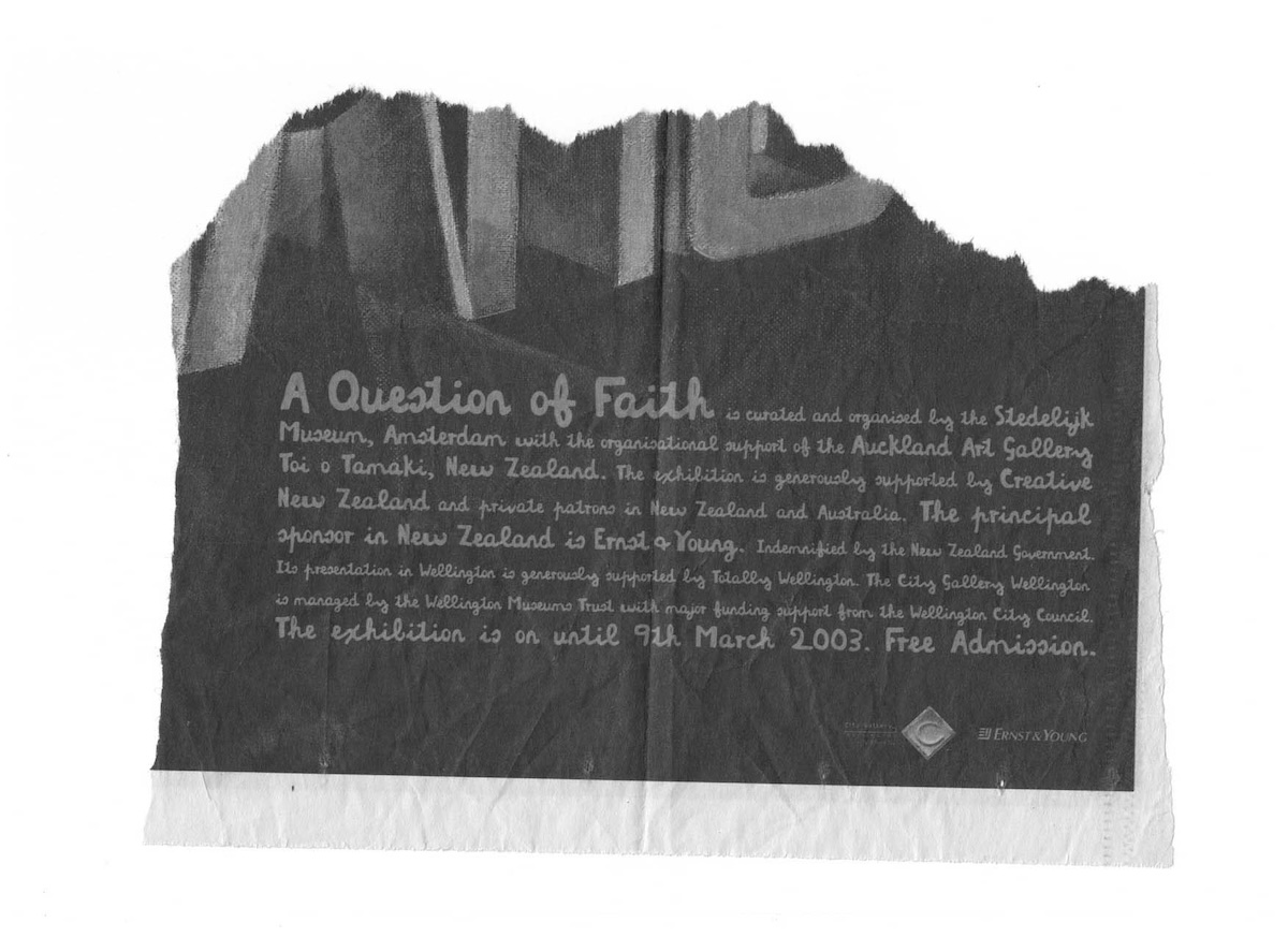
In late January 2003 a friend sent me a cutting from a newspaper containing an advertisement for ‘A Question of Faith’, an exhibition of McCahon’s work then on at the City Gallery in Wellington. The text in the ad, as had been suspected by the observant friend, was set entirely in the McCahon typeface I had made. I remember it feeling quite strange. Slightly horrifying actually. Firstly it just seemed so blatantly inappropriate—to advertise McCahon’s work using a font that quite obviously mimicked it. But then also there was the question: who did this? And where did they get the typeface from? The weird feeling that someone had ripped me off... which was stranger still, considering that my work was a rip-off of sorts anyway.
I contacted the City Gallery and was told that Saatchi & Saatchi in Wellington had done the work, and that, interestingly enough, someone there had designed that typeface. I contacted Saatchi & Saatchi, and they spent a couple of weeks trying to convince me that someone there had indeed done it, and that if I’d simply copied McCahon what made me think my copy would necessarily be any different to someone else’s copy. When I finally offered to send them my original drawings for the thing along with a letter from a lawyer they finally gave up and with minimal fuss a small amount of money was sent my way.
It was a hollow victory though, and I still felt some unease. That my creation had escaped, not even really ‘finished’ properly, and was now out in the world (via a slip-up with that CD) was vaguely horrifying. Other people using the thing was a possibility I hadn’t planned for, or considered.
"I considered the being whom I had cast among mankind, and endowed with the will and power to effect purposes of horror, such as the deed which he had now done..."12
Over the next few years the thing kept appearing in the strangest places—in the pages of The Listener, the titles for a reality TV show, a logotype for Peta Mathias, an insurance company, a film festival guide...
I’m not usually very sentimental, but I do sometimes feel quite bad about all this. Bad for Colin, I mean. Sometimes it is a bit like I’ve dug him up and set him to work, zombie-like—the shell of his former self. But then there’s something I quite like about that too. Let me see if I can explain.
Part IV:
Full Circle
(or The Monster Comes Home)
"That he should live to be an instrument of mischief disturbs me..."13
Shortly after the incident with Saatchi & Saatchi, in an attempt to somehow reclaim the thing, I organised to show it—to demonstrate it—publicly by way of exhibition. A sort of ‘freak show’, if you like. As is often the case with displays of monstrosity there was some hype around the event. I myself was not entirely disappointed with the exhibitions (there were two in the end, including offers for more), but they certainly didn’t feel how I imagined they would.
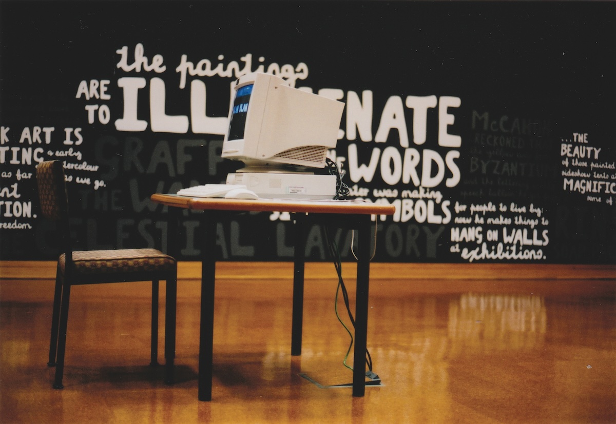
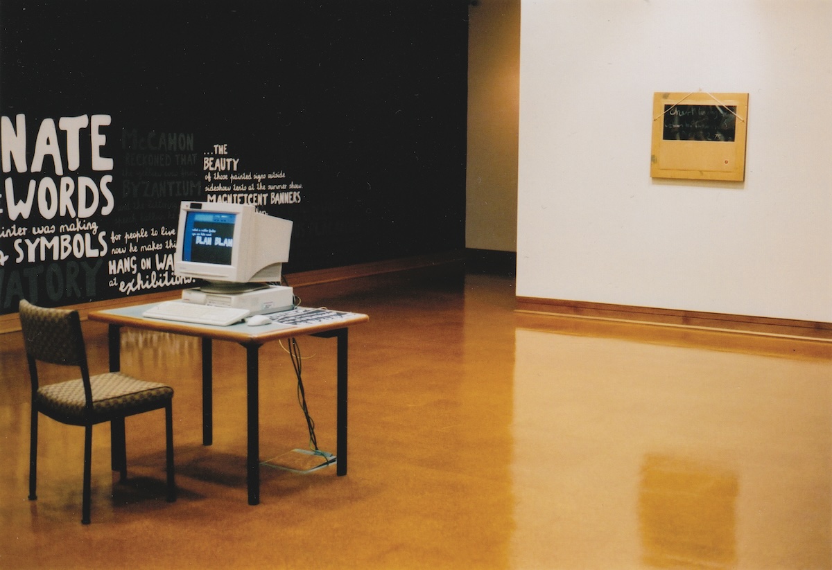
exhibition at the Hocken Library
Dunedin, 2003
At the time I had naively enjoyed the idea of having taken the thing from the gallery, redistributed the quality and spirit of the original and then fed it back into that system. In reality this was a failed gesture. I am no artist, and this was not my domain. This was not the outcome I was looking for, and the monster was not put to bed.
"Come on, my enemy; we have yet to wrestle for our lives; but many hard and miserable hours must you endure until that period shall arrive."14
Around five years later, in 2008, a well-known purveyor of fruit juices in New Zealand, Charlie’s, re-branded and repackaged its products. The new bottle labels being based loosely on the vernacular hand-painted signs often seen around roadside fruit stalls and orchards. The gist—the marketing angle—being to do with ‘honesty’. Funnily enough the typeface on those labels is, of course, my McCahon. Unlike particular other outings though, this one is quite legitimate, and Charlie’s have paid me for an ‘exclusive license for the beverage sector’. Apart from the fact that it was someone I knew who initially approached me about this, I was quietly very interested in it going ahead.
"The completion of my demoniacal design became an insatiable passion. And now it is ended; there is my last victim!"15
Colin McCahon’s interest in the vernacular art of sign-writing came up often in his letters and conversations. I’d been vaguely aware of this—the ‘Hairdresser and Tobacconist’ story for example—but in reading the books that I was scanning his letterforms from I was surprised at how frequently he would comment on it. One instance in particular was sparked in my memory by the initial approach from the juice company...
"You’ve all seen those number paintings without realising it. For example fruit stalls with white lettering. The best in New Zealand are on the Bombay Hills."16
The signs he’s talking about are commonly black boards with white hand-painted letters and numbers on them. The exact same signs that Charlie’s are now mimicking for their labels.
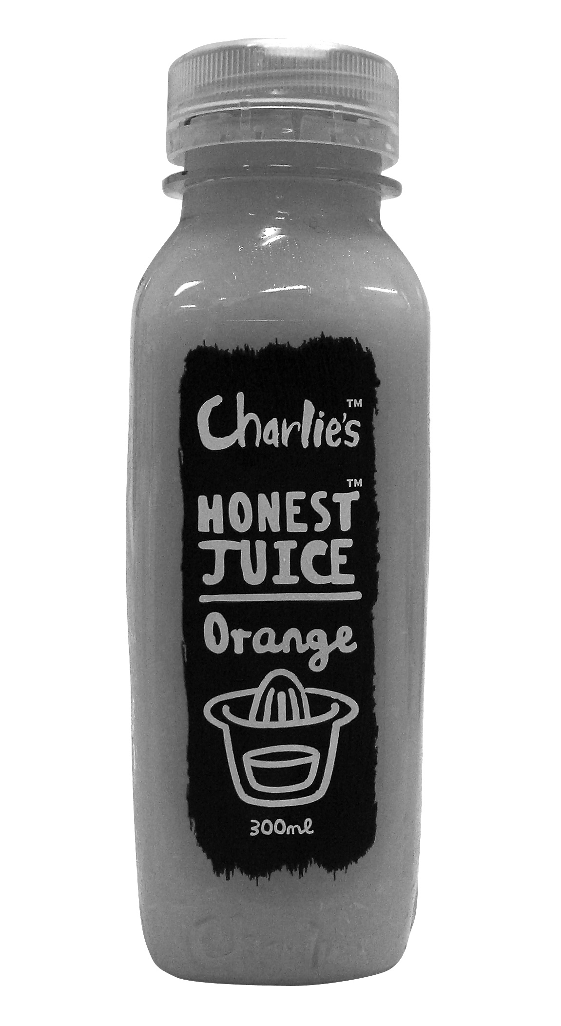
Labels designed by The Wilderness
2008
And so, now—I like to think—it is as if through some sort of voodoo or dark magic that McCahon has been returned to his point of departure. Commercial, vernacular, cheap, reproducible; this awful stuff...
"The awful stuff made by the W.D.F.F. & the signwriting of the towns & the football & racing & advertising. Is that possibly the culture, & from there we must start. Not from the imports but from the awful stuff around..."17
So it’s a bit like Romero’s zombies who, brain-dead, return to the mall. The monster is a creature of habit. It simply does what it knows best.
The End Then
"The combined effects of the drugs and rotted bodily organs wore off about thirty-six hours later. I came out of a deep and not unrestful sleep feeling disoriented, displaced, vaguely depressed, emotionally numbed, but with mind and body in a relatively sound state. After a couple of days I was even able to listen to music again, even his albums. There’s just one thing that’s different. If they exhume the body again, I don’t think they should be worrying about drugs (I certainly wouldn’t take anymore drugs that came outta Elvis Presley’s stomach!). I think they should take him down to a taxidermist’s, and have him stuffed, like Trigger. I could say something like ‘and then have it placed on the steps of the White House’, but that would be glib. The trouble is, while I know he should be stuffed and put on display somewhere, I don’t for the life of me know where that should be. Because I guess he really doesn’t belong anywhere, anymore, does he? Does he?"18
NOTE: A version of this text originally appeared in the catalogue for the exhibition Printing Types: New Zealand Type Design Since 1870, Objectspace, Auckland, NZ, 25 July – 12 September 2009.
Footnotes
Lester Bangs, from ‘Notes for Review of Peter Guralnick’s Lost Highway, 1980’ published in Psychotic Reactions and Carburetor Dung, by Lester Bangs, edited by Greil Marcus. Serpent’s Tail,London, 1996. ↵
Roland Barthes, The Pleasure of the Text, 1973. This quote used by Aaron Kreisler in his text ‘Lost For Words’, McCahon: A Typeface by Luke Wood. University of Canterbury, SoFA Gallery, July 2003. ↵
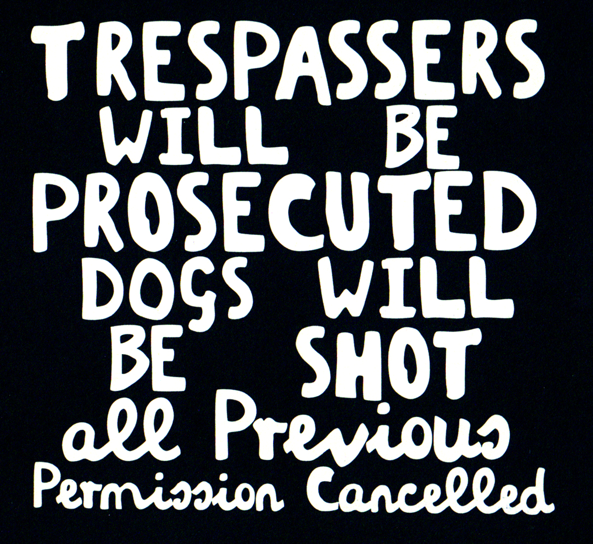
Since this text’s first publication I have discovered that this sign was actually ‘collected’(stolen from a farm gate) by Jim and Mary Barr. It was photographed, and then lost when their car was stolen a couple of weeks later. It was this photograph (although the negative was reversed to get white text on a black ground) that was used in the book I Will Need Words, edited by Mary Barr. National Art Gallery, Wellington, 1984. ↵
Victor Frankenstein in Chapter 4 of Mary Shelley’s Frankenstein. ↵
Given the parameters of legibility the development of typefaces from one to another is often incremental, and it is relatively common for a typographer to use an existing face as a starting point in the development of their own. Eric Gill’s re-design of Edward Johnston’s typeface for the London Underground is a well-known example. ↵
See Beatrice Ward’s Crystal Goblet for instance. ↵
Victor Frankenstein in Chapter 5 of Mary Shelley’s Frankenstein. ↵
Roger Schülbeuys in ‘Up The Arts’, Canta, Issue 16, July 2003. ↵
Anonymous feedback from Hocken Library exhibition of the McCahon typeface, December/January 2003. ↵
Victor Frankenstein in Chapter 5 of Mary Shelley’s Frankenstein. ↵
Ibid., Chapter 7. ↵
Ibid. ↵
Ibid., Chapter 24. ↵
The ‘Monster’ in Chapter 24 of Mary Shelley’s Frankenstein. ↵
ibid. ↵
Colin McCahon, from a talk at Outreach, Auckland, 1979. Quoted by Wystan Curnow in I Will Need Words, edited by Mary Barr. National Art Gallery, Wellington, 1984. ↵
Colin McCahon, in a letter to John Caselberg, 21 February 1951. Quoted by Peter Simpson, Answering Hark, Craig Potton Publishing, Nelson, NZ, 2001. ↵
Lester Bangs, from ‘Notes for Review of Peter Guralnick’s Lost Highway, 1980’ published in Psychotic Reactions and Carburetor Dung, by Lester Bangs, edited by Greil Marcus. Serpent’s Tail, London, 1996. ↵