A patient waiter is no loser: Some notes on dots and their reception – David Bennewith
0.
Good evening. I’m compiling a text about dots and reading; permutations of the [read] dot presented as text, sound and image.
• • •
1.
[CLAP, CLAP, CLAP] / • • •
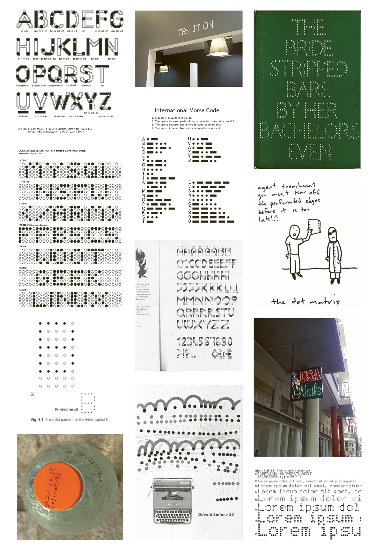
This is Morse code for ‘s’; the Morse ‘s’ constitutes the same visual make-up as the ellipses—a punctuation character that denotes an intentional omission in text.
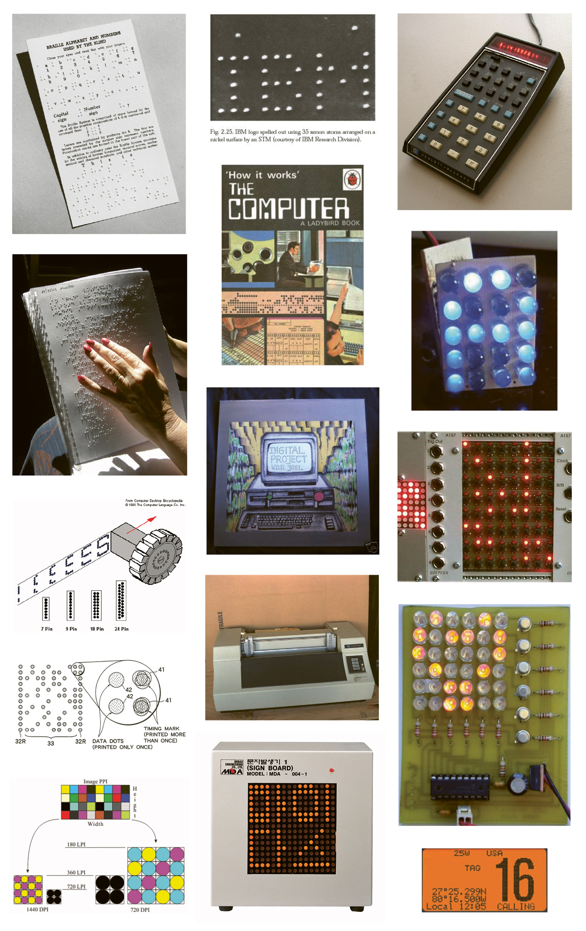
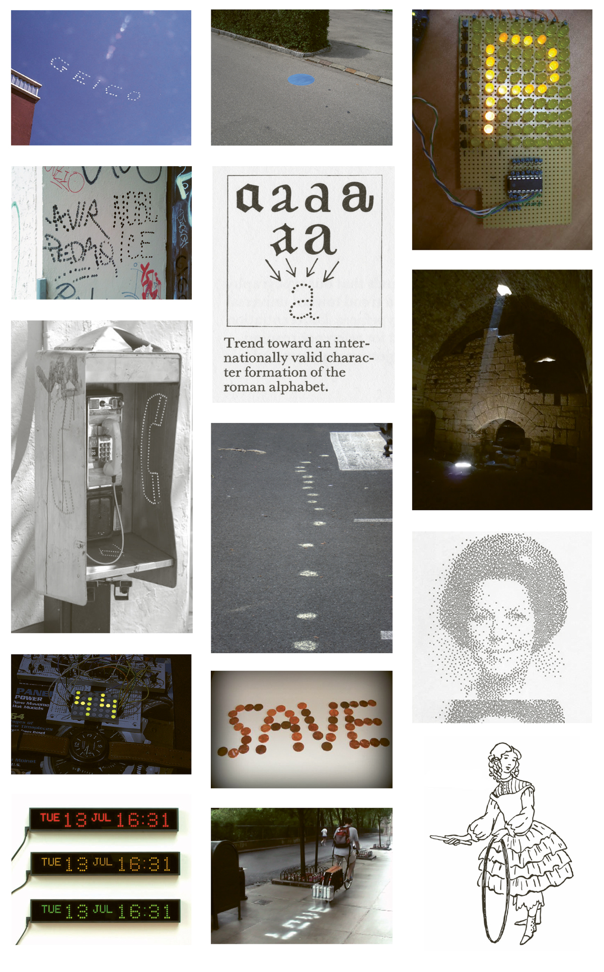
Letters and symbols that can be, and are, constructed of dots (or points) to form (legible) characters are called ‘dot-matrix’.
• • •
2.
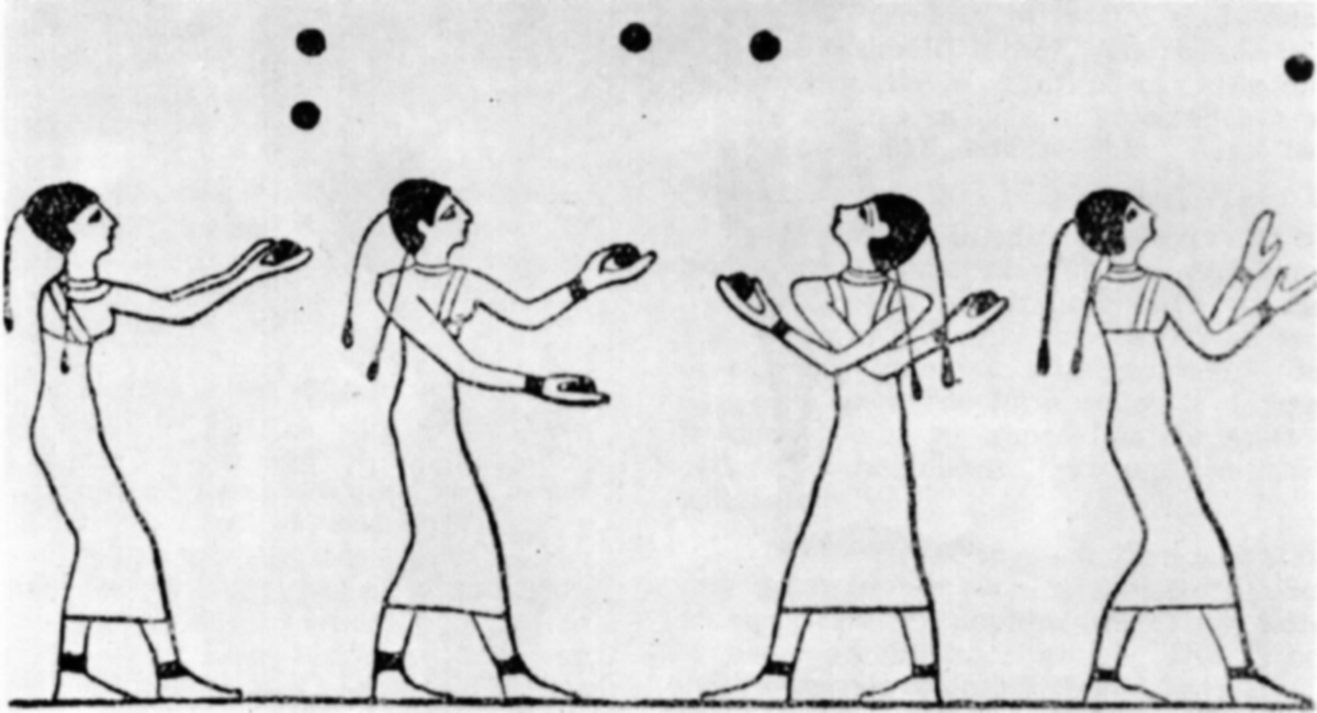
The earliest known depiction of toss juggling is Egyptian, from the 15th Beni Hassan tomb of an unknown prince, dating from the middle kingdom period of about 1994–1781 BC.
• • •
3.
From early studies of electricity, electrical phenomena were found to travel at great speeds and many experimenters began to work on the application of electricity to communications over a distance.
In 1746 the French scientist and abbot Jean-Antoine Nollet gathered about two hundred monks into a circle—of about 1.6 km in circumference—and with pieces of iron-wire connecting them he discharged a battery of Leyden jars 1 through the monks. He observed that each monk reacted, for the most part, at the same time to the electric shock; showing the speed of propagation (transmission of electrical current through the monks) to be very high.
• • •
4.
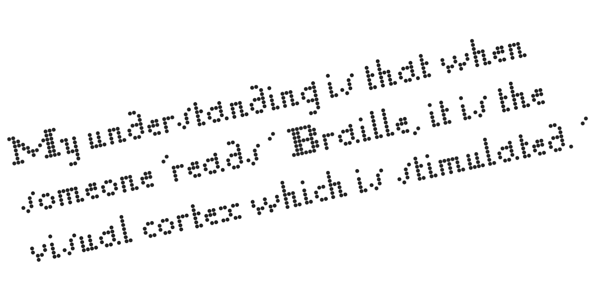
The first true dot writing system, translated directly from French as ‘Night Writing’, was invented and designed in 1815 by Charles Barbier, a captain in the French army. The characters of his Night Writing—developed in response to Napoleon’s demand for a code that soldiers could use to communicate silently and without light at night—consisted of a 6 × 6 grid which included most of the letters of the French alphabet, as well as frequently used digraphs and trigraphs.
As is common with many military inventions, the Night Writing system soon found a use in civil society. In 1821 Barbier brought Night Writing to the Paris Institute of the Blind, where it was temporarily adopted as a writing system.
A 12-year-old attendee of the Institute found the system too difficult to understand and he set about devising his own, using the same implement with which he had blinded himself [a stitching awl] at the age of three. Louis Braille completed his system in 1824, aged fifteen. Braille’s 6-dot system was ingenious in the fact that it allowed recognition of letters with a single fingertip—apprehending all the dots at once. These dots consisted of patterns in order to keep the system easy to learn. Braille offered a blind person the ability to be able to both read and write, providing enormous benefits in comparison to other raised alphabet systems of the day.2
Braille later extended his system to include notation for mathematics and music.
The first book in Braille was published in 1829 with the title Method of Writing Words, Music, and Plain Songs by Means of Dots, for Use by the Blind and Arranged for Them.
In 1839 Braille published details of a method he had developed for communication with sighted people (or, those who could not read Braille). Called ‘Decapoint’ the system used patterns of dots to approximate the shape of alphabetic characters. Louis Braille and his friend Pierre Foucault went on to develop a machine, called the ‘Raphigraphe’ (needle-writer), to speed up the somewhat cumbersome system. The Raphigraphe was eventually
to be replaced by a typewriter. In part, Decapoint and the Raphigraphe present a distillation, shift and cross-pollination in the construction, production and recognition of characters in the Latin alphabet system—and also precludes the dot-matrix faces we see used today.
• • •
5.
Not long after the advent of Braille, early telegraphy—the long-distance transmission of written messages without physical transport of letters—was being developed.
The first telegraphs came in the form of optical telegraphs, including the use of smoke signals, beacons or reflected light. These ‘telegraphs’ have existed since ancient times.
In 1833, in Göttingen, Germany, Carl Friedrich Gauss and Wilhelm Weber built and used the first electro-magnetic telegraph for regular communication. The telegraph connected the observatory with the Institute for Physics in Göttingen.
The first commercial electrical telegraph was constructed in Great Britain by Sir William Fothergill Cooke. Cooke and Charles Wheatstone (a British scientist) patented it in May 1837 as an alarm system. The telegraph came into operation on 9 July 1839 on the Great Western Railway in Britain. It ran for 21 km from Paddington station to West Drayton.
Simultaneously an electrical telegraph was being independently developed and patented in the United States. In 1837 Samuel F. B. Morse and his assistant Alfred Vail developed the Morse code signalling alphabet—a code in which letters are represented by long and short signals of light or sound—visually the equivalent of a dash (long) and a dot (short) on a thin strip of paper. America’s first telegram was sent by Morse on 6 January 1838 across 3 km of wire at Speedwell Ironworks near Morristown, New Jersey. The message read: ‘A patient waiter is no loser’.
For its commercial debut in America, on 24 May 1844, Morse sent the message ‘What hath God wrought’ (quoting Numbers 23:23 from the Bible) from the Old Supreme Court Chamber in Washington DC, to the old Mt. Clare Depot in Baltimore. This dramatic message was chosen by Annie Ellsworth of Lafayette, Indiana—the daughter of Patent Commissioner Henry Leavitt Ellsworth. The Morse/Vail telegraph was quickly deployed in the following two decades, and the overland telegraph connected the West coast to the East coast of the continent by 24 October 1861, bringing an end to the Pony Express.
When Morse code was later adapted to radio, the dots and dashes were sent as short and long pulses. It was later found that people become more proficient at receiving Morse code when it is taught as a language that is heard, instead of one read from a page. To reflect the sound of Morse code, practitioners began to vocalise a dot as “dit” and a dash as “dah”.
On 12 December 1901, Guglielmo Marconi transmitted the tele-graphic signal of the [Morse code] letter ‘s’ [ • • • / dit dit dit] across the Atlantic Ocean from Poldhu in Cornwall, England, to St. John’s, Newfoundland. The first transatlantic wireless test signal was the letter ‘s’ repeated over and over .
Telegraphy has played a strong part in—and has led to—the internet and email technologies we know and use today.
• • •
6.
‘Did I feel such a tumultuous sensation before, as when, all alone in the still room, I heard the needles click, and as I spelled the words, I felt all the magnitude of the invention pronounced to be practicable beyond cavil or dispute.’
– Charles Wheatstone
• • •
7.
The most balls juggled is 10, by Italian juggler Enrico Rastelli (1896–1931).
• • •
8.
LED [Light-Emitting Diode]: Oleg Losev was a Russian scientist and inventor. In the course of his work as a radio technician he noticed that diodes used in radio receivers emitted light when current was passed through them. In 1927, Losev published details in a Russian journal of the first-ever light-emitting diode. Just over 4 decades later the evil American company Monsanto became the first organisation to mass-produce visible LEDs – using gallium arsenide phosphide in 1968 to produce red LEDs suitable for indicators. These were first introduced in hand-held calculators designed by Hewlett Packard.
• • •
9.
‘ … it requires light to illuminate not the text itself, but the space around the text. ’
‘ ... it requires light to illuminate the text itself, not the space around the text. ’
• • •
10.
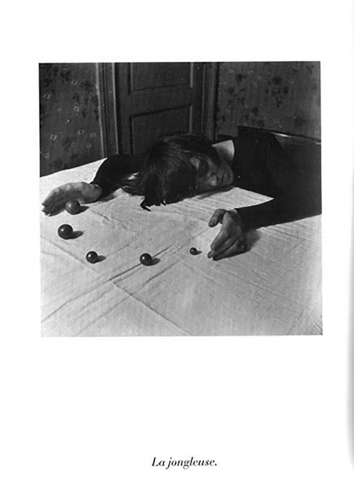
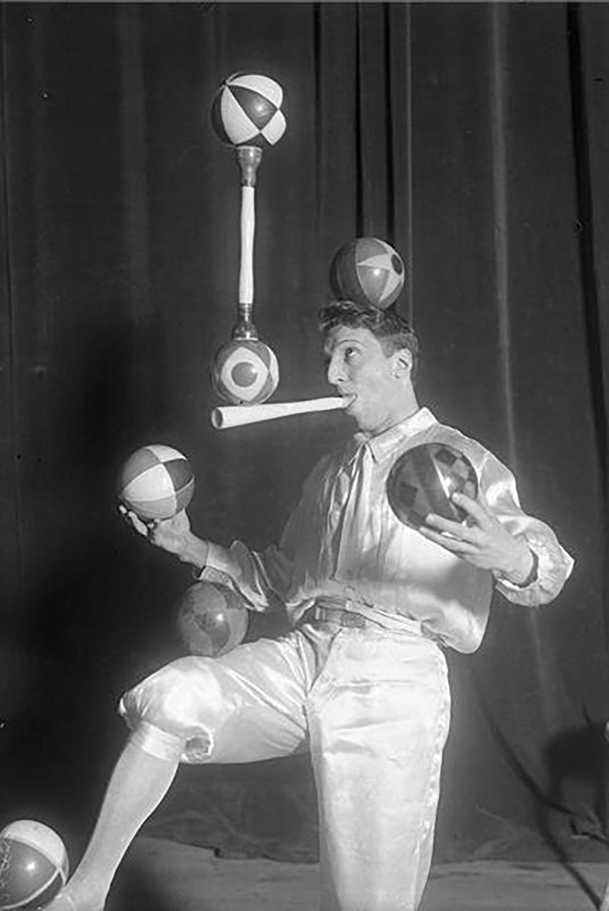
Paul Nougé was a Belgian poet, instigator and theorist of the Surrealist movement in Belgium. Between December 1929 and February 1930 Nougé created nineteen photographs which were finally published in 1968 with the title ‘Subversion of the Images’. The image ‘A new way of juggling’ forms a part of this series. Juggled on a flat surface, black dots of diminishing sizes appear like punctuation marks.
• • •
11.
‘One of the difficulties facing a typographer was the aesthetic effect of placing the dots over [Times Roman] letters which were not designed for this purpose [to produce Times Gaelic]. For easy reading all dots would need to be on the same visual line. Secondly the dots on a number of lines of caps printed consecutively would not be typographically pleasing. As you are aware the letters ‘t’ and ‘f’ are not in alignment with the x-height and needed to be redesigned to conform to the Roman font and to carry the dot at the same visual level as the other letters.’
– William Britton, reproduced in ‘Simply a dot’ by Dermot McGuinne, Visible Language 31.1, 1997
• • •
12.
‘Periods have life of their own, a necessity of their own, a feeling of their own, a time of their own. And that feeling, that life, that necessity, that time, can express itself in an infinite variety—that is the reason I have always remained true to periods.’
– Gertrude Stein
• • •
13.
‘All these attempts were based on the idea of unifying graphics and photography, so that lettering and pictures would become one whole.’
– Unknown source
• • •
14.
‘Formally they’re made up of dots; they even have this kind of dotty printed matrix thing about them. You know, the ease with which language is made up of these points.’
– Cerith Wyn Evans, www.necronauts.org, 2002
• • •
15.
A dot matrix printer, or impact matrix printer, is a type of computer printer with a print- head that runs back and forth or in an up-and-down motion on the page. It prints by impact, striking an ink-soaked cloth ribbon against the paper, much like a typewriter. However, unlike a typewriter or daisy wheel printer, letters are drawn out of a dot matrix, and thus, varied fonts and arbitrary graphics can be produced. Because the printing involves mechanical pressure, these printers can create carbon copies and carbonless copies.
Each dot is produced by a tiny metal rod, also called a ‘wire’ or ‘pin’, which is driven forward by the power of a tiny electromagnet or solenoid, either directly or through small levers [pawls]. Facing the ribbon and the paper is a small guide plate (often made of an artificial jewel such as sapphire or ruby) pierced with holes to serve as guides for the pins. The moving portion of the printer is called the print-head and generally—when running the printer as a generic text device—prints one line of text at a time.
Most dot matrix printers have a single vertical line of dot-making equipment on their print-heads; others have a few interleaved rows in order to improve dot density. The first dot matrix printers were introduced pretty much simultaneously.
1. The LA30 was a 30-character-per-second dot matrix printer introduced in 1970 by Digital Equipment Corporation of Maynard, Massachusetts. It printed 80 columns of uppercase-only 5 × 7 dot matrix characters across a unique-sized paper.
2. The Centronics Model 101 was introduced at the 1970 National Computer Conference. The print-head used an innovative seven-wire solenoid impact system. Based on this particular design Centronics later made the claim to have developed the first dot matrix impact printer.
• • •
16.
Or, as suggested by a lover, these early digital letter-formations—letter transformations—could be regarded as the technological catalyst, or a reconciliation, to the present-day digitisation of typefaces for use in all modern processing and viewing devices.
• • •
17.
‘When dot matrix printers first came out, my dad picked one up for our home computer. We figured out we could print a million dots (5000 dots per page onto 200 pages) and put the print-outs all over the walls of his classroom, so that his students could get an idea of what a million was. This was a big idea at the time—to actually be able to visually see, or hold in your hand, a million of something.’
– Gabrielle Blair, www.designmum.com
• • •
18.
‘One way representation has entered design is through the gradual stylisation of designs until they become almost abstract, and may come to be regarded as purely patterns which have lost their original symbolic meaning.’
– Anthony Hyman, The Computer in Design, 1973
• • •
19.
'In our present arsenal of forms one finds many corresponding expressions—the clearest [expression of them] in contemporary architecture—all based on the principle of many small units, together shaping the form. For example: the honey-comb, certain architectural studies by Conrad Wachsmann, the geodesic domes of Buckminster Fuller, and Habitat at the Montreal Expo. No matter which computer aided system one applies, the cell principle seems to me a correct starting point, just as was the papyrus stamp, the goose quill, or the engraver’s tool.
'Although the cell form is important for the arrangement of patterns, I use the expression ‘dots’ as an example for convenience sake. If we compose a classical letterform with these dots, you will notice that there is something happening. The letter cannot be dotted, cannot be screened; that is incompatible with its appearance. In principle nothing has changed when one takes 4000 dots to the centimeter (cm.) instead of 20. Apparently everything is in order, but the screening has been done. It remains a concealed affront! It is against the classical letterform.'
– Wim Crouwel, ‘Type Design for the Computer Age’, 1969 [Reproduced in Visible Language, Volume 4, Number 1 (Winter), 1970]
• • •
20.
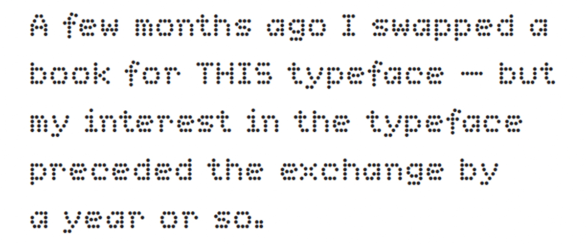
Having wanted the typeface for a while [even trying to sneak it into commissioned work], naturally, I was quite excited. This typeface is called ‘Dot Matrix — Text’, and it was designed by Cornel Windlin in 1999.
To quote Windlin: “I set it as a challenge to myself to create a matrix font that had a grid that is a bit more complex than the usual strict dot matrix grid. The idea was to create a font that had a bit more personality than the usual results of such experiments, and that would be more easily readable.”
• • •
21.
‘New media and new techniques of reproducing the visible word are providing new opportunities for alphabetic communication as well as imposing changes in the design of signs we employ. The reconsideration of our alphabet is, therefore, no longer merely a theoretical exercise but an activity which, on practical grounds, it is today both desirable and opportune to pursue with vigour.’
– Herbert Spencer, The Visible Word, 1969
• • •
22.
In more recent times a budding type-designer’s first typeface is quite likely to be a dot-matrix. This is the case with the Dutch type-designer Martin Majoor for example. A printed receipt with dot matrix characters brought home by his father one evening—showing the results of his evening’s chess game—fascinated Majoor with the realisation that, by using only a few dots, you could produce a letter. Not being allowed, after asking, to have the receipt from his father (it was for his personal archive), young Martin borrowed the receipt and traced it letter for letter—compiling his first digital typeface.
• • •
23.
'You know what I love? Beautiful type. Gorgeous books, letterpress, ink and the swish of the pen. The flow of thought communicated through the way words are placed on a page, and the artistry and design intent hidden behind a functional form. You know what I work with? Yep, that’s right. Grids and dots. LCD displays and CRT monitors. ’
– Unknown source
• • •
24.
Dot dash
dot dash
dot dash
dot dash
dot dash
dot dash, dip flash
dip flash
dip flash
dip flash
dip flash
dip flash, don’t crash
don’t crash
don’t crash
don’t crash
don’t crash
don’t crash.
– Wire, ‘Dot Dash’, from On Returning, 1979
• • •
25.
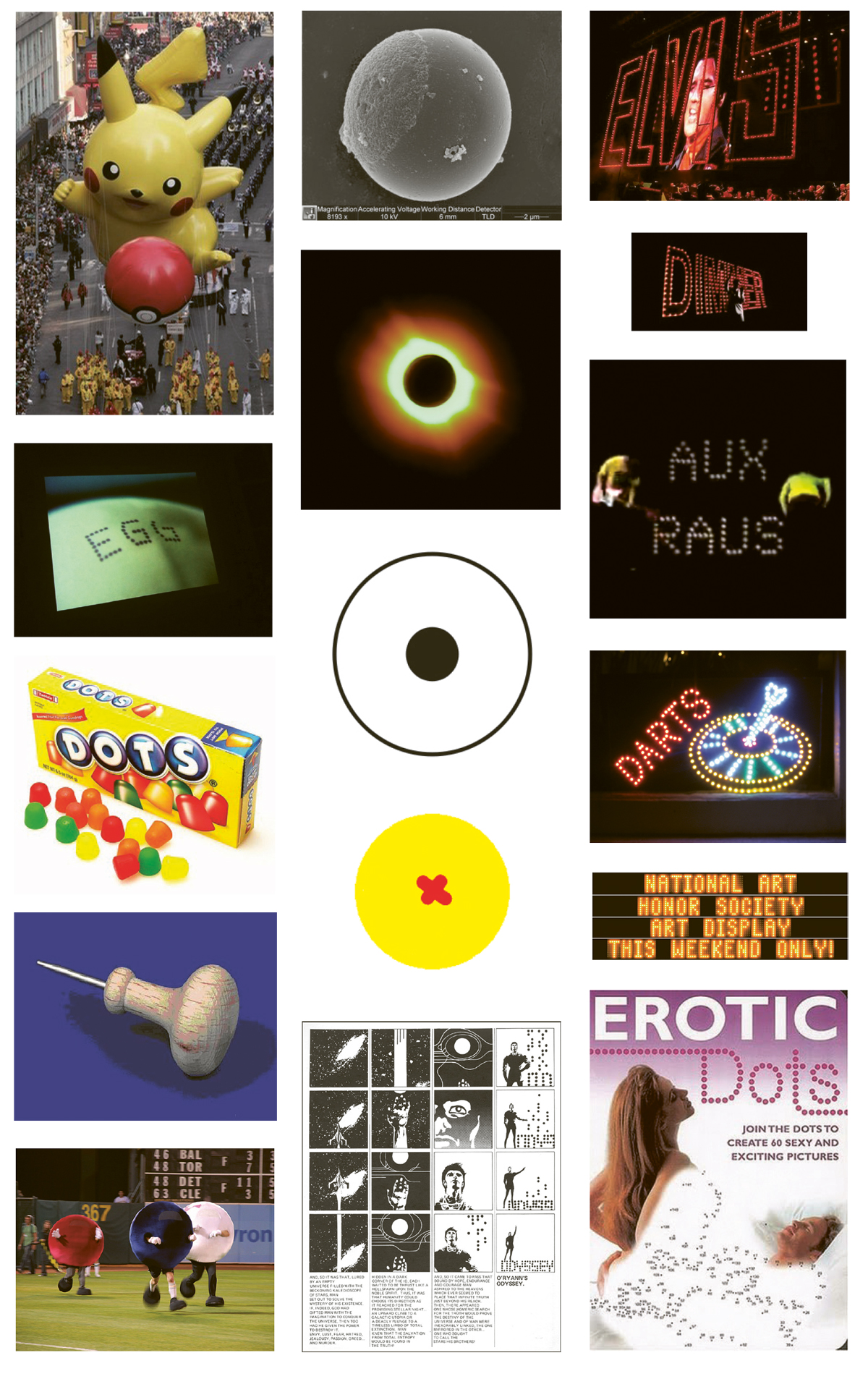
These letters might have also been produced by fire, or by stones placed in an intelligible way on the ground: ‘S.O.S.’ !
Either a planet,
a sun or a star,
a stain,
the button,
the wheel,
a coin,
the doughnut’s hole,
remnants of a push-pin,
pupil of an eye,
a row of boulders,
a ball,
a drop of blood,
a particle,
a pimple,
a pellet,
a frightened caterpillar or shielded armadillo,
etc.
• • •
26.
‘What a spectacle, on some clear, dark nightfall, from the edge of Hampstead Hill, when in a moment, in the twinkling of an eye, the design of the monstrous city flashes into vision—a glittering hieroglyph many square miles in extent; and when, to borrow and debase an image, all the evening streetlamps burst together into song!’
– Robert Louis Stevenson, ‘A Plea for Gaslamps’, in Virginibus Puerisque, c. 1881
• • •
27.
‘Distances between points, relative distances represent a minimal fact which does not carry meaning within itself. It is unpretentious material, but one may do a lot with it as we have seen. The meaningful portrait is built of the most meaningless of elements. [...] I use the least associative and least meaningful elements I know of—the space between dots. Generally visual images can be conjured by either densely grouping or thinning out of dots. The dots themselves do not refer to an outside reality. As a designer I am fascinated by the similarity of some of the dots with a particular thing, thus generating a specific meaning.’
– Peter Struycken
• • •
28.
On Staten Island at the Hudson-Fulton pageant in New York [1909] a thousand lightbulbs spelled out WELCOME in 20-foot-high letters. The Hudson-Fulton Celebration, as well as being a representation of the discovery of America and its industrial development, gave the public a spectacular taste of what an electrified landscape might be like.
– Extracted from chapters 6 and 7, David E. Nye, American Technological Sublime, 1994, MIT Press
• • •
29.
Presided-over by them. Those dirty dots. Frenetic electricity from behind with light projecting your own [standard] message. In this place it says: ‘WEALTH TIES QUAKE VICTIMS TO CHCH’; with no exclamation, it just loops.
So.
What does it say on your street?
• • •
30.
‘Digital face: shadows that flicker in halves of 0.02 seconds’
– Max Bruinsma, ‘The Reader’s Terms’, 1998
• • •
31.
When thinking about these dot characters, certain economies of form—and the reproduction of that form—are visible. Compared to the varied ‘skeleton’ structures normally required for alphabetic characters—those most familiar to us in daily writing and reading—a shift and an alternative in the construction of dot characters is apparent. This shifting suggests substitute opportunities for the making and viewing of these characters and there-fore slightly adjusts the transmission and reception of their messages.
Concerning typefaces: A dot character’s assembly usually relies on the duplication of a single form within a grid structure—a structure that is either created or prescribed . This assembly, when compared to skeleton characters—and the embellishments that they are subjected to when formed into typefaces [a consequence of reference, expression, aesthetics, decoration, function, intention and exclusivity]—means the formal connotations intrinsic to dot characters are greatly minimised. The dots simply concatenate to uniform characters.
Further, as carriers and transmitters of information, dot characters might wander closer in meaning and intention to something like an ideogram—symbolising the idea of a thing without indicating the sounds used to say it. This is because the production and reception of dot characters are bound up in relatively recent technologies ; they carry a tactility, tangibility and a certain sense of implied abstraction that is as familiar as it is ubiquitous. This familiarity mimics—and, in a strange way, performs—quickly changing ideas and relationships towards reading and writing technology in our daily lives.
Generally, these are the characters that became a conveyance of information or instructions in daily society: Destinations, services, warnings, encouragements, temptations, time and temperature, economic weaponry... implying themselves forthright, dot characters operate without theory—their presence is accepted as an empirical fact.
And yet, over the generations since their introduction into objects and systems, the dot characters are being refined to the point of invisibility to the human eye. To those objects that already exist and continue to show messages up to the present day, like containers turning into repositories, a sensation of ambiguous immateriality becomes bestowed to their characters. Glowing even into the daylight, their uncomplicated, functional, ultra-binary-ness—which goes rudimentarily unnoticed—must affect reading. Reading words constructed of dots is different from reading words that are constructed of lines.
• • •
Reference List
‘A patient waiter is no loser.’ is a growing collection of notes and observations that was first carried out, in an audio presentation format, at ‘Scriptings #8’, organised by Achim Lengerer, Amsterdam, Netherlands, 25.10.2009. Consequently it was re-edited and re-presented at ‘Bold Italic’, organised by Michaël Bussaer, Ghent, Belgium, 4.3.2010 and ‘Different Ground’, curated by Roman Gornitsky, Saint Petersburg, Russia, 11.4.2010.
References, inspirations & thank you:
Amsterdam, Public Library
Bennewith, Mark
Braille, Louis
Brown, Ian
Bruinsma, Max
Brunner, Laurenz
Buchanan, Ruth
Bussaer, Michaël
Elliman, Paul
Fontblog
Frenken, Jo
Hogeschool voor de kunsten, ArtEz
Hyman, Anthony
Internet, the
Kassenaar, Sandra
Lengerer, Achim
Lüthi, Louis
Majoor, Martin
Marmatakis, Vasilis
Moholy-Nagy, Lazlo
Morse, Samuel F. B.
Nougé, Paul
Nye, David E.
Siegel, Arthur
Smith, David
Spencer, Herbert
Stein, Gertrude
Stevenson, Robert Louis
Struycken, Peter
The National Grid
Typeradio.com
Typografie, Werkplaats
Typophile.com
Van der Velden, Daniel
van Eyck Academie, Jan
Visible Language
Wheatstone, Charles
Wikipedia
Willey, Karen
Windlin, Cornel
Wire
Wyn Evans, Cerith