The Aesthetics of Distribution: A Conversation with Bruce Russell – Luke Wood, Bruce Russell
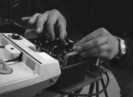
In 1981 the Springbok rugby team’s tour of New Zealand sparked the largest and most violent protests this country has ever seen. Demonstrators were opposed to our ongoing sporting relationship with South Africa’s apartheid regime, and the country was quickly divided as the tour’s supporters rallied around a belief that sports and politics were—or should be—entirely separate. The conflict on the streets however, illustrated more fundamental problems, and in hindsight the events of that winter are seen as a pivotal moment in the nation’s developing identity. Bruce Russell has two police convictions to show for his role as a student leader in protests against the tour that year, and he was part of a small group responsible for turning off the Mt Studholme television transmitter on the day of the Auckland test, killing all South Canterbury coverage after the first 20 minutes.
While the 25th anniversary of that event may seem like a tenuous connection here—an attempt to talk to Bruce about graphic design—it seems to bear some significance within the larger picture of Bruce’s more well known activities in and around music and sound. Any of his various projects can be seen as being either surreptisiously or overtly political, and the spirit of Karl Marx is palpable in his approach the production of a cultural artefact.
Bruce Russell has been described as “one of the most literate polemicists this country has thrown up”,1 and in the introduction to his November 2000 interview Mark Williams suggests that “Bruce Russell has driven a pretty substantial wedge into New Zealand music.”2 Most well known for his part with infamous noise-rock trio The Dead C, Bruce also records as a solo artist and with the improvisational ‘free-noise’ combo A Handful of Dust. His instruments of choice are the electric guitar, cheap electronic devices, and analogue tape.
Working as a publicist for Flying Nun in Christchurch in the mid-1980s, his growing disenchantment with the New Zealand music industry came to a head in 1987 when our last vinyl pressing plant closed and Flying Nun were forced into a manufacturing and distribution deal with a much larger international label. Flying Nun moved to Auckland, and Bruce went in the opposite direction, moving further south (Port Chalmers), and launching the XPRESSWAY label as a “life-boat” for the more marginal, less radio friendly artists who now found themselves cut adrift by Flying Nun.
XPRESSWAY ran until 1993, releasing solely New Zealand artists but developing an enviable international reputation (even being approached by Pavement to release their Slanted And Enchanted album). Bruce eventually ended the label when its increasingly high profile made it difficult to run in its orginal manifestation (no contracts or licensing, and never registered as a company). Roughly two years later Bruce set up Corpus Hermeticum, originally only as a licensing body to release his own work with A Handful of Dust, but then becoming more serious when approached by Thurston Moore (Sonic Youth) to release his first solo album. While XPRESSWAY tended toward song-based recordings of local musicians, Corpus Hermeticum releases have featured more improvisational, experimental, and noise-based recordings by musicians and sound artists from both New Zealand and overseas.
In the liner-notes to his most recent solo album, 21st Century Field Hollers and Prison Songs, Bruce’s writes about a photograph of a young Muddy Waters;
"Dressed in his best suit, he cradled on his knee his most prized possession—not a guitar, but a record, with his name on the label. Muddy knew that any fool could rip up a juke joint with a guitar, but a man who made a record really was someone."
The image evokes the power and/or potential of distribution — the ability of the reproducable artefact to move further and more widely than the artist. And I can’t help but think that the switching off of that television transmitter twenty five years ago might have been important.
A3, 1985
Design by Bruce Russell
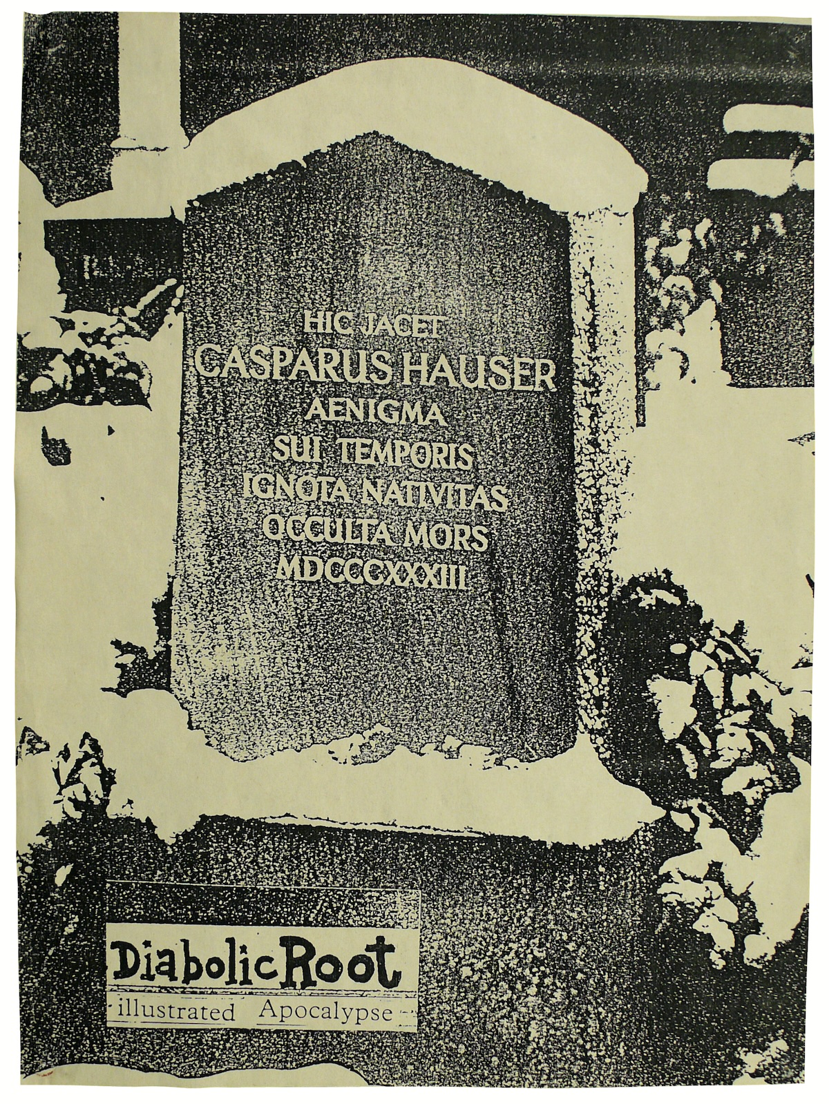
The tombstone of the famous ‘mystery man’ of early nineteenth century Germany. Noble savage or wild boy manquee, randomly murdered or assasinated? Nobody cares much now. Great film by Werner Herzog with piano-playing cameo by Florian Fricke of Popol Vuh. Another example of vain erudition, but feel the quality of the xeroxing... Publicity poster for a cassette magazine, catalogue number DR501. (BR)
A3, 1989
Design by Bruce Russell
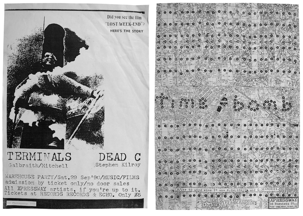
Time Bomb 7” release poster (right)
A3, 1989
Design by Alastair Galbraith
The heyday of the xerox poster, these reference Asger Jorn’s psychogeographical maps of Paris and El Lissitsky’s photo-montages. ‘You gotta have a montage...’ (BR)
A3, 1990
Design by Bruce Russell
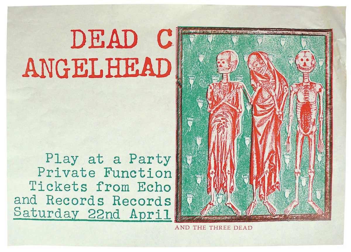
Medieval altar-screen panel reproduced in two colour xerox using primitive craft-knife cutout ‘separations’. The left hand panel contained ‘The Three Living...’ (BR)
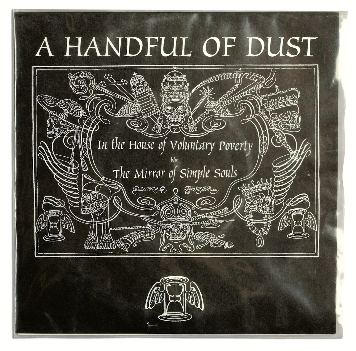
In The House Of Voluntary Poverty b/w The Mirror Of Simple Souls
Siltbreeze SB038
7", 1994
Edition of 500
Design by Bruce Russell
The wryness involved in the titling of this one is more obvious, surely? Released on Siltbreeze, the original calligraphic demonstration was reversed out and new lettering inserted in the lozenge. (BR)
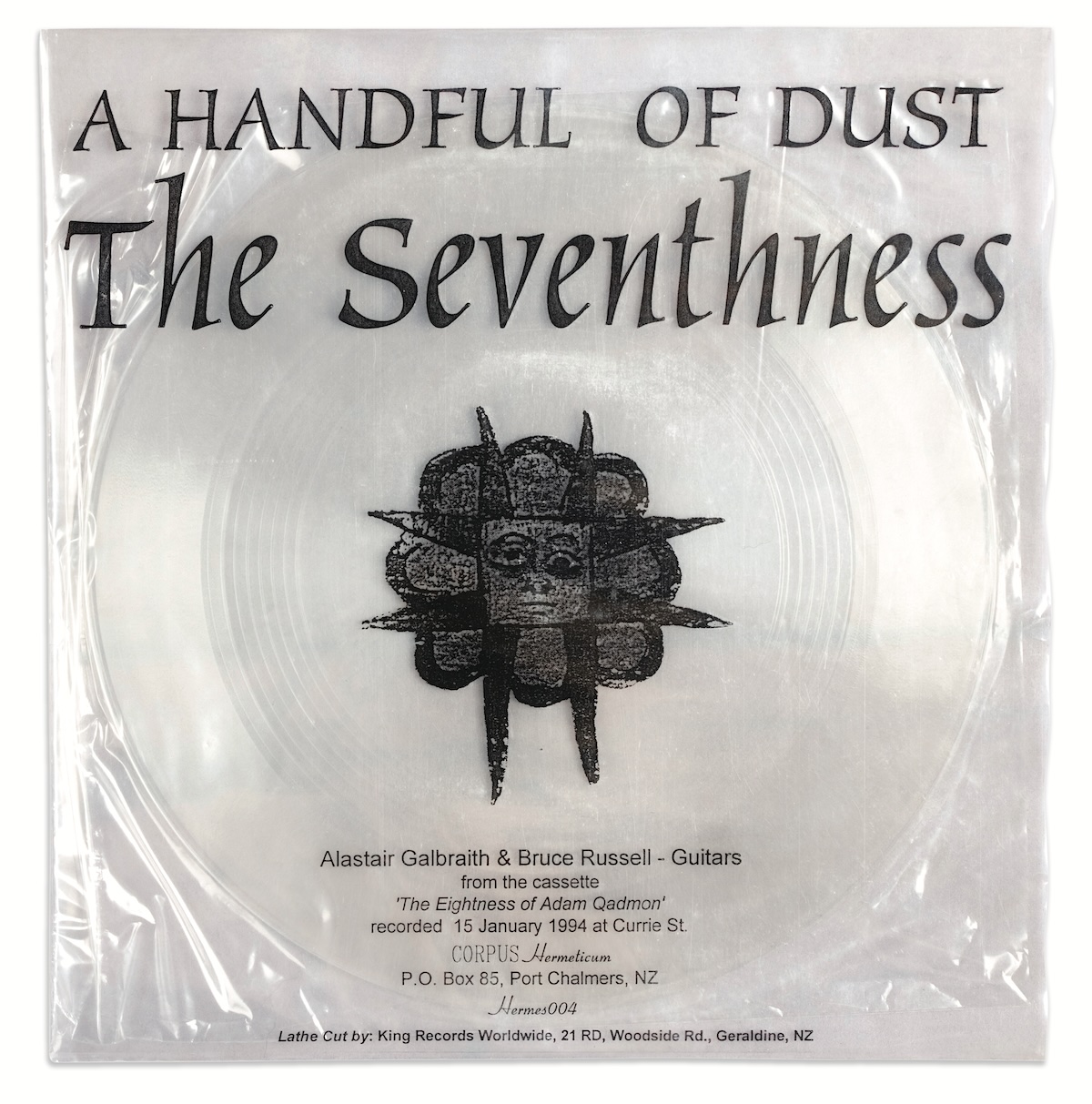
The Seventhness
Hermes004
7", Mar 1994
Edition of 25
Design by Bruce Russell
Deriving its title from complex Kaballistic theory regarding a celestial and an earthly Adam as cosmological twins, the cover of the first h/corp lathe-cut polycarbonate disc was based on the fabulous transparent first LP by Faust, on German Polydor. Never short of a conceptual conceit. (BR)
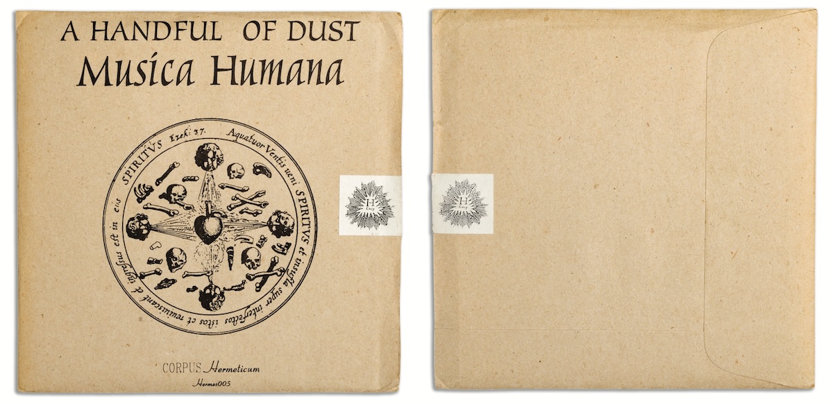
Musica Humana
Hermes005
CD, Oct 1994
Edition of 1000
Design by Bruce Russell
The original CD package involved a manila outer envelope around a square booklet containing the CD. Sealing them with a purpose-printed sticker was the ultimate touch, also used on non-transparent h/corp singles. (BR)
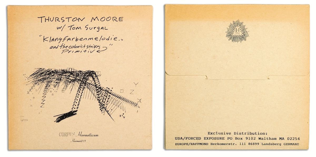
Klangfarbenmelodie... and the Colorist Strikes Primitiv
Hermes011
CD, Aug 1995
Edition of 4300
Design by Thurston Moore
The image is from a graphic score by Cornelius Cardew. When Thurston proudly gave one of these to guitar-improv legend Derek Bailey, the Yorkshireman merely commented: ‘It’s oopside down’. Bugger. This square pack format was based on a tile-saw blade box found on the counter of a tile shop. The saw blades are 5 inches in diameter. Later refined into the rectangular version with spine titles. (BR)
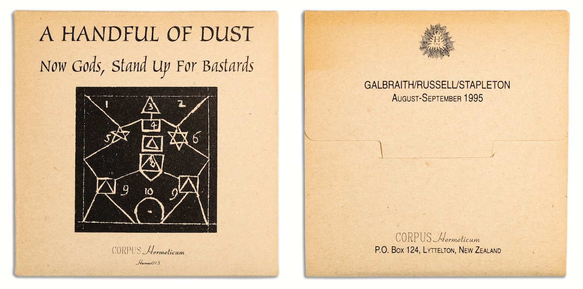
Now Gods, Stand Up for Bastards
Hermes013
CD, April 1996
Edition of 450
Design by Bruce Russell
The title is a line from King Lear signalling the start of Edmund’s rebellion against all moral order. This kind of swagger often passes under the critical radar, like calling a picture-disc single ‘Authority Over All the Signs of the Earth’. Presumably semioticians everywhere were sharply indrawing their breath at our sheer hubris, but most people seemed to pass it off with a bored ‘whatever...’. The cover image was a visual mnemonic by Giordano Bruno, who sought to reintroduce the worship of ancient Egyptian deities to renaissance Italy. There is a level on which this makes sense, but you have to hold your breath for a long time to reach it. (BR)
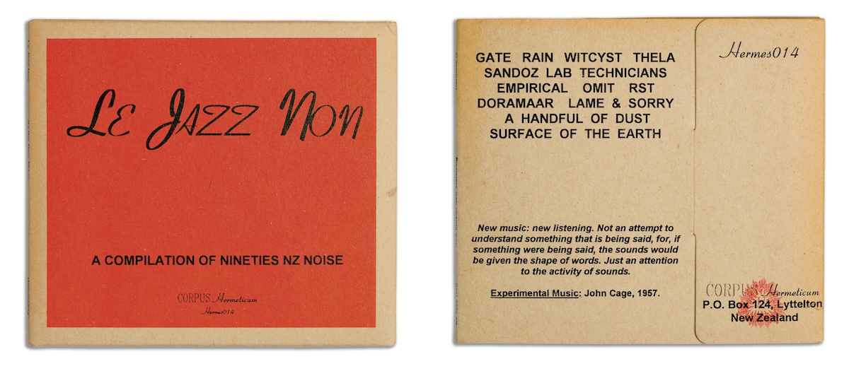
Le Jazz Non
Hermes014
CD, Jul 1996
Edition of 1200
Design by Bruce Russell
The supremely cheesy Microsoft ‘Coronet’ font of the title was used for the catalogue numbers on every label release. This was its only cover appearance. The use of manila card was a label signature from the first release. This 1995 compilation proved slightly epoch-defining in later context. This was the first CD cover to appear in the ‘final’ folding design, with top and side spine titles, an innovation in marketing still not adopted by any other label. (BR)
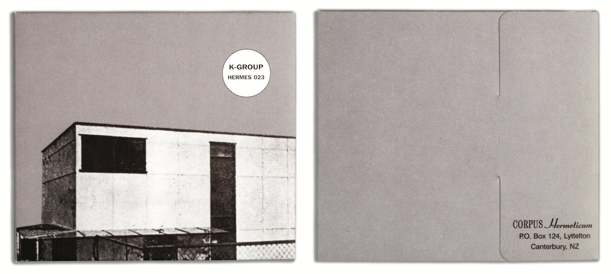
s/t
Hermes 023
CD, Oct 1997
Edition of 500
Design by Paul Toohey
The starkly functional architectural theme in monochrome totally matched the finely polished drone textures of the recording. (BR)
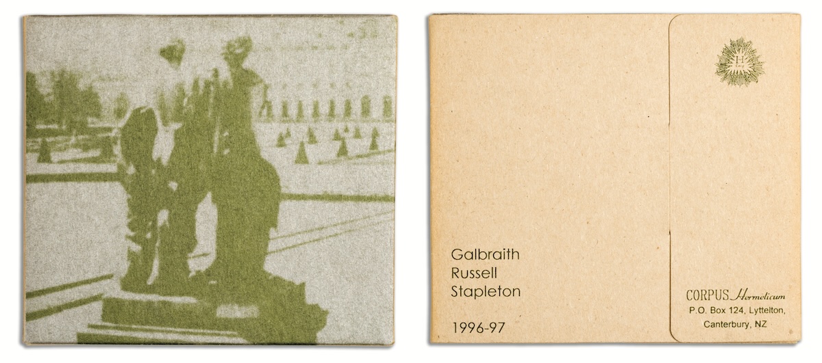
Jerusalem, Street of Graves
Hermes029
CD, Dec 1998
Edition of 500
Design by Bruce Russell
The silver/olive green combination worked a treat. Cover image is a still from ‘L’Annee Derniere a Marienbad’, and the album title is a Say Yes To Apes reference. Multi-level allusivity has always been an h/corp signature. (BR)
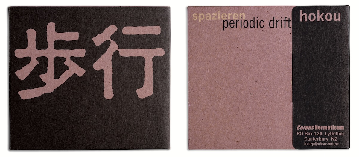
Hokou/Periodic Drift/Spazieren
Hermes036
CD, Mar 2001
Edition of 700
Design by Bruce Russell
The violet colour was chosen by the colour oracle, Kate McRae, ‘label widow’. Another strict typography job, enlivened by the tri-lingual approach—everything was repeated in Japanese, English and Swiss German, reflecting the ethnic mix of group and label. The ideographs say ‘Hokou’—enigmatically translated as ‘Periodic Drift’. Who knows what that means? (BR)
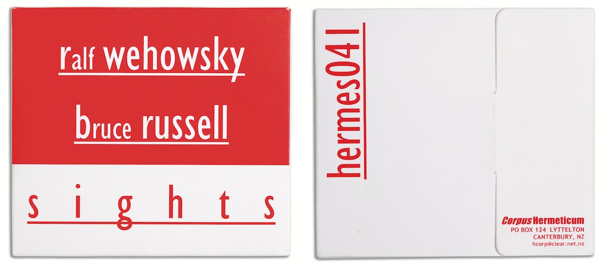
Sights
Hermes04
CD, Feb 2004
Edition of 500
Design by Bruce Russell
Last h/corp release, the colour scheme was inpired by the Paul Bley Quintet LP Barrage on ESP. ESP was similarly mean to h/corp on their printing budgets — this looks wild but costs nothing. Having got an unwilling Wehowsky to agree to a ‘band photo’ inside the cover, the corollary was strict typography on the outside. (BR)
I’ve read various bits and pieces of texts—either about you, or by you—that all work together to describe, with some sort of precision, your practice as a musician and as an artist. But I wanted to talk to you about your undocumented, but presumably triangularly related, practice as a graphic designer. I’m not sure, but I think I remember you mentioning something about setting up your own record label so you could design your own covers—was that right? I’m wondering if you’d always been interested in the design of album covers, or whether that evolved as more of a by-product to some initial interest in playing music and making noise?
Doesn’t every kid want to start a record label so they can design covers? When I started my first label (and I’d done a few cassettes before that but cassette covers are sooo unsatisfactory), I’d been a serious record collector for about 10 years. I’d spent so long looking at covers. In the pre-internet era, record covers were the entire sum of the information we had on many artists. No one was writing features about The Pop Group, so studying their record covers and labels was about all we could do. I spent a lot of time ‘triangulating’ from one record to another, seeing where the same names cropped up, working out who recorded what where. This was why The Fall’s album covers were so coded, I’m sure, because that’s what fans did, they decoded them. Of course the other thing I designed was gig posters. If you did a gig and twenty people came, and we’d done two or three different posters for it, doesn’t that say something about an obsession with graphic design also? I collected them too, my collection is at the Hocken Library. Posters were practice for records as well. Certainly I’d absorbed some important lessons about house styles by the time we started XPRESSWAY in 1988, and I was quite clear on the parameters I wanted to work with, all the record covers were monochrome, typewriter fonts and ‘ransom note’ lettering were almost ubiquitous, we had a logo. I wanted people to know who was releasing them, and where, and how to contact the label. Ditto if we licensed something and designed the cover, as we always aimed to do. The point was establishing an international network of communication with other labels and artists. I didn’t have a computer till 1996, so no email, no MySpace. Let’s not get started on why MySpace is a design atrocity!
I guess living in pre-internet New Zealand, and being interested in anything vaguely outside of the mainstream, meant always obsessing over those marginal notes on things. I used to really like that potential of the album though, or more precisely perhaps the collection—the recordings, the liner notes, the images, and the design—being a sort of rhizomatic index to the world that mattered. That’s actually how I first found out there was a thing called ‘graphic design’—on the back of a record cover—which seems to be a common story. Anyway, I’m presuming you would have been taking notice of who’d designed certain covers, and I’m wondering if you were interested in any designers in particular? Obviously it was common for punk bands at the time to make their own covers, but where there was a designer referenced would you follow that up, or store them somewhere in your memory/imagination?
Internationally I was well aware of Peter Saville and Neville Brody, they were the big names. I’ve already mentioned Mark E. Smith, the Gang of Four did some good things deconstructing covers, instructing the designer as part of the design... The Blue Orchids Agents of Change EP and the Fire Engines LP both came in plastic bags that were printed as part of the design. I can’t recall who did these, but they impressed me. Ronnie van Hout’s work on early Flying Nun records and posters was very impressive and inspirational to me, and a little later Stuart Page did some good stuff, often both of them would screen print entire editions. Ronnie was clearly referencing the Warhol aesthetic, but he did it so well.
I think a retrospective of that stuff would be really revealing. There was an exhibition at Te Papa a while back, but it was ‘curated’ by people who seemed to have no real idea what was good, it was like throwing shit at a wall to see what stuck. In some ways I was in sympathy with the DIY aesthetic, but the downside was evident, often people with no taste whatsoever got to design covers. When I started putting stuff out I was quite fixated on having some quality control. I’d discuss with artists, but often the execution was in my hands, which I naturally felt was the best way. I could single out many examples of great records with crap covers, I think the Snapper EP was a good example. It looked vile, and wasn’t even cheap, and did nothing to ‘sell’ the record.
I’m interested to know more about how you evaluate what’s a good cover? I’m sort of surprised that you would care whether it ‘sold’ the record or not. You often see/hear graphic design described as an exercise in translation, and I’m wondering if you’re interested in that—the translation of the way something sounds into the way it is presented visually? And in fact there’s a much bigger question here that I really want to ask. You obviously approach ‘music’ in quite a particular way—coming at it backwards you might say. By which I mean you’re not interested in proficiency in the traditional sense, in virtuosity. In fact you could say you’ve become quite proficient at avoiding that. I was surprised to hear that you’ve managed to avoid ever learning to play the guitar properly, and in your ‘Free Noise Manifesto’ you state that “‘notes’ don’t matter, the playing and the elapsed time do.” So of course I wonder how, or if, this anarchic and disruptive attitude towards familiarity manifests itself in the visual side of what you do with texts, images, and materials?
Not really. I’m pretty straight in design terms. I don’t mind if things look unusual, but I like them to be functional, and the functions include being aesthetically pleasing, protecting the contents and conveying information. So you got me, I’m inconsistent and a secret straight. Well, not that straight, actually. I guess my photography tends to reflect my audio aesthetic, often the images are skewed, grainy, or just meaningless. My favourite tool is the fun camera, so that matches my sound approach, using the cheapest or most outmoded technology available and putting it to the service of artistic expression in a way it usually isn’t—like recording a single in a cupboard, or on a dictaphone. I guess my approach to design is very unreflective, I just make it look ‘good’ to me, and I like clean lines, clear fonts, and balanced grids. I’m full of contradictions.
But there’s an obvious connection there in terms of technology or tools isn’t there—weren’t you telling me you’ve designed a lot of this stuff in Microsoft Word, or even Notepad software? I know improvisation and chance are at the core of your practice as a musician, but I like that you don’t try to force that into the design of your own covers. I fooled around a bit last year trying to figure out how to approach design in a more improvisational way, until eventually I thought (realised?) that ‘to design’ was ‘to plan’, and that perhaps I was flogging a dead horse. Anyway, I don’t know—perhaps I’m looking too hard—but there seems to be some sort of obvious resonance between these covers and their contents. I’m thinking about the Handful Of Dust ones now, particularly the first two. Their not fitting into my CD rack seems to be an obvious place to start, but more importantly there’s the alchemical images and the texts—the voodoo, and the explanations that ask more questions than they answer. You mentioned the heavily coded album covers of The Fall, and yours tend to be densely referential too. Language and images seem to me to be just as important a part of any of these productions as the sound recordings?
All this is true. The mock academic journals that accompanied the early hcorp CDs were laid out in Write, which used to come with Windows 3.1, slightly more sophisticated than Notepad. The CD covers were all laid out on card with craftknives and PVA, I never did the digital pre-press thing. Most recently I designed the booklet for my most recent solo album with Word, including inserting all the photographs, then made a PDF and gave it to the printer on disc. Not sure how big a page I can lay out that way! The levels of allusion are very dense. It’s all about getting a lot out of a little. I studied ‘The Waste Land’ by T S Eliot at school and was fascinated by the way you could unpack the text with footnotes, so I’ve since done albums the same way. My favourite is From a Soundtrack to the ‘Anabase’ of St. John-Perse by A Handful of Dust. All the pieces are titled from the poem, and several feature me reciting texts to musical accompaniment. The artwork included a photo of the oldest Egyptian pyramid and historic stills from Tibetan temples taken by early European visitors—I have a collection of Tibetan travellers’ accounts. After the first couple of hcorp CDs were non-standard size, I started doing standard size, but still in card folders, so they can be stored alongside normal CDs. This seems to amplify their interrogation of standard package design. I haven’t tried to make design improvisational, other than to base many designs around semi-accidental photographic things that have come from my fun camera experiments.
I spent about four years researching neo-Platonism, alchemy and Paracelsian medicine, Rosicrucianism, Swedenborgianism, Gnostic gospels, Kaballah—and pouring that into CD covers. I think I easily earned another masters from all that, I have boxes of notes, xeroxed articles. If my doctorate gets going I’ll find a way to feed that in. Mark E. Smith has also absorbed a lot of that from the modern occult tradition, and sci-fi. Martin Bramah of the Blue Orchids (now there’s a band!) wrote stacks of great songs derived from the writings of Gurdjieff, apparently—great songs, but I can’t swear to the Gurdjieff, personally. I don’t do lyrics, but some people can pack a lot into a little, Alastair Galbraith for one: “Grandma said ‘This’ll boil yer blood’, as the pipes began to skirl’’—magic!
I’ve been wondering where did that interest in alchemy, and the occult come from? Apart from the appropriated imagery it seems to be there in a lot of your recordings too—some of which I have to admit I find quite disturbing, and might make excellent sci-fi horror soundtracks. I’m also reminded of the last Dead C gig I saw where you were swinging your guitar by the head and catching it with your foot just before it hit the floor—trance-like, over and over again. It was quite shamanistic, and the whole performance had an air of hoodoo or some sort of dark magic about it.
In fact, from studying the history of science, and realising that for a very long time there was no difference between science and the occult. Magic and natural science were the same thing until the 17th century at least. Magic is simply science that has been ‘ruled out’, in the sense of being struck from the record. In the way that the Gospel of Thomas was Christian until some Council ‘ruled it out’ in about 350 AD. It’s a different Christianity that has that kind of gospel in it. I don’t subscribe to the occult at all, but I’m interested in the history of knowledge, what we think we know and how we came to know it. Much of this knowledge supports views of the cosmos that I oppose, and much of that also feeds into conventional musical theory, notions of harmony etc. Tony Conrad also writes in this vein, by coincidence.
The trance thing is about improvisation, ‘letting go’ of control, letting ‘it’ flow. The Yoruba have a concept called ‘itutu’, which means ‘alignment with an inner divinity’, a concept which is associated with the sensation of ‘coolness’. I think that’s where that goes to. I distrust ‘cleverness’ in the same way I distrust words. Without words you can’t lie. Without premeditation you can’t be ‘clever’, you can only be true to the moment. True shamanism is a collective state entered into on behalf of, and for the purposes of, a community—without the social purpose it can’t be shamanistic. However, what can happen in an improvised group situation can be equally mysterious, certainly things do happen which wouldn’t happen in any other way, and at times the effect can, I suspect, be quite disturbing.
I’ve been thinking about what you said about not writing lyrics. I guess I was surprised because I’ve been reading a lot of other writing that you have done... much of it from the mock academic journal — Logopandocy: The Journal of Vain Erudition — that accompanies the Handful Of Dust CDs. You seem to be quite comfortable writing, and you have a particular style — also sort of ‘mock academic’. Initially — due to my own (current) anxieties — I’m interested to know about your writing because it seems simultaneously didactic and self-reflective. Like you have something really important to say to other people, but you’re only figuring out what it is by writing it down in the first place?
Certainly working it out in practice is central to my approach, and that’s what I’m doing. But it is simultaneously working it out and thinking it out, the two cannot be separated. I love writing, but I distrust my ‘creative’ writing, I don’t think I’m honest enough to do it well. I like to play games with language, but I also feel that the worth of real art work transcends that, and that’s what I try to do. I also distrust simple answers, and in an aesthetic sense I think real art has more than one meaning, so I try to keep my work open to more than one simple interpretation, which is often helped by the sometimes contradictory things I say about it. I suspect my recording two blues albums in the last couple of years is part of that. It confounds people’s expectations nicely.
I’m interested in how all these different things you do—performance, recording, writing, designing—go together. Actually I was talking to Dylan (who I interviewed for #1) and mentioned to him that I was trying to avoid talking to you about music and to keep focusing on graphic design. He pointed out how silly that sounded, and I remembered what I thought was good about the interview with him was how the discussion about gear (his amplifier for example) did a good job of illuminating his approach to design. More recently I was reading an interview with English designer/writer Richard Hollis in which he mentions his initial attraction to graphic design being to do with “the idea of not doing anything in particular, or of ‘total’ design”. He points out that work for a theatre company had meant that he could “lay out the programme, design and paint the sets, and have a walk-on part”. So what I’m getting at here is your tendency to combine all these different sorts of effort into the one package. How important is that to you? Do you think these different ways of working inform or modify one another, so that your practice is actually all these things working together? Or would you still describe your practice as being centrally about sound/music... and these other things are more marginal by-products of that?
I do firmly believe that running a record label, for instance, is an example of what Hollis is talking about. The curation/production of music is only one part of it, it also encompasses the graphic work, the organising of benefits and performances, designing posters, building a community. The Dead C has done a lot of trying to create new environments for performances. Our first show was in an independent art space, and other early performances were in art galleries, and later warehouse or ‘loft’ spaces, often with projections. A couple of years ago we did a free show in the Port Chalmers Town Hall as part of an arts festival, people could just come and go as they wanted from the old wooden town hall, while we played for three hours more or less non-stop. That was why we were happy to do the Creation ‘election night’ show, we really wanted to spend election night doing a show, and see who came. It was great.
In the case of XPRESSWAY we also invented new ways of getting paid. Artists who were owed money by Flying Nun would demand stock of their records, which we exported and paid them the money. This kind of guerrilla intervention in the industry was all part of the same creative process. If you’re going to make art and sell it, you need to consider the totality of your exposure to the market and how you’ll manage it. I think Factory Records was very important in that way, they pioneered the commerce as art statement thing in independent label terms I think, the idea that the label’s output included posters, performances, even things—the Hacienda nightclub had a catalogue number, for instance. In the same way we’ve done a series of projects that have come out on different labels, but are numbered as sets, DR503, the first Dead C. album, was one of those. It was a Flying Nun LP (FN092) with a title that was actually a catalogue number in an entirely different series that included a cassette magazine, and a cassette single that came with a magazine. And of course DR503 also has a ‘b’ and a ‘c’ version. I gave a lecture this year at polytech to the rock paper which was on branding and business planning. I tried to explain that doing a good job of selling yourself was legitimate creatively so long as you retain some control of the process, that you can make the promotion a part of the art. All the better if you can get well paid doing it.
I think maybe this is really why I wanted to talk to you in the first place—there are some obvious parallels between your efforts with a record label and what we’re trying to do here with The National Grid. Those ideas about building a community, creating new environments, and inventing new ways of getting paid are central to this project if it’s going to survive. We’re trying to get something going out of a deeply ingrained sense of dissatisfaction with the existing community/environment we find ourselves, and graphic design, to be in. So I wonder when you say ‘guerilla intervention’ do you mean to imply that XPRESSWAY was set up from some sort of disenchantment with the industry as you saw it? What was your relationship with Flying Nun like?
I’m also really interested in this idea that the aesthetics of distribution are part of the project, and Factory Records are a good example although their creative approach to business kind of fucked them in the end didn’t it? Or did it? I guess it depends on how you evaluate success — cultural significance or financial profit. Have you ever made any money out of either of the labels you’ve run? Was that ever the intention? Your talk at the polytech seems to me to fit into an increasingly common theme in tertiary education now — the attitude being that if creativity can’t be commodified then what’s the point? Universities are diverting funds from the humanities to business schools, and students are generally more concerned with the amount of money they’ll be able to earn from their degree. Which is fine I guess, except for that it seems very short-sighted, and art schools seem to be becoming more and more conservative and boring as a result.
My comment about ‘guerrilla intervention’ sure did mean I was and am still disenchanted with the industry. I was also disenchanted with Flying Nun who I felt were pursuing a foolish policy of eliminating the fringe artists who had never cost anything, but contributed mightily to the label’s credibility. That blanding out finally resulted in the label dying for lack of creative oxygen and the irrelevance that brings, as well as the usual tedious money nonsense that this industry brings. And yes, I was trying to suggest that while making money may be a necessity, its a sad ambition. I have made some at times, but certainly never a living. I have also spoken at times publically against the creation of an industry with public money, as opposed to supporting artists with that money. The XPRESSWAY model was the realisation of the Deleuzian slogan—‘Flee! But while fleeing, pick up a weapon!’—we were retreating from involvement with the industry on one level, in order to preserve our artistic existence, but seeking at the same time to fashion a weapon that would enable us to strike back. I suspect that aspects of my polytech lecture were not what was wanted, I certainly did not start from the standpoint that all the students would or should rush to prostitute themselves. In fact, there were complaints from at least one student that I had advocated tax-avoidance strategies. In fact, as I was at pains to point out, I merely described my own experience as a tax-avoider, and as a tax-payer. I did not advocate either, but I did point out that if you were going to avoid tax, you had to find a way to make money without becoming recognised through the media! I also tried to show how artists could use the industry’s requirements to fashion works of art, through for instance, innovative branding and high-concept packaging design—and that to be professional did not mean you had to compromise artistically. I was at pains to explain that The Dead C were always professional but also always refused to do what the ‘common sense’ of the industry dictated. Foucault has made a detailed critique of this ‘common sense’ and how it is a lie propagated to enforce uniformity and obedience. Many 20-somethings have difficulty grasping this, I’ve found. I guess your students are the same.
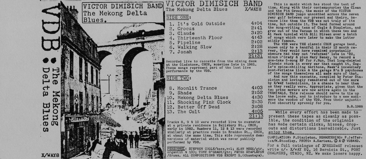
The Mekong Delta Blues
XPRESSWAY X/WAY8
Cassette, 1989
Edition of approx 200 (made to order)
Design by Bruce Russell
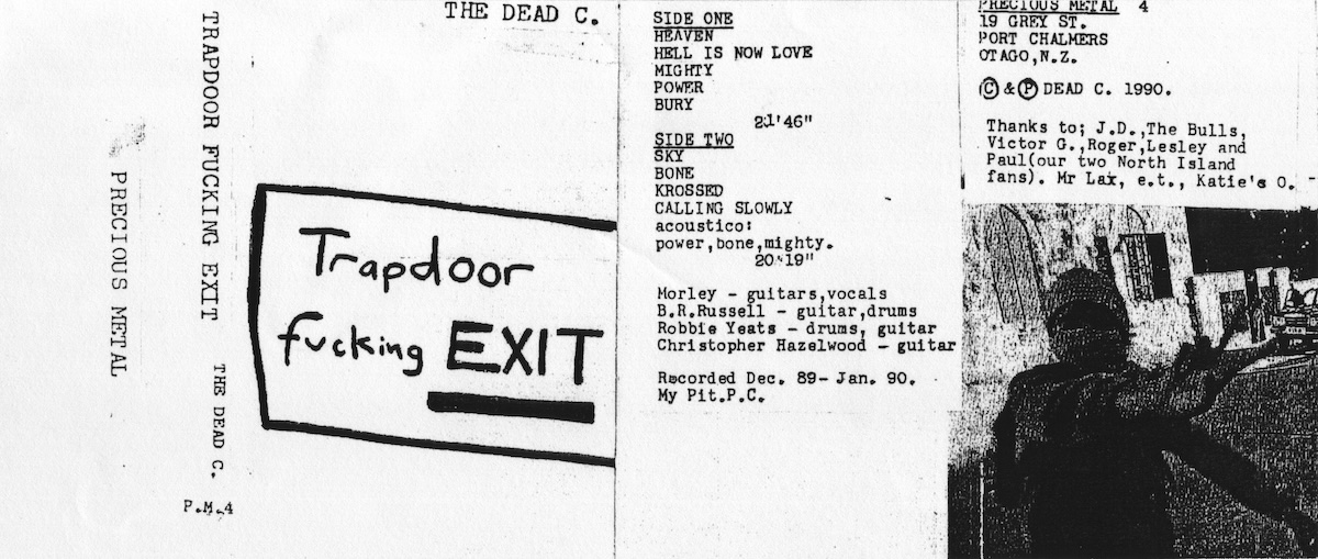
Trapdoor Fucking Exit
Precious Metal PM4
Cassette, 1990. Edition of approx 75
Design by Michael Morley
Xeroxed two to an A4 sheet, the VDB cover features a brilliantly composed shot by Andre Kertesz, who taught Cartier-Bresson to point and click. The original cassette cover for Trapdoor by Michael Morley was in full Xerox colour. Few survive.
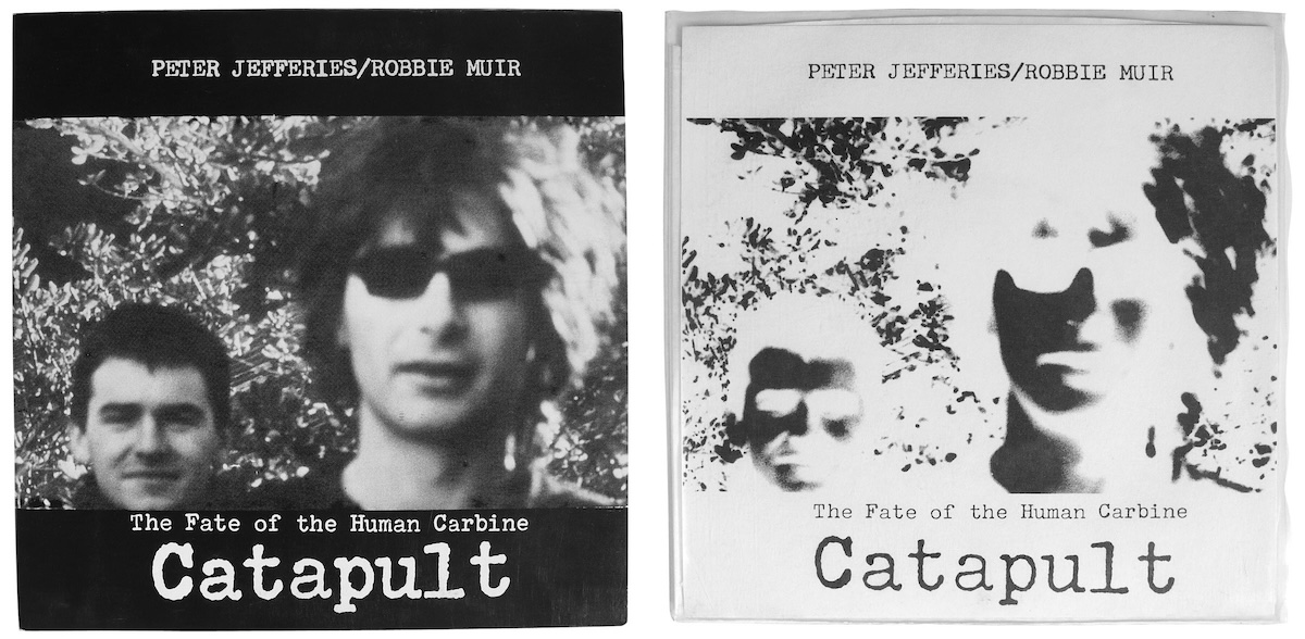
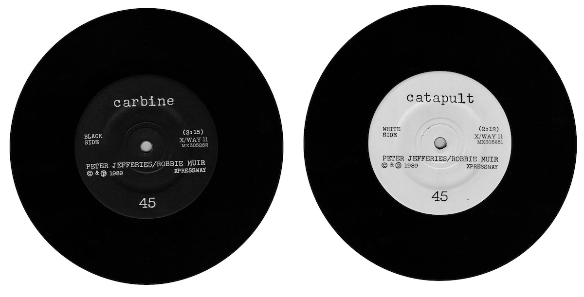
Catapult NZ release (left)
XPRESSWAY X/WAY11
7", 1989
Edition of 500
Design by Peter Jefferies/Bruce Russell
Catapult US release (right)
AJAX016
7", 1990
Edition of 750
Designed by Peter Jefferies and BR, photo by Gerard O’Brien. Peter had the idea of doing a negative version for the US re-issue of the XPRESSWAY single. This is what is known as ‘conceptual rigour’.
Yeah, I mean I’m generalising about art/design students, but it’s interesting to look at what they do now as my memories of being in their shoes are still relatively clear. I’d grown up with some romantic modernist idea about the avant garde, which of course validated our marginal behaviour and sort of discouraged participation with ‘The Industry’. Whereas the students I am involved with now are much less skeptical, and probably quite comfortable with “innovative branding and high-concept packaging design”. You mentioned it earlier, and I can’t help but think about MySpace right now—in terms of industry intervention, enabling new peripheral communities, and making money—isn’t this exactly the revolution someone like you was looking for?
Unfortunately the revolution has been commodified along the way, and is now just another product. I find myspace very very disappointing, in terms of usability and freedom to customise your content, it is a rubbish old-skool web product, as well as hopelessly compromised, so they got it wrong on all counts. My aims have never been analogous with those of a web entrepreneur. It seems many of the claims made by record labels about how ‘their’ artists ‘came up from the streets’ via MySpace are largely marketing cow-piss. Increasingly, or perhaps ‘still’, these outbursts of raw talent are orchestrated by major label marketing ‘street teams’. You still can’t trust anyone over 21 it seems... actually, you can’t trust anyone. There are more genuinely anarcho-syndicalist models of web-based art practice communities out there, I hope. There was an interesting interview with Kim Fowley in the latest Real Groove magazine, where he urged NZ recording artists to do exactly what we did with XPRESSWAY 18 years ago. Of course it is still a good strategy, the sad thing is there are still so many people who don’t realise it.
In that interview Fowley sort of dismisses that rather pervasive feeling that we need to get out of New Zealand to be recognised or successful or something like that. “Try to do it from down there. Make noises and send the noises or the pictures or the noises and the pictures to the other side of the planet from New Zealand...” — which is obviously what you’ve been doing all these years, and seems to apply to a lot more than music. More pertinent/relevant to the XPRESSWAY example perhaps is his comment that “if everyone at home hates you, study the overseas market and learn how to use courier mail, learn how to use sound files or learn how to use snail mail or sea mail. Put a manuscript in a bottle—send it out.”
You’ve talked about this before—the idea that the industry is hierarchical and that generally the plan is to work your way up, but that you were more interested in working your way around. Or across — “you just ignore everything that’s happening further up that chain and go straight across to people in the same position overseas.” You’ve also pointed out how important fanzines were in enabling you to do this, in terms of locating and tapping into an international network of like-minds. In fact you said that “the fanzine was the internet of the steam age.” Which brings me back to Fowley—“How do you study the world? Well the first thing you do is go on MySpace or you go on YouTube.” So on the one hand there’s that ‘finding-out’, and then there’s the ‘getting-it-out-there’. People always ask us why we don’t just do The National Grid as an online thing, and so my question here is sort of about whether you think there’s anything inherently better (more engaging/attractive?) about the more artefact-based ‘fanzine/post’ model, than the less tangible ‘upload/download’ model?
There are two things here, the research and communication—and the distributing of the work. I still think distributing the work is better done by means of a real object, a magazine, a compact disc. Ultimately a download is an OK marketing tool, but a crap artwork. There’s so much you can’t convey on an aesthetic level through a download. Simply because files are so mutable, your appreciation of the ‘work’ can be distorted by a system setting, or a hardware limitation on the receiving computer. Some artworks may be designed so this doesn’t matter, but I care about sound quality and picture quality—it doesn’t always have to be the best, but it has to be the way I conceived it—not at some quite random level of quality that varies from one computer to the next. But as a means of communication and research, the internet is hard to beat. But I just got sent a couple of CDs in the mail today that made me want to be on the label, they’re so cool—and that could never be conveyed by an email. So I’m always going to be a digital immigrant. I’m not at home in the medium, I’m just visiting. Digital natives own the future, until the power gives out.
Radiation b/w Four Letters
Hermes008, 7", July1995
Edition of 300
Design by Bruce Russell
Specially die-cut silver on black folding wing-wang. Another excuse for sealing with a sticker. Unopened ones fetch a premium price.
Footnotes
From http://www.nzepc.auckland.ac.nz/features/dunedin/russell.asp ↵
Entire interview is at http://www.furious.com/perfect/deadc.html ↵