Beautiful, Boring Postcards – Steve Kerr
Waikato Souvenir Distributors, Amba Graphics, Parnell
Looking through British photographer Martin Parr’s Boring Postcards books, the title (a term which Parr coined, or at least popularised) seems entirely appropriate. Nevertheless, there is a paradox inherent in it: to publish a popular art book called Boring Postcards is to beg the question: what is it that makes boring postcards so interesting?
Even a cursory glance at the postcards themselves reveals at least part of the answer. The images convey something essential about the people and places they portray. Reviewing Parr’s books in Artforum, Luc Sante observed distinctive, nation-specific, types of dullness: staid British self-consciousness, brash American self-belief. Beyond their obvious kitsch appeal, boring postcards have stories to tell about notions of national identity.
It should be no surprise, then, that New Zealand boring postcards have their own unique character, reflecting the country’s post-war experience and offering visually rich representations of aspects of (Pakeha) identity building. The present article examines post-war New Zealand colour postcards, collected via non-systematic junk store purchases by the author and friends.
Gladys M. Goodall, Felicity Card Co. Ltd. / Whitcoulls Ltd.
’Pictorial Publications Ltd., Hastings
Full colour photographic postcards became widely available in New Zealand in the late 1950s and early 1960s. A number of different firms produced them, from small specialists such as Oamaru’s Fotocentre / Colourview and Pictorial Publications in Hastings, to major national publishing houses such as Whitcombe and Tombs (later Whitcoulls), and A.H. & A.W. Reed. Each of these firms commissioned photographers to supply images to be printed and distributed. This work provided an income for a large number of photographers, who travelled the country capturing points of interest, beauty, and local pride for a mobile, largely middle-class, internal tourist market. One of the most important and prolific of these photographers, Gladys Goodall, was also the only woman among them.
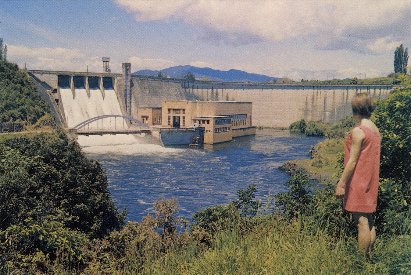
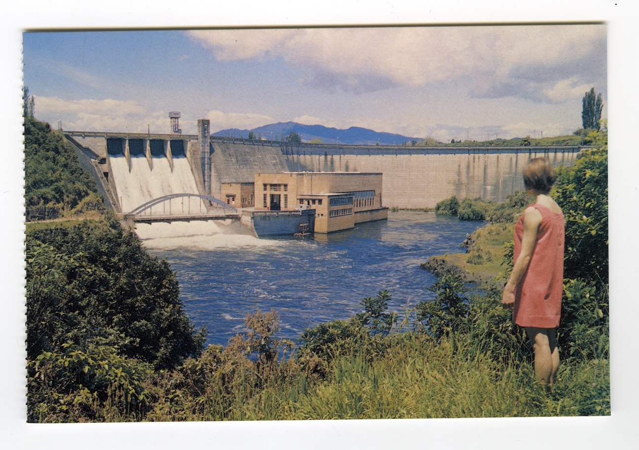
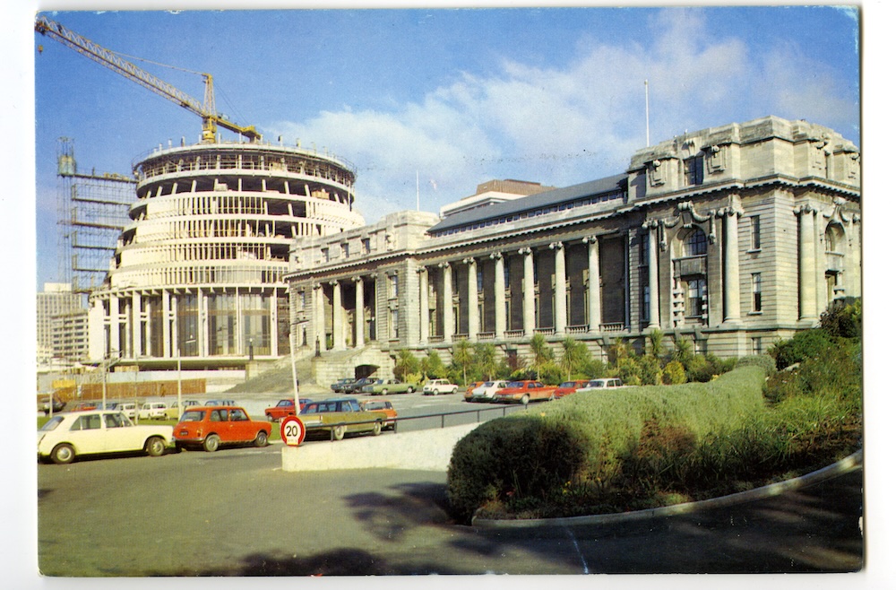
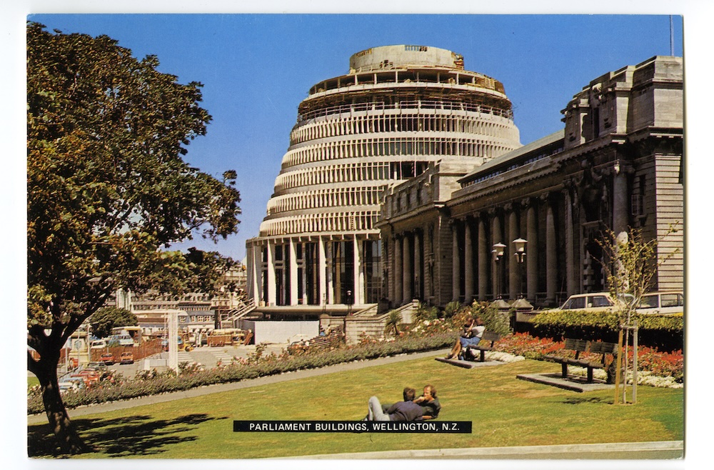
Postcard photographers were required to rephotograph each location every few years, to supply up-to-date images to their publisher. Goodall: “You had to re-photograph places when they changed. Wellington was changing every month, we’d get one postcard printed and it’d be out of date in no time. That’s why mine were selling so well, because all the new things were in them”. Sure enough, cards (fig. 1 and fig. 2) show Wellington’s Beehive in various states of completion.
Behind each photograph was a surprisingly complex tangle of artistic considerations and business imperatives. Goodall describes her basic modus operandi: “I always went to the people who sold postcards in each town and said, what do tourists ask for in this area? I never took a photo until I’d spoken to the people who were going to sell them. There’s no point in taking the most beautiful photograph in the world if it won’t sell”. Thus, each image represents a delicate compromise on the part of the photographer, a need to negotiate a balance between what their publisher would accept, what the retailer could sell, and (perhaps lastly) their own preferences.
Despite this complex balance, in aesthetic terms, the works seem purely functional: the images are completely, almost crudely, literal. There is little sense of the image maker commenting on or critiquing the content of the photograph in a sophisticated way, any further than trying to portray a location in as sunny and as positive a way as possible, or, as Goodall puts it, as ‘pictorial’ a way as possible. The idea of ‘pictorialism’ echoes New Zealand’s long-established self-image as a scenic paradise, a place to look at.
Thus, as widely circulated, inexpensive texts about and conveyers of identity, boring postcards reflected and reinforced affluent post-war New Zealand’s various ideas of itself. Not only as a place of great natural beauty, but also a model of colonial race relations, a progressive industrial economy, an egalitarian suburban paradise, and a modern agricultural powerhouse. In various ways, their particular aesthetic style worked to enhance this function.
Fotocentre / Colourview Ltd., Oamaru
Gladys M. Goodall, Felicity Card Co. Ltd. / Whitcombe and Tombs Ltd.
Gladys M. Goodall, Fourcolour Productions Ltd., Auckland
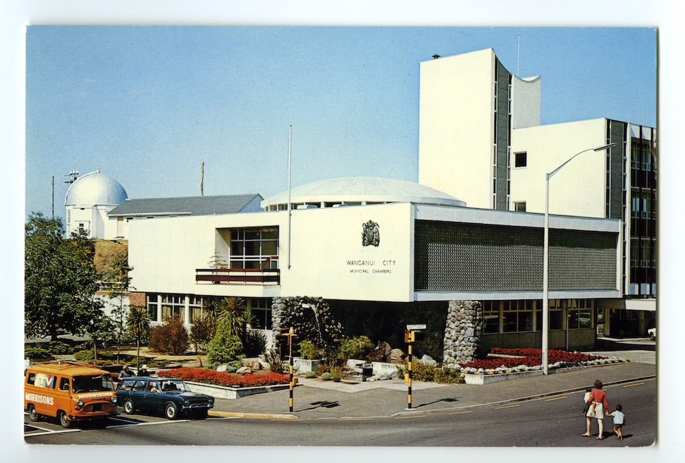
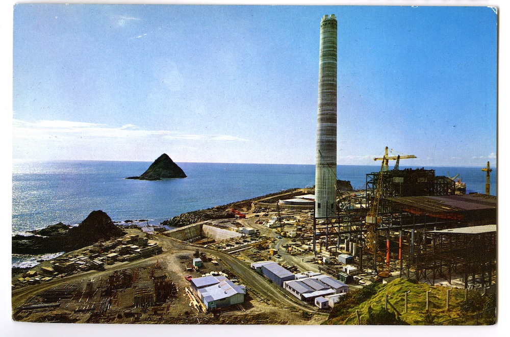
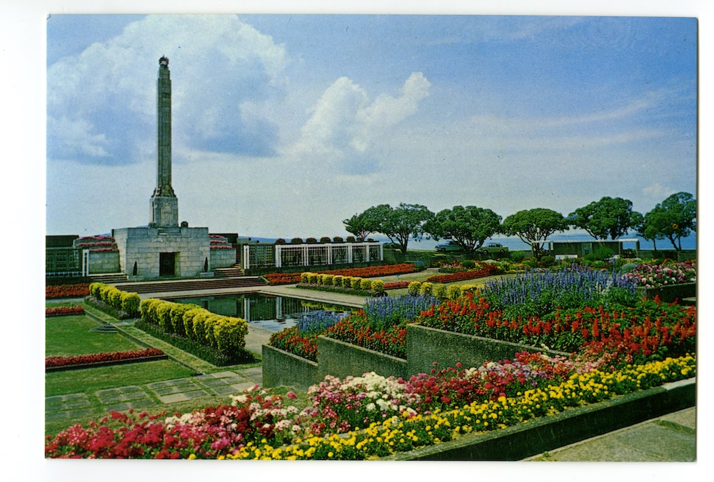
First, many of the photographs employ strict grid-based principles of composition (reflecting the kind of clean modernist aesthetic exemplified by architect Gordon Smith’s landmark civic buildings in Wanganui, shown in card (fig. 3). In card (fig. 4), the large New Plymouth power plant construction site is neatly framed by a slight rise in the foreground and the expansive Tasman Sea behind it. The horizon runs the full width of the card, precisely and completely bisecting the shot. One of the small offshore Sugarloaf island sits one third of the card’s width from the left edge, balanced by the chimney standing one third of the card’s width from the right edge. Positioning this card next to card (fig. 5) (of the Michael Joseph Savage Memorial), we see that Goodall’s faithfulness to grid composition is so exact, and so consistent, that the horizon flows continuously from one card to the next. The vertical Savage memorial mirrors the New Plymouth power project chimney. Incredibly, the diagonal line of the flower bed in the right foreground of the Savage card runs perfectly into the north Taranaki coastline on the other (see colour section pages 18 & 19).
Bascands Ltd., Christchurch
Bascands Ltd., Christchurch
Fotocentre / Colourview Ltd., Oamaru
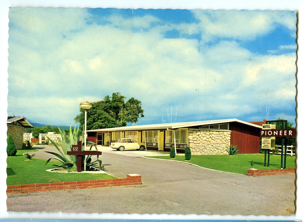
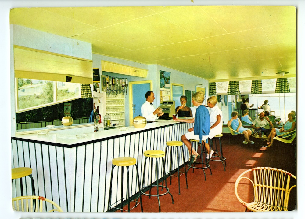
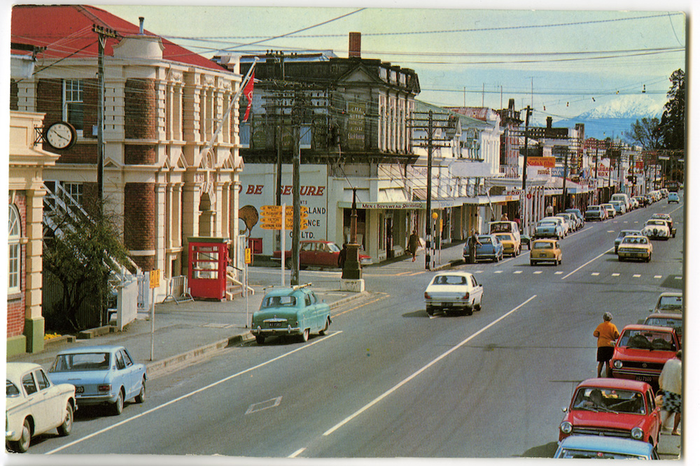
In addition to their characteristically rectilinear composition, these photographs contain an astonishing level of detail. Captured originally on 4 x 5" colour positive transparencies, the action is rendered minutely right up to the edge of the frame. (In fact, the ‘action’ is often precisely at the edge of the frame.) Thus, we are treated to a mass of peripheral information around the main subject of the photograph, detail such as the Triumph Herald parked outside Pioneer Motel in card (fig. 6), or the beehived patrons and stunning pastel décor of the Trans Holiday Hotel bar in card (fig. 7).
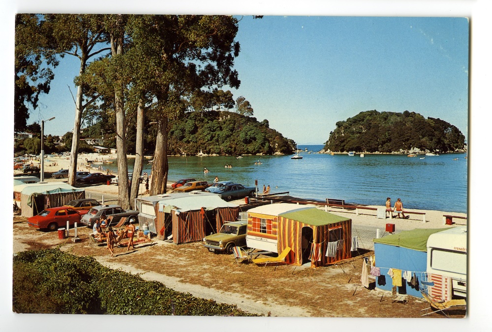
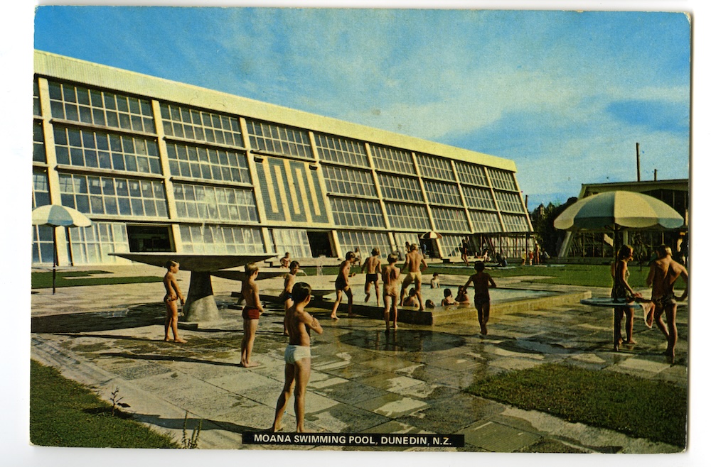
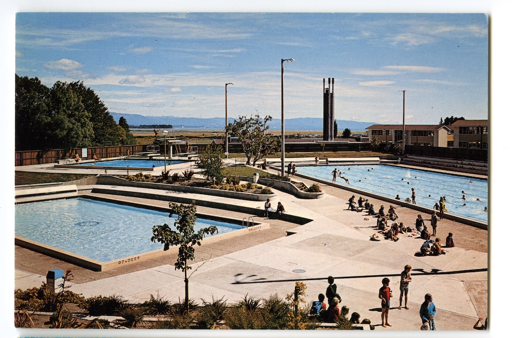
These banal details are critical. The distinctive appeal of boring postcards derives from the very mundaneness of their subject matter. The closer our eye gets to everyday scenes such as a camping ground (fig. 8) or swimming pool (figs. 9 & 10), the more we notice authentic and apparent detail that no contemporary production designer or creative director could ever quite capture. In an era when nostalgia has been co-opted irreversibly into the visual language of corporate marketing, boring postcards stand apart.
Pictorial Publications Ltd., Hastings
Fotocentre / Colourview Ltd., Oamaru
In a sense, boring postcards seem transparent, even clunky. They are free of the manipulative devices which commonly accompany the deployment of nostalgia in contemporary advertising or fiction: straw filters, lachrymose strings, and languorous retrospective voice-overs. Their nostalgic value appeals directly to the eye, mind and memory of the viewer, offering a refreshingly unreconstructed view of our recent past.
This is not to say the images are not contrived. Earlier I described some of the commercial and creative imperatives at work in their construction. In addition, viewing the images at the present time, we can see that they are broadly and unapologetically reflective of the prejudices of dominant culture of the time. It is precisely this transparency which lends them their quaint authenticity.
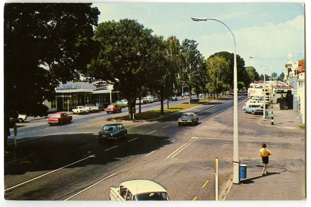
However, if boring postcards are not as consciously constructed or conceptually sophisticated as fine art or documentary photography, nor are they as technically naïve as vernacular photography. Nevertheless, there is something of the ‘snapshot’ style to some of the images. In card (fig. 11), the eye is drawn down the row of trees lining Te Puke’s main street, to a Vauxhall Velox driving out of frame at the bottom centre of the card. An anonymous man in walk shorts and knee-length socks passes a rubbish bin, perhaps heading for the distant shade of the shop verandah. By presenting a scene in which essentially nothing is happening, the card perfectly captures the baking, silent serenity of a provincial summer day. Cartier-Bresson’s principle of the ‘decisive moment’ applies equally to a postcard of Te Puke, as a grainy black and white of inner-city Paris.
In card (fig. 8), garishly striped canvas awnings shield campers from the relentless sun at Kaiteriteri. Here is the archetypal image of the beachside camping holiday: togs and towels dry on improvised washing lines, the grass has burnt brown, in the distance kids paddle their canoes. Kingswoods, Cortinas, and Austin 1100s abound.
While such scenes are near iconic, representations of Maori people and culture which, more than anything, identify these images as distinctly and unmistakably ‘of New Zealand’. The post-war period saw Maori seeking to empower themselves politically and culturally, following the massive and cumulative change wrought by the colonial encounter: land loss, disease, social reorganisation, urbanisation. Many aspects of this so-called ‘Maori renaissance’, for example master carving schools and kapa haka performance groups, are represented in boring postcards. There is always, however, a palpably non-Maori lens at work in these images.
Dow Productions / Batley Offset Printers
Gladys M. Goodall, Felicity Card Co. Ltd. / Whitcoulls Ltd.
Pictorial Publications Ltd., Hastings
From the earliest days of the country’s existence, Pakeha New Zealanders have appropriated aspects of Maori visual culture in order to distinguish themselves from their British colonial cousins. Hence, boring postcards present neatly commodified and highly contrived portrayals of Maori life, often directly associated with the tourist industry in and around Rotorua.
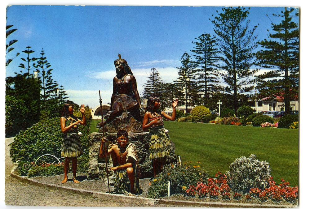
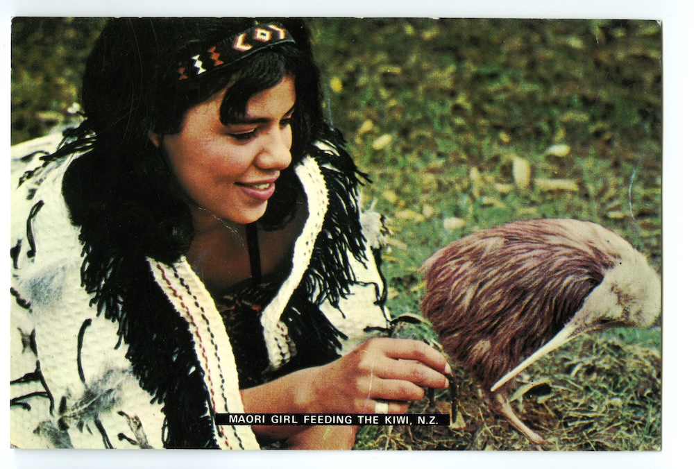
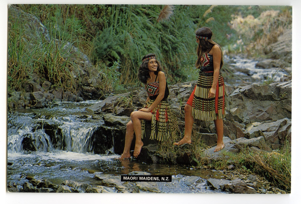
In card (fig. 12), three young children pose in front of the bronze statue of Pania, among the formal Norfolk pines, closely cropped lawns and marigolds of Napier’s Marine Parade Gardens. In card (fig. 13), in broad daylight, a young Maori woman in tourist performance costume gingerly holds a worm out to a bemused kiwi. In card (fig. 14), two ‘Maori maidens’ (below a certain age, Maori women are typically referred to as maidens) pose awkwardly, chatting in a river. Such images are very nearly absurd, and are certainly distinctly Pakeha creations. The ideological connections being drawn are clear, reinforcing certain centuries-old western stereotypes of indigenous Pacific peoples as childlike, feminine, and uniquely ‘of nature’.
Another aspect typical of such appropriation is the employment of images of indigenous species. It has been proposed that part of the ‘uniqueness’ of the Pakeha visual and cultural identity lies in the distinctive combination of environmentally modified agricultural landscapes on one hand, and ‘wild’, ‘natural’, and ‘untamed’ indigenous flora and fauna on the other. This combining of the exotic and indigenous is so familiar to us, so much a part of our psyche, that the inherent contradiction within it seldom registers. In card (fig. 15), a kiwi and a kowhai branch are posed in front of a wire fence on a lawn in the Napier Botanic Gardens. The kiwi tentatively nibbles on raw minced beef. As a text, the postcard offers an economic, elegant précis of these key symbols of Pakeha identity: agricultural fertility (grass, beef) and decontextualised images of indigeneity (nocturnal kiwi in daylight, dismembered kowhai blossom).
Pictorial Publications Ltd., Hastings

details unavailable
In discussing boring postcards, one is confronted with a series of paradoxes. In spite of the fact that the ‘boring postcard’ term seems perfectly appropriate, there is clearly a sense in which these postcards are not boring at all. Somehow, we can intuitively see them, even categorise them, as boring, while finding in them an endless fascination.
By their association with leisure and travel, we might normally think of postcards as conveyors of the exotic. Yet in the case of boring postcards, we are presented with certain scenes which appear archly mundane. Nevertheless, while such scenes may be familiar in a geographical sense, they do somehow recast their locations as exotic. Boring postcards speak to us across time, not space, thus throwing into sharp relief cultural, social, even architectural, shifts in our own society.
Lastly, behind boring postcards’ plain grid formality and a no-nonsense geometry, lies a very ‘kiwi’ paradox: the cards seem bursting with both a nascent national pride and a lingering, almost bashful, suspicion of sophistication. Within both the content and the form of these images, is reflected a prosaic late-colonial Pakeha mentalité. These are beautiful, boring postcards for a beautiful, boring country.
A.H. & A.W. Reed